Gene Discovery Rate in RNA-seq data

I was curious regarding at what rate new genes are detected as the number of reads in RNA-seq data increases. Let’s start by looking at the results.

The figure shows how many genes there are with nonzero counts at certain read depths.

In particular I was interested how this discovery rate looked for single-cell RNA-seq data. I found some read files at ENA which was from human cells. The two data sets used are SRR445722 and SRR499825.

In the interest of saving space on my tiny laptop, I only kept the first four million reads in the fastq files. For each read number investigated, reads are first randomly sampled from the fastq file using the reservoir sampling of seqtk. The sampled reads are then mapped to the human transcriptome (Homo_sapiens.GRCh37.73.cdna.abinitio.fa) using bwa mem. To map from transcripts to genes, I use eXpress (with the annotation file Homo_sapiens.GRCh37.73.gtf.gz). The final step is to count the number of genes which have counts different from 0.

In the interest of time and simplicity, I didn’t perform any quality or adapter trimming of the data.

For each read count, the sampling was performed five times with different random seeds. In the figure these replicates can barely be seen, but at some pints some smaller colored points can be glanced.

These are the pipeline for the process for the two datasets:

for READS in $(seq 10000 10000 1000000)
do
    for i in $(seq 5)
    do
        echo $READS reads >> sample_num_genes_SRR445722.out
        seqtk sample -s$(date +%s) SRR445722_4M_reads.fastq $(echo "scale=8; $READS / 4000000" | bc) | \
        bwa mem -t 2 Homo_sapiens.GRCh37.73.cdna.abinitio.fa - | \
        express --no-bias-correct Homo_sapiens.GRCh37.73.cdna.abinitio.fa
        cut -f5 results.xprs | grep -v "\b0\b" | wc -l >> sample_num_genes.out
    done
done


and

for READS in $(seq 10000 10000 1000000)
do
    for i in $(seq 5)
    do
        echo $READS reads >> sample_num_genes_SRR499825.out

        SEED=$(date +%s)
        FRAC=$(echo "scale=8; $READS / 4000000" | bc)

        bwa mem -t 2 Homo_sapiens.GRCh37.73.cdna.abinitio.fa \
        <(seqtk sample -s$SEED SRR499825_1_4M_reads.fastq $FRAC) \
        <(seqtk sample -s$SEED SRR499825_2_4M_reads.fastq $FRAC) \
        | express --no-bias-correct Homo_sapiens.GRCh37.73.cdna.abinitio.fa

        cut -f5 results.xprs | grep -v "\b0\b" | wc -l >> sample_num_genes_SRR499825.out
    done
done


They are slightly different since SRR499825 is paired-ended while SRR445722 is single ended.

I ran these for as long as I could leave my laptop on and stationary at a time.

What I find interesting about this is how these logarithm-like curves seem are so smooth.

Both studies these data come from have plenty of replicates, so a more thorough version of this study would be to try data from multiple cells and make sure that correlates. It would also be interesting to see how bulk RNA- seq compares to these data sets. I also only looked at data from human cells because I didn’t want include another set of transcriptome and annotation file to keep track of, but there are a lot more mouse single-cell RNA-seq studies on ENA than human.

It would also be fun to run the analysis much longer, to get up to millions of reads, where we start seeing the majority of genes as detected. And see precisely at which point this starts to happen.

EDIT

I reran the computations, but this time I let both data sets run to completion (depth of 1000 000 reads). I also saved the counts for each gene, so I could query detected genes with a lower cutoff. The new graph above show the detection rates for lower cutoffs of one, three and five mapped reads.

More interactive Python plotting with Clojure and Quil

The Python plotting library matplotlib is one of the libraries I read about a lot, and often, to try to keep track of everything possible to do with it. But I keep running in to situations where I don’t find it very useful.

Here I will write about one issue I had at a point, where I found it annoying when I wanted to sequentially build a graph, by adding scatter points to it one set at a time.

This summer I started playing with Clojure, and I enjoyed it quite a lot. Through looking at presentations for this I found Quil. I’ve only at some points played with Processing before, and I feel like quil better fits my way of thinking.

So, what I want, is to to my regular things with point data in IPython Notebook, and when I want to add it to a graph, I want to just send it to a quil sketch which is just running to the side of my IPython window. This way I can build my graphs over time.

I enjoy working with MongoDB, it has a tendency to just work where I need it and it is easy get started with. So I used this as a backend, and connected my quil sketch to the database using the monger library, which is extremely simple to use.

Here follows the entire code for the quill sketch that does what I want:

(ns square-vis.core
  (:gen-class)
  (:require [monger.core :as mg])
  (:require [monger.collection :as mc])
  (:use monger.operators)
  (:use quil.core))

(mg/connect!)
(mg/set-db! (mg/get-db "test"))

(defn draw-square
  [doc]
  (let [size (get doc :size)
        x    (get (get doc :coord) 0)
        y    (get (get doc :coord) 1)
        c    (get doc :c)]
    (no-stroke)
    (fill c)
    (rect x y size size)))

(defn -main
  [& args])

(defn setup []
  (smooth)
  (frame-rate 30)
  (background 200))

(defn draw []
  (background 200)
  (doseq [item (mc/find-maps "squares")] (draw-square item)))

(defsketch example                  
           :title "Squaaaares!"  
           :setup setup                      
           :draw draw                        
           :size [323 200])                  


This is only for making scatter plots with squares, in grayscale, which I like a lot. This piece of code connects to a database called “test”, and searches for documents in the collection named “squares”, and give them as Clojure maps, so they are easy to use in the rest of the sketch. The documents in the collection represents squares, with the following schema.

square = {'coord': [10, 20], 'size': 8, 'c': 155}


Some small examples:

from pymongo import Connection
conn = Connection()
coll = conn['test']['squares']

for i in range(28):
    for j in range(22):
        square = {'coord': [10 + 10 * i, 20 + 10 * j],
                  'size': 5, 'c': (i * j) ** 2 % 251}
        coll.insert(square)

coll.drop()
for k in linspace(0.0, 2.0):
    x = np.linspace(1, 350)
    y = k * x
    for xi, yi in zip(x, y):
        doc = {'coord': [xi, yi], 'size': 5 * k + 1, 'c': 100 * k}
        coll.save(doc)

print('running')
while True:
    try:
        for doc in coll.find():
            doc['coord'][0] += 1 * (random.random() - 0.5)
            doc['coord'][1] += 1 * (random.random() - 0.5)
            coll.save(doc)
    except KeyboardInterrupt:
        print('done')
        break

Non-standard Python on UPPMAX

Non-standard Python on UPPMAX

This is something I’ve had to look up at least 10 times in the last year, so to save myself from searching my email inbox yet another time I will write it out here. This post is specific to the Kalkyl cluster at UPPMAX.

To make a virtual environment with Python 2.7 on UPPMAX, do the following

mkvirtualenv --no-site-packages --python=/sw/comp/python/2.7.1_kalkyl/bin/python2.7 new_venv


What’s the problem?

Firstly, the standard Python on Kalkyl is 2.6, which is incompatible with most things we do, as we all tend to use 2.7.

UPPMAX uses the module system to manage different versions of software. Naively, you would think one could make a Python 2.7 by doing

$ module load python/2.7.1
$ mkvirtualenv --no-site-packages  new_venv


This will not work.

In stead, one need to point to the Python binary as it is stored on the filesysten; the one that the module system links to when module load is called. And this is located in /sw/comp/python/2.7.1_kalkyl.

Visualizing overlapping intervals

Visualizing overlapping intervals

Rather often I find myself wanting to see a pattern of how some interval data looks. I never found a good package for this, so always reverted to either drawing the intervals after each other on the x = y line. Or pile the intervals to histogram like graphs.

But today I got an idea how I could do it rather simply. What I want to do is stack the intervals so they don’t overlap, but also doesn’t need too much space on the Y-axis.

First let’s create some intervals that we want to try stacking.

intervals = [(2, 6), (7, 10), (1, 3), (4, 6), (8, 10), (1, 2), (3, 7), 
            (9, 10), (1, 2), (3, 5), (6, 7), (8, 10), (2, 5), (8, 10)]


Here is the basic idea: We sort the intervals by the start values. We give the first interval an initial Y-value. For the next interval, we check if the lower value is smaller than the upper value of the previous interval. If not, we just place the interval after the previous one. But if, we increment the Y-value, and check the same thing for the previous interval in that Y-category.

Here is a python implementation of this Y-categorization.

def intervals2layers(si):
    layers = [[si[0]]]
    for p in si[1:]:
        for lay in layers:
            if lay[-1][-1] < p[0]:
                lay.append(p)
                break
        else:
            layers.append([p])

    return layers


Let’s try it out!

si = sorted(intervals, key=lambda p: p[0])
layers = intervals2layers(si)

figsize(8, 4)
for i, lay in enumerate(layers):
    x1, x2 = zip(*lay)
    plt.hlines([i + 1] * len(x1), x1, x2, lw=30)

plt.xlim(0, 11)
plt.ylim(0, 6);

This works quite nicely. Let’s try something more problematic; we’ll generate 1024 intervals and see how these end up stacking using this strategy.

intervals = []
for i in range(1024):
    x1 = random.normalvariate(0.5, 0.25)
    x2 = x1 + random.random() / 16
    intervals.append((x1, x2))


figsize(20, 10)
for i, lay in enumerate(layers):
    x1, x2 = zip(*lay)
    plt.hlines([i + 1] * len(x1), x1, x2)

ax = plt.gca()
adjust_spines(ax,['bottom']);

Precisely what I’m after! One can see overall patterns of the distribution of all the intervals, but it’s also possible to see certain subintervals which might be interesting.

This is how some real data looks like.

Single Linkage Clustering Heuristic

Explaining the magic fudge in Mapper.

Background

A few months back I attended a couple of seminars by Gunner Carlsson talking about topological data analysis, and discussed some methods they employ at Ayasdi. Given my background in mathematics I thought it was quite nice to see some concrete applications of some rather abstract theory. In addition to this, their topology based analysis methods seem to be succesful with bioinformatical data where other methods fail.

This first paper about the method describes it quite well, and on the groups website they are also hosting a Matlab script which they used for the applications in that first paper. This scientific report gives a very nice summary of capabilities of topology based data analysis.

Using their refined implementation of the method on your data means contacting them and sending them your data to run their analysis on.

Therefore I thought a nice evening project would be to reimplement the Matlab script in Python, so it can be easily run anywhere, and eventually optimize the implementation somewhat.

A great start would be at the [upcoming Seqahead Hackathon] (http://seqahead.cs.tu-dortmund.de/meetings:2013-06-hackathon), where I’d hoped to perhaps get some collaboration.

Mapper basics

Just extremely briefly (see the scientific report or paper for details), the basic idea of Mapper is to divide the space of the data in to sections. Within these sections clustering is performed, these clusters are then combined depending on overlaps to form a graph which reveals a “shape” of the data.

Single Linkage Clustering

In the Matlab implementation of Mapper the authors use single linkage clustering. Briefly, single linkage clustering means initially taking every object as a cluster on its own, then pairwise link together “clusters” which are the closest to each other. This is repeated until the algorithm is left with one single cluster.

Software performing this kind of clustering usually returns a representation of the tree being built throughout the clustering, with the intermediate distances between clusters in each step preserved.

Mysteries in the Matlab implementation

When reading the Matlab implementation one comes across the parameter magicFudge. This is described in the comments of the script.

%  magicFudge: The number of histograms to divide each homology plot into
%              Increase this number if you expect to see more clusters
%              and decrease it if you are seeing more clusters.
%              Default : 10

Heuristic for number of clusters

This is further explained in the paper (page 5).

Now, to find the number of clusters we use the edge length at which each cluster was merged. The heuristic is that the interpoint distance within each cluster would be smaller than the distance between clusters, so shorter edges are required to connect points within each cluster, but relatively longer edges are required to merge the clusters. If we look at the histogram of edge lengths in C, it is observed experimentally, that shorter edges which connect points within each cluster have a relatively smooth distribution and the edges which are required to merge the clusters are disjoint from this in the histogram. If we determine the histogram of C using k intervals, then we expect to find a set of empty in- terval(s) after which the edges which are required to merge the clusters appear.

The authors also points out problems with this approach.

Although this heuristic has worked well for many datasets that we have tried, it suffers from the following limitations: (1) If the clusters have very different densities, it will tend to pick out clusters of high density only. (2) It is possible to construct examples where the clusters are distributed in such a way such that we re- cover the incorrect clustering. Due to such limitations, this part of the procedure is open to exploration and change in the future.

While I was reading the paper, I didn’t think much about this heuristic, but when trying to implement the method, it got me fairly confused.

I figured it would be nice to try the heuristic out and see how well it performs.

First we want to simulate some data, there’s a nice function in scikits-learn to generate blobs of data (clusters): sklearn.datasets.make_blobs. First generate some clusters.

from sklearn import datasets
num_clusters = 3
X, y = datasets.make_blobs(n_samples=N, centers=num_clusters)

(Throughout this post, I will omit commands for creating plots, but it can all be viewd in this IPython notebook.)

To perform single linkage clustering, we need a distance matrix between all points in the data set.

from scipy.spatial import distance
d = distance.cdist(X, X)

Then we can use, e.g. this new fastcluster package to perform the clustering.

import fastcluster
Z = fastcluster.linkage(d, method='single')

This creates the linkage Z, a (num_points - 1, 4)-shaped array where the distance between Z[i, 0] and Z[i, 1] is Z[i, 2].

This graph contains a dendrogram representation of the linkage.

In Mapper they also add the longest distance from the distance matrix to the array of inter cluster distances.

lens = np.zeros(Z.shape[0] + 1)
lens[:-1] = Z[:, 2]
lens[-1] = d.max()

They also introduce the notion of calling this collection of distances a “lens”. I like this as it invokes the idea of “unfocusing” the view of the data to see the overall shape.

Now just look at the histogram of distances.

This finds one cluster, as can be seen by doing the following.

z = np.nonzero(hst == 0)[0]
hst[z[0]:len(hst)].sum()

Out[613]: 1

It’s pretty impossible to see, but this cluster has the distances in the 9th bin in the histogram. This is obviously wrong, since we knew beforehand that we made three clusters in this example. Thus we should “focus” the lens by increasing the magicFudge, in this case I increase it to 64.

magic_fudge = 64
hst, _ = np.histogram(lens, bins=magic_fudge)

z = np.nonzero(hst == 0)[0]
hst[z[0]:len(hst)].sum()

Out[632] 3

Here we see the pattern discussed in the paper quite clearly. A nice almost normal distribution of small distances, breaking at the 9th bin (black arrow), followed by three bins at various locations with a single distance in.

Now to the issue that motivated this blog post: It took my many tries of generating example clusters, as well as trying different magicFudge-values for this last histogram.

Testing the heuristic

To see how the heuristic performed, I wrote some code that randomly generates between one and six clusters, performs the cluster count using nine different magicFudge-values, and collects how many times for each value the heuristic found the correct number of clusters.

magic_fudge_settings = [8, 16, 25, 32, 50, 64, 100, 128, 256]
hit_counts = [0] * len(magic_fudge_settings)
n_tests = 500
for i in range(n_tests):
    true_num_clusters = random.randint(1, 6)

    X, _ = datasets.make_blobs(n_samples=300, centers=true_num_clusters)

    d = distance.cdist(X, X)
    Z = fastcluster.linkage(d, method='single')
    lens = np.zeros(Z.shape[0] + 1)
    lens[:-1] = Z[:, 2]
    lens[-1] = d.max()

    for j, magic_fudge in enumerate(magic_fudge_settings):
        hst, _ = np.histogram(lens, bins=magic_fudge)
        z = np.nonzero(hst == 0)[0]
        if len(z) == 0:
            num_clusters = 1
        else:
            num_clusters = hst[z[0]:len(hst)].sum()

        if num_clusters == true_num_clusters:
            hit_counts[j] += 1

Results

Are best summarized with the following plot.

These results are quite bad in my opinion. However, when using this process to find clusters in order to make a graph of connections between them, it is probably not that important to be accurate. Just as long as enough overlapping clusters are found we will end up with a nice network that describes the data. But I very much doubt this is the cluster counter method used in the production implementation at Ayasdi.

Teaching Python at SciLifeLab

This spring we organized the KTH course Scientific Programming in Python for Computational Biology, hosted at SciLifeLab Stockholm.

The course ran over seven weeks with one two hour session every wednesday, with alotted time after the session for students to ask questions about assignments. The examination was by passing the weekly assignments in a timely fashion. Our twist on this classic concept was that all hand ins had to be done via Github.

The structure of the course was inspired by Software Carpentry.

There was demand for a course that goes beyond the basics of Python, and one challange with this is that even thought there are plenty of online resources for introducing people to Python, structured lectures, and in particular exercises, of more advanced sections are hard to come by.

We had a brainstorming session where we talked about what kind of things we wanted to cover in the course. The course was intended for scientists, but in the spirit of software carpentry, we also wanted to teach good software engineering practices.

A survey to various mailing lists to gage the interest of a Python course for scientists and how they would feel about a more advanced course rather than the normal introductory courses.

Responses for the survey were great, though most people had stated they would prefer a simpler course, we felt that those are already available several times per year. When we announced the course we asked people who intended to attend to sign up on a mailing list. We got some 100 people signed up, but we figured plenty of people signed up for the list simply because it was easy, and wasn’t really planning to attend. However, when the course started, we had roughly 70 people on the first session! We had booked the largest presentation room in the building, but it was filled to the brim. Personally I had expected the course to be more like a 10-15 people seminar. Now it was something else.

Everything was in Github

In the first session, Roman Valls Guimera gave an interactive lecture where students were to set up their Github accounts, join the Github Organization for the course, and learn how to clone their repos for the course to their computers. Among many other things he taught the students how to structure a Python project. The thought was that at the end, the students should all have a repository for the course which we could later build upon with examples.

Part of the first assignment was to have everything set up so that you could push code to your personal repository in the course organization. Every student had a repository named after their last name. Surprisingly, there were no overlapping last names!

There were a couple of points of confusion here. Some inconsistencies in examples, along with a confusion even among us organizers about where the repo’s for the course should be kept, caused students repositories to be quite varied. But after just this first session we were lenient in the correction, enjoying the success of getting over 50 people to use git for the first time and join Github!

The takeaway from this in the end, is that consistency of organization and examples would have helped the students understand things quicker. And we organizers definitaly could have done a better job communicating with each other in the beginning.

A key here is that we forced the students to use version control, and while we didn’t go through anything particularly advanced, not even branching, getting people to do commits and push to a central server habitually is something that courses normally don’t do.

IPython Notebooks rather than slides

In the second session I talked about how to parse various file formats with Python, and gave recommendations for packages to use in various occasions. Actually, I can show exactly what I talked about, because for rather than using slides as is common, live coding, I used IPython notebooks which I kept on Github for students to read after the sessions.

Session 2 - Getting Data

Personally, I think the notebook is optimal for teaching Python. It takes a bit of explaining what it actually is, and how it works. (That you can run code in cells of a browser is not intuitive when you’re just getting used to the idea of running code in the terminal, as was the case for many students.)

It enables you to prepare a lecture in advance, like slides, but also gives you the abality to change things, or quickly show things you didn’t think of when students have questions.

The session also included a guest lecture by Mats Dahlberg showing how to talk to relational databases with Python in the second hour.

At the end, I went through how to talk to web services using requests. This is a bit unconventional, but we have the convention at SciLifeLab to write and use RESTful API’s, and then it makes a lot of sense to show people how to actually use these.

For the assignment the students were supposed to fetch some data from the web and do some calculation. But as a part of this they were also supposed to structure the repo, and make setup.py install scripts so they could be used globally.

Originally, I wanted to use data from the public transport network about the bus stop outside the SciLifeLab building, but it turned out that data was not available without a for-pay API key. So instead I used the New York City transit system data as an example. An idea I got from Python for Data Analysis.

To push the students to structure their repositories the way that was originally intended I explicitly wrote out what kind of structure they should have after the assignment was done:

[lastname]/
    [lastname]/
        __init__.py
    scripts/
        getting_data.py
    README.md
    setup.py

This caused some to change their structure at least. Since we had so many students, we really wanted the repos to look basically the same, so we could easily correct assignments, and assist students that needed help without having to figure out their repo structure.

In the end, we never required the students to use the repos in the organization account, and allowed them to update the fork of the repo they had on their personal accounts in stead. Thinking back, it would have been much better to only look at the repos in the organization.

Self correcting assignments

The third session was about some modern Python idioms that people normally don’t see in an introductory course. You can see the notebooks online.

The session also included a brief introduction to NumPy, and I remember talking a fair amount about the difference between lists and arrays.

Session 3 - Modern Python Idioms

When preparing the session I was struggling with three things.

  1. I wanted a self contained example that would use what I had talked aboud.
  2. Many students still had inconsistant repository structures.
  3. I wanted to find time to write a script that would correct assignments automatically.

Out of all the nice things we did with the course, this is the one I’m the proudest of, I made the assignment so that the students were supposed to make a class who’s objects would be used to check that any course repository was correct. This is an assignment that will correct itself! A script was supposed to be written which would output the string “PASS” is the specification of the directory was satisfied, and “FAIL” otherwise.

I made sure to be very explicit in what kind of structure the RepoChecker class should check for, and pointed the students to use git mv if their own repos didn’t satisfy the structure the checker was looking for.

After this session almost every student had the required structure on their repos!

Use data about students generated through the course

The fourth session was much about not reinvinting the wheel, in particular about data containers. I mostly went through use cases for the more useful types in the built in collections module.

Session 4 - Don’t reinvent the wheel

I also talked about SciPy and the SciKits. I didn’t want to delve too deeply in to any particular SciPy submodule as the course was supposed to be wide, and honestly, for bioinformaticians SciPy doesn’t contain extremely useful submodules.

Something I was glad to show and go through was Pandas, a package I really enjoy using. One thing to note, is that though the rendering of a DataFrame as a table in the IPython notebook is really nice, some students got confused of whether Pandas worked in the terminal, so I had to open a terminal and show a couple of examples.

Data containers are used everywhere, but the different ones are used in rather particular instances. So I didn’t even try to think of an assignment that would use the ones I talked about. In stead, I wanted the students to do an assignment where they used Pandas.

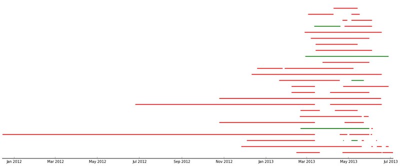
Inspired by the previous weeks assignment, I thought the data could be self generated as well. As the course had been going on for a few weeks now, there was quite a bit of activity on the Github repositories. You can see the entire formulation of the assignment at the end of the linked notebook. (I was even more explicit in the description this time. Really, if you want to be able to correct things automatically, you need to be very explicit.)

In gist, the assignment was to use the RESTful API of Github to take data about commits to the organization repos and put this in a Pandas DataFrame of time series, which they then couls use to find trends in the data.

Result: All students found that the vast majority of commits occured the hour before the weekly session (when also the assignment deadline occured).

Many of the students had problems with this assignment, in particular due to one repository that ruined most people strategies for fetching the data. In retrospect I think this was actually a good thing, it really demonstrated how programming turns out a lot of the time in the real world, they had to figure out how to handle the special case.

Scientists should learn CI and testing

In the fifth session Roman returned, and talked about how to work with tests, and how to use a continous integration system. He actually blogged about this here: Automated Python education via unit testing and Travis-CI

Rather than writing too much about it I’ll encourage anyone interested to read his blog post.

The session also had Hossein Farahani showing the graph package Networkx.

(Try to) use the code the students created.

For the sixth session I talked about how to optimize Python code, and quite in depth about how to use iterators / generators.

Session 6 - Optimizing Python

This also lead to an interesting construct in Python that I see very few people use, the coroutines. These are in essence the reverse of a generator, have a look at the notebook if you’re interested.

At the end I talked about how to use various profilers. When preparing this part of the lecture I realized even more how handy the IPython notebook is for teaching. By using the %%bash cell magic, I could store bash commands, and run them and see the output in a very nice way. In the process I also learned about the ability of starting background processes in a notebook cell using %%script --bg bash.

For the assignment, again thinking that it’s the best for the students to work with what they have already created, I figured they could profile the scripts they had made and report the results (by saving the outputs in the repo).

This, however, did not work out at all. (Yes this means the headline was never achieved). One of the profilers I wanted them to use turned out to be more experimental than I had thought, and just plain crashed on the students code. Various other differences in how the students had structured their scripts caused them to not be able to run several of the profilers. In addition to this, their script weren’t doing enough job for the profilers to have much time finding anything interesting.

In the end, we had to give the students an extra week to complete the assignment. And in stead of them using their scripts I found a script online for factoring numbers using the Elliptic Curve Method. I made sure to give very explicit instructions, and made sure the profiling worked.

Parallelization is hard but rewarding

For the seventh and final session of the course I went through the two most common strategies for parallelization. The multiprocessing module for programmatic parallelization, and IPython.parallel for interactive explorative parallelization.

Session 7 - Parallel Python

This session was very popular, it seemed a lot of people realized many of their time consuming problems could be rather easily parallelized to cut down computational time significally. As far as the lecture went, I just described how to use the various components of the modules. For this session the students had plenty of questions, and the feedback about the notebook was that it should have contained more comments and explanatory text.

One particular thing, is that multiprocessing doesn’t work in interactive prompts, so I had to make use of the %%file cell magic to write tiny scripts for each example, then again use the %%bash magic to run them. It went rather smooth, and I think the students understood what was going on.

Another detail, is that I piped the interactive notebook from an 8 core desktop to my laptop, as I figured the examples would be quite dull with my dual core laptop.

For the assignment I wanted the students to factorize many numbers, and calculate some statistics about the factors afterwards. So that this would be emberrasingly parallel over the list of numbers to factor. I wanted them to implement this using both multiprocessing and IPython.parallal.

It turned out that IPython.parallel was very bad for this problem, and everyone was confused as to why the parallel implementation was slower than a serial implementation. I managed to make an implementation that was slightly faster than serial, but only when using a much longer list of numbers than the one specified, and only large numbers.

Meanwhile the multiprocessing implementation gave everyone speedups quite quickly.

Making nicer looking pie charts with matplotlib

Firstly, one should in general stay away from pie charts, showing an area when the data relates to the arc lengths is confusing. Among other things, resizing a pie chart have a tendency to make people change their interpretation of the relation between the slices.

But, sometimes people really want them.

Matplotlib, the Python plotting framework, has a pie function implemented. And it’s used like this:

import numpy as np
import matplotlib.pyplot as plt
from random import shuffle

slices = [1,2,3] * 4 + [20, 25, 30] * 2
shuffle(slices)

fig = plt.figure(figsize=[10, 10])
ax = fig.add_subplot(111)

cmap = plt.cm.prism
colors = cmap(np.linspace(0., 1., len(slices)))

labels = ["Some text"] * len(slices)

ax.pie(slices, colors=colors, labels=labels, labeldistance=1.05)
ax.set_title("Figure 1");

hämta1

The very first thing that comes to mind is that the black edges doesn’t really work. So as a first action, lets make them white. Unfortunately there’s no keyword for edgecolor in pie, so we need to go through the patches for the slices and change each of their edge color property.

fig = plt.figure(figsize=[10, 10])
ax = fig.add_subplot(111)

pie_wedge_collection = ax.pie(slices, colors=colors, labels=labels, labeldistance=1.05);

for pie_wedge in pie_wedge_collection[0]:
    pie_wedge.set_edgecolor('white')

ax.set_title("Figure 2");

hämta2

Ok, so the point I originally wanted to make with this point, is what you can notice in the top left corner of the pie chart. The label text overlaps when thin slices are too vertical.

Let’s go through some steps on how to mend this. First, if we sort the data by size, we will at least now for sure where the thin slices will end up.

slices = sorted(slices)

fig = plt.figure(figsize=[10, 10])
ax = fig.add_subplot(111)

pie_wedge_collection = ax.pie(slices, colors=colors, labels=labels, labeldistance=1.05);

for pie_wedge in pie_wedge_collection[0]:
    pie_wedge.set_edgecolor('white')

ax.set_title("Figure 3");

hämta3

That’s good, however, firstly, if we have more thin slices they will still after a while end up being too vertical and the label texts will again overlap. Secondly, in my opinion, it looks a bit odd.

For a nicer solution, take the sorted slices, and make four sections; two with large slices, and two with small slices.

large = slices[:len(slices) / 2]
small = slices[len(slices) / 2:]

reordered = large[::2] + small[::2] + large[1::2] + small[1::2]

fig = plt.figure(figsize=[10, 10])
ax = fig.add_subplot(111)

pie_wedge_collection = ax.pie(reordered, colors=colors, labels=labels, labeldistance=1.05);

for pie_wedge in pie_wedge_collection[0]:
    pie_wedge.set_edgecolor('white')

ax.set_title("Figure 4");

hämta4

That looks much nicer, but it would be ideal if the thin slices where all as close to horizontal as possible. This we can fix by calculating the angle in degrees that we would need to shift the pie chart in order to get the first small section aligned around the horizontal axis.

fig = plt.figure(figsize=[10, 10])
ax = fig.add_subplot(111)

angle = 180 + float(sum(small[::2])) / sum(reordered) * 360

pie_wedge_collection = ax.pie(reordered, colors=colors, labels=labels, labeldistance=1.05, startangle=angle);

for pie_wedge in pie_wedge_collection[0]:
    pie_wedge.set_edgecolor('white')

ax.set_title("Figure 5");

hämta5

Perfect!

The code for making the pie charts can also be seen in this gist