Low mapping rate 6 - Converting sorted BAM to FASTQ

Some sequencing centers have moved to only work on BAM or CRAM files rather than "raw" FASTQ files. The motivation for this is that CRAM files can be heavily compressed and require less memory for the sequencing service provider. The CRAM files in particular make use of the alignment to a reference genome to achieve better compression performance, especially when the files are sorted by alignment coordinate.

In many forms of sequencing analysis, in particular genetics, coordinate sorted alignments to a standard reference is so standardized it is considered a "raw data" format. Unfortunately, this is not the case for RNA sequencing, in single cells or other. As demonstrated by the previous posts in the series, we are often not even sure what material we have been sequencing. The choice of what cDNA's are in the reference is also an informed choice depending on the experiment. For these reasons, software for working with RNA-seq data require FASTQ's as input.

To convert BAM's/CRAM's to FASTQ, a handy command from the samtools suite is samtools fastq. It is however not mentioned in the documentation or in the help for the command itself that is assumes name sorted BAM/CRAM input. It will not even stop or warn you if your file is coordinate sorted. Instead, it will silently create paired FASTQ files with incorrect read orders.

This issue was recently raised by Davis on twitter.

In particular, the incorrectly generated FASTQ files will have worse performance in terms of mapping statistics, caused by read pairs not originating from the same cDNA fragment. We can compare the result on the same data and reference as we used before, after converting files with name sorted and coordinated sorted CRAM files.

 
1.png
 

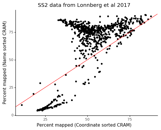
We see that cells which would have a mapping rate of > 75% only have ~40% mapping rate with the incorrect coordinate sorting.

Thomas Keane recommends using the samtools collate command before converting to FASTQ to quickly ensure reads are correctly ordered.

If you have data with lower mapping rates and you were provided BAM or CRAM files by your facility, it might be worth to check the sort order. This can be seen in the first line of a BAM/CRAM file.

$ samtools view -H 20003_4#70.cram | head | cut -c1-50
@HD    VN:1.4    SO:coordinate
@RG    ID:20003_4#70    DT:2016-06-07T00:00:00+0100    PU:1
@PG    ID:SCS    VN:2.2.68    PN:HiSeq Control Software    DS:
@PG    ID:basecalling    PP:SCS    VN:1.18.66.3    PN:RTA    DS:B
@PG    ID:Illumina2bam    PP:basecalling    VN:V1.19    CL:uk.
@PG    ID:bamadapterfind    PP:Illumina2bam    VN:2.0.44    CL
@PG    ID:BamIndexDecoder    PP:bamadapterfind    VN:V1.19
@PG    ID:spf    PP:BamIndexDecoder    VN:v10.26-dirty    CL:/
@PG    ID:bwa    PP:spf    VN:0.5.10-tpx    PN:bwa
@PG    ID:BamMerger    PP:bwa    VN:V1.19    CL:uk.ac.sanger.n

Similar to the case of unsorted FASTQ files, you can also notice this by read headers not matching up in the FASTQ pairs.

$ head 20003_4#70_*.fastq | cut -c1-50
==> 20003_4#70_1.fastq <==
@HS36_20003:4:2214:5946:43267
CTATTAAGACTCGCTTTCGCAACGCCTCCCCTATTCGGATAAGCTCCCCA
+
BBBBBBBFFFFFF/FFFFFF/<F</FFF/B/<<F/FFF/<<F<B/F/FFF
@HS36_20003:4:2111:19490:55868
GTATCAACGCAGAGTACTTATTTTTTTTTTTTTTTTTTTTTTTGGGTGGT
+
BBBBBFFFBFFFFFFFFFF/<<<FBBBFFFFFFFFFFFFFFFB///////
@HS36_20003:4:2109:19213:11514
TATCAACGCAGAGTACATGGGTGGCGCCAGCTTCAGCAAAAGCCTTTGCT

==> 20003_4#70_2.fastq <==
@HS36_20003:4:2214:5946:43267
GCCCTTAAGTTGATTTGAGAGTAGCGGAACGCTCTGGAAAGTGCGGCCAT
+
BBBBBBFFBFFFF/FFBFFFB/<FFFFF<FFFBFFFFFBFFFFFFFFF<F
@HS36_20003:4:1111:7773:69672
GAGACATAATAAACAAAAAAAGAATAAGATAAAGGAGAGAGAAAAAAACG
+
/<//////<//BF/F/FFFFF/<F/B//</<FF//F/F/F/FFFFFFF</
@HS36_20003:4:2109:19213:11514
CATTACAGGCGCATCTTACGGAATTGGATATGAAATAGCAAAGGCTTTTG

This post was suggested by Raghd Rostom and Davis McCarthy.

23947188368_b4f1d20c93_k.jpg

Droplet scRNA-seq is not zero inflated

As scRNA-seq (singel cell RNA sequencing) started to gain popularity users expressed concern about an unexpected number of zero values among gene expressions. That is, for any given gene many cells had not detected the expression, even if it was relatively high in other cells.

It is unclear when this was originally stated, but it has been named the "dropout" problem. A search on Google Scholar will give hundreds of publications discussing the problem of "dropouts" in scRNA-seq, and there are several methods papers explicitly aimed at investigating and dealing with the "dropouts". Typically by imputing zeros to positive values or by stating models which includes a zero-inflation component. These observed zeros ("dropouts") in the data have typically been explained by inefficiencies of molecular reactions, due to the very small volumes of mRNA in individual cells.

In high throughput variants of scRNA-seq assays cells are isolated in (reverse) droplets, within which several molecular reactions occur to eventually give rise to labeled cDNA from expressed genes from each cell. Part of what makes this possible is limiting the sequenced fragments to just single tags from the 3' or 5' end of each transcript. It has recently been observed in statistical analysis that RNA tag counting versions of scRNA-seq data is better explained without additional zero inflation.

Nevertheless, it is common to hear weariness from potential usesrs of droplet based scRNA-seq assays because they are percieved to have a higher amount of "dropouts" than alternative more expensive and manual methods with less throughput.

These observed zeros are consistent with count statistics, and droplet scRNA-seq protocols are not producing higher numbers of "dropouts" than expected because of technical artifacts.

To see this, consider four experiments were solutions of RNA were evenly distributed into droplets, guaranteeing a complete lack of biological variation. One was performed with inDrop (Klein et al), one with 10X Genomics GemCode (Zheng et al), and two with 10X Genomics Chromium (Svensson et al. All datasets have on the order of ~1,000 droplets with RNA, facilitating accurate estimation of e.g. mean or variance for each gene.

It has been observed that expression counts from these technologies follow the negative binomial distribution, in which there is a quadratic mean-variance relationship.

1.png

Compared with experiments involving single cells the mean-variance relation is extremely clear in these homogenous datasets.

In negative binomial data, the probability of observing a count of \( k \) given the mean \( \mu \) and dispersion \( \phi \) is

\[ P( k \,|\, \mu, \phi) = {k + \phi^{-1} - 1 \choose k} \left( \frac{\mu}{\mu + \phi^{-1}} \right)^k \left( \frac{\phi^{-1}}{\mu + \phi^{-1}} \right)^{\phi^{-1}}. \]

So the probability of \( k = 0 \) is simply

\[ P( k=0 \,|\, \mu, \phi) = \left( \frac{\phi^{-1}}{\mu + \phi^{-1}} \right)^{\phi^{-1}}. \]

With this function we can visualize theoretical "dropout" rates for various means and dispersion values.

 
2.png
 

These values can be compared with the empirical "dropout" rate, simply calculated as

\[ \frac{\text{# cells with gene = 0}}{\text{# cells total}} \]

for each gene.

3.png

The "dropout" rates for the data without biological variation follows the theoretical prediction. In all datasets the Pearson correlation between theoretical and empirical dropout rates is 99.9%.

Here the \( \phi \) parameter is different for each dataset, and it is possible that this overdispersion is affected by technical factors. There does however not seem to be any technical contribution to zero-inflation, if it is observed it is instead more likely caused by biological heterogeneity.

37223886084_f00b3efc33_z.jpg

Variance stabilizing scRNA-seq counts

Quantitative sequencing assays in general yield counts. The generative models for different levels of counts are in many ways fundamentally different from continuous distributions such as the more common Gaussian (normal) distribution. The problem is not that the data consists of integers; rounded normal data such as e.g. user ratings of products wouldn't have any particular problems being analysed with normal methods. Counts however are generated by several, cumulative, singular events. With each of the events having some probability of occurring in a given "time interval" or other relevant unit.

For example, if we think about the RNA sequencing process in the abstract we have a large collection of cDNA molecules which are randomly sampled and identified as originating from genes. How often moleculas are identifed from any particular gene tells us something about the abundance or expression level of the gene. The process of counting however implies that variation will propagate as the number of events increase. The effect of this is that there will be an inherent relation between mean (expected value) and variance of counts.

As an example, let us look at two recent datasets. One from Karaiskos et al where the authors mapped out fruit fly development on the single cell level, and another from Stoeckius et al where the authors developed a new method to study RNA and protein expression from cells in tandem.

1.png

The mean-variance relation typical for negative binomial distributed count data is quite clear. Negative binomial, or other similar distributions, have been used to study RNA-seq data for a long time. Almost all statistical tests for comparing control vs condition style experiments (differential expression) use generalized linear models assuming count data with these kinds of distributions.

Single cell RNA-seq data is different. Not necessarily because the data wouldn't be suitible for these tools, but rather because differential expression is a minor question of limited interest in single cell studies. By far the most popular use of scRNA-sequencing is to identify groups of cells which are similar to eachother and might correspond to functionally distinct cell types. In addition to such clustering analysis, inference of developmental trajectories are popular, as well as quantifying the degree of variation between conditions.

So unlike bulk RNA-sequencing, the key analysis modality is in terms of multivariate analysis such as clustering or "dimensionality reduction" like PCA. In the coming years I believe figuring out effective ways to think about these issues for count data will be important, especially for sparse counts from low depth!

In the meantime, it is useful to be able to use available methods. Existing methods for clustering or dimensionality reduction are almost always either explicitly or implicitly designed with normal data in mind. (A notable exception being ZINB-WaVE by Risso et al). Any method using Euclidean distances implies normally distributed data.

One way to deal with these problems is to transform the data) in some way which makes it more similar to normal data. The logarithm is a very practical transformation for positive data. In particular ratios are very useful to log transform. With counts though, it is common to observe values of zero, for which the logarithm is not defined. Instead, it is common to perform \( \log(x + 1) \) for counts \( x \).

If we apply this transformation to each gene \( i \), we can investigate a couple of things. First of all, we can see what happens with the mean-variance relation. Secondly, we can display the first few principal components for both of the data sets using the transformed unit. This will represent a form of multivariate analysis.

2.png

From the plots we can observe a few things. For higher mean counts the relation between mean and variance (or standard deviation) is gone. However, for lower counts (mean \( < 1 \)) there is still some correlation. From the PCA below we can see some subpopulations for each data set.

The 1 here was added due to the observed zero counts. But why 1? What if we used something else? Is this the best we can do? In the end, adding the one was quite ad hoc wasn't it? Or in the words of Arjun Raj the other week:

There is actually some theory we can use here. Our goal was to transform the data in way that removes the mean-variance relation as effectively as possible. This is known as a variance-stabilizing transformation. For example, in bulk RNA-sequencing the DESeq2 package has a function vst() for this (based on the underlying parametric Poisson-Gamma model).

If there is a functional form for the relation between the mean and the variance, e.g.

\[ Var(x) = g(\mu), \]

then the variance can be stabilized by applying the function

\[ f(x) = \int^x \frac{1}{\sqrt{g(v)}}dv. \]

As illustrated in the first plot of the post, for negative binomial data, which generally suits scRNA-seq counts well, we have that

\[ Var(x) = \mu + \phi \cdot \mu^2, \]

where \( \phi \) is the dispersion for the data. If we plug this into the integral above, and use Wolfram Alpha to solve the integral because I'm not in school anymore, we get

\[ VST(x, \phi) = 2 \cdot \frac{\sinh^{-1} \left( \sqrt{ \phi \cdot x } \right)}{\sqrt{\phi}} \]

It is very easy to find a \( \phi \) for the data by fitting a polynomial to the observed mean-variance relation. Let's transform our data in this way, and redo the plots for the two data sets.

3.png

We can note that this transformation behaves very similarly to \( \log(x + 1) \). One difference is that the standard deviation is scaled around 1 rather than around 0.5. Any effect on the PCA seems minimal though.

In a 1948 paper Anscombe explored these sorts of tranformations for Poisson and negative binomial data. In addition to the \( \sinh^{-1} \) form of the solution to the integral, Anscombe also considers an approximation which works for certain ranges of mean and \( \phi \). The approximation has the form \[ \log\left( x_i + \frac{1}{2 \cdot \phi} \right). \]

This has the same form as the heuristic \( \log \) transform, but instead of just picking 1 the "pseudocount" is motivated by the data distribution and statistical theory. We also create the same plots as above for data tansformed in this way.

4.png

Again the data looks similar to before, and we're back to the situation of having standard deviation around 0.5 for highly expressed genes.

In both of these cases we have assumed a global \( \phi \) parameter, and found it by polynomial curve fitting of mean vs variance. This is handy because we can use information from all genes and learn something global about the data. Then each gene is transformed assuming a fixed dispersion level.

For these data sets, there's actually no real need to assume a global \( \phi \). They have thousands of cells providing observations for each gene, we can easily learn individual \( \phi_i \) for each gene by maximum likelihood. That means we can perform VST of each gene independent of the other genes.

(It should be mentioned that finding all the \( \phi_i \)'s took about 40 minutes for the larger of the data sets, so it's not extremely practical).

5.png

When plotting these independent VST values we first see that the relation between mean and standard deviation is much "tighter" for both data sets. We still get an interesting bump for lower expression values, but after a mean of 2.0 the standard deviations are stable at 1.0. (A problem of course is that it's hard to know what "2.0 expression" means here, but it seems somewhat comparable between the two data sets).

Here we notice that the low-dimensional representation in the PCA is different from the previous data transformations. For the left data, we don't see clear clusters anymore, while for the right data some within-cluster covariance seem to follow PC1 better.

Finally, we can try to perform the approximate Anscombe transformation for gene specific \( \phi_i \) values.

6.png

It's hard to say what we are seeing here. There's definitaly no apparant correlation between mean and variance after the transformation. Though the standard deviations are not particularly stable around a value. For very high mean expression, values are transformed to have 0 standard deviation, meaning they are probably transformed to a constant value.

The multivariate PC analysis shows similar results as the first few transformations.

In the end I don't have any particularly good conclusions. The results are in the end somewhat different, especially when considering per gene \( \phi_i \) values. I have no idea which would "correct" in any meaningful way.

One note though, is that in all cases (except the last) there still is a dependency between mean and variance for genes with very low means. Considering that scRNA-seq as a field is moving towards more cells rather than more counts per cell, this might mean that variance stabilizing transforms are the wrong way to go in modern studies. Instead working directly with count distributions might be a more stable strategy for low counts. There of course is very limited prior work on this, and that is good to keep in mind when working with and planning to make shallow scRNA-seq data.

37339323141_eae57e8364_z.jpg

Low mapping rate 5 - Human DNA contamination

This is (most likely) the final post in the series investigating the low mapping rate of our Smart-seq2 data from our study on the malaria immune response. If you have read the previous posts, you might have notied a population of cells which have been stuck at extremely low mapping rate, no matter how much things improved for the other cells. It turns out this population of cells are contaminated with human material.

In our study we invsetigated CD4+ T cells sorted from spleens of infected mice. There are a number of potential entry points for human material to contaminate the samples.

  1. Human cells can be sorted with mouse cells.
  2. Human material enter the plate of cell lysate during cDNA generation.
  3. Human material can end up in the plate when creating the DNA sequencing library.

These different potential vectors of human contamination will lead to data with different characteristics. If human cells are sorted together mouse cells, the data will have heterogenous expression patterns as single cell data does, only with human genes rather than mouse genes. On the other hand, if human material enter the plate of sorted cells while cDNA is being generated, human mRNA will convert to cDNA but with consistent bulk-like expression patterns in the different wells. Finally, if human material enter the plate during library preperation no reverse transcription will be performed, and instead DNA from the human material will end up being sequenced.

To analyse this, I added all human Gencode transcripts to the Salmon reference from the previous post, along with a human 18S rRNA sequence. This will account for the first two possibilities. For the case of human DNA contamination, I extracted the unmapped reads from Salmon and aligned them to the human genome with HISAT2. With the remaining unmapped/unaligned reads I calculated the final mapping rate.

 
1.png
 

It is clear that we hace solved the mystery of the extremely low-mapping population! By breaking up the mapped reads into the sources of contribution like we have done before for each sample, we can see which have the contamination cases have happened.

 
2.png
 

In the entirety of the plate 20003_6, as well as stretches of the plate 20003_8 we see that by for the greatest contribution of material is from human intergenic DNA, suggesting that the contamination happened during library preperation.

At this point I want to illustrate how much of the reads we have no found an explenation for compared to the original reference.

3.png
4.png

The mapping rate have moved from a heterogenous stretch to a clearer distribution common for the plates. In the end the mapping rate is only 75% on average, but this is a great improvement from before, and I haven't managed to see something systematic about the remaining reads.

To summerise, the Salmon reference now contains Mouse Gencode genes, ERCC spike-in sequences, mouse ribosomal RNA, a TSO concatemer "bait" sequence, Pseudomonas 16S and 23S sequences, human Gencode genes, and human 18S. Additionally, the unmapped reads are aligned to the human genome.

I hope the series of posts have been helpful, and in particular illustrative of the many failure modes of scRNA-seq experiments. This was all within a single experiment!

35663989820_a08bb9629b_z.jpg

Low mapping rate 4 - Bacterial contamination in reagents

The large amount of amplification needed to get usable material from single cells cause us to get detectable signal from minor effects such as ribosomal RNA or TSO concatemers. This also means reagents need to be particularly pure. Several studies have inviestigated the bacterial contents in kits used for sequencing studies, investigating the 'kitome'.

Reagents might have a small amount of contamination which will not be detectable in the "bulk" assays with more input material it was designed for, or even for relatively large single cells.

In particular, some commercial reverse transcriptases have been reported to contain contaminating bacteria. This thread on Seqansweres is generally recommended for anyone using scRNA-seq. A few years ago multiple people reported electropherograms which showed different sample purity depending on the reagent lot. This is an illustrateive plot reported by user bplevi:

1.png
 

The thread contains more examples good vs bad lots of reagents. They also reported which lots they had had success or failure with. For the data analyzed in the previous posts of the series, SuperScript II has also been used, though I don't know the lot number.

The company producing SuperScript II later acknowledged a couple of lots where contamination of E. coli had beed detected.

Analysing the reads from my data, I didn't see contribution from E. coli, however, I did find contamination from Pseudomonas. This bacterial family have also been reported in papers describing reagent contamination.

I added sequences for Pseudomonas 16S and 23S to the Salmon reference, reran the samples, and compared the results to the previous iteration.

 
2.png
 

With this addition the mapping rate for the majority of the cells jump up to ~75%!

From the scatter plot above we can see that before adding the Pseudomonas sequences, the mapping rate was more heterogenous. As we did before, we can see if this relates to the individual plates.

 
3.png
 

It is quite interesting that some plates have a larger contribution of TSO concatemers while others have larger contributions of bacterial sequences. All these plates are suppowed to have the same lots of reagents. However, the plates are sorted on different days then stored in a freezer until the experiment is done. It might be the case that TSO products and bacterial products degrade differently due to this.

(I should also acknowledge Luisa for pointing me to various bacterial resources.)

35309298473_96472ec6f7_z.jpg

Low mapping rate 3 - TSO concatemers

Compared to the two previous posts in the series, this post deals with something more technology specific.

Many biochemical reactions require a criticial amount of material before they work at all. This is the main challange with single cell RNA-sequecing: to create sufficient material for the next step in a protocol. The Smart-seq2 protocol makes use of Nextera, a kit for fragmenting and adding adapters for amplification, and finally Illumina sequencing adapters. But in order for Nextera to work a minimal input of DNA must be provided.

Once cDNA have been reverse transcribed from mRNA from a cell, it can be pre-amplified if it has PCR adaptors at both ends of the cDNA. A particularly convenient way to add these adapterors is though template switching PCR.

Template switching oligos

Here when reverse transcription reaches the 5' end of the RNA, a CCC sequence is added. This allows a DNA oligo with GGG at the to bind to the end if the cDNA. This oligo allows the second strand of the cDNA to be generated, and at the same time provides as an adapter for PCR primers.

In the standard implementation of the Smart-seq2 protocol the template switching oligo (TSO) is AAGCAGTGGTATCAACGCAGAGTACATGGG.

Sometimes these TSOs concatenate to longer DNA sequences, and get amplified along with the cDNA. If you investigate reads not mapping to the transcriptome or rRNA you will find a number of reads whic have the TSO repeated after itself multiple times.

The TSO concatemers can be accounted for during quantification by including a FASTA record of a TSO concatemer in the reference, like this one:

>TSOconcatamer
AAGCAGTGGTATCAACGCAGAGTACATGGGAAGCAGTGGTATCAACGCAGAGTA
CACGGGAAGCAGTGGTATCAACGCAGAGTACATGG

Rerunning Salmon with the new reference, we can compare the mapping rates to those in the previous post:

 
1.png
 

As we can see, the majority of cells get increased mapping rate when including the TSO concatemer. And many cells go from single digit percentages to over 50%! These samples are likely wells with almost no cellular mRNA in.

As before we can visualize the relative contribution of fragments from the different sources (here I merged the rRNA genes expression to one unit).

 
2.png
 

We see that several of the plates have large amounts of TSO contamination, and compared to rRNA it seems more variable between samples. It also seems to generally have a larger contribution than rRNA except for in one of the plates.

To quickly investigate different concatemers in data I created a little tool to our readquant collection which counts the number of occurances in reads from FASTQ files.

$ concatamer_filter.py fastq/20003_3#57_1.fastq fastq/20003_3#57_2.fastq AAGCAGTGGTATCAACGCAGAGTACATGGG
Copies,Fragments
0,667147
1,32750
2,33590
3,84431
4,8723
5,8

A typical strategy when investigating low mapping rates is to BLAST unmapped reads. Many times this will give results from scaffolds of the common carp genome (Cyprinus carpio). Actually, if you simply BLAST a 3x concatemer of TSO, it will map all over the carp genome with 100% similarity

 
Screen Shot 2017-09-07 at 00.22.08.png
 

Finally, I should mention that Smart-seq2 isn't the only protocol making use of template switching. It is also used in STRT-seq, the different flavours of Drop-seq (e.g. SeqWell, DroNc-seq etc) as well as in the very popular 10X Genomics Chromium single cell solution.

35948630474_b86df0d057_z.jpg

Low mapping rate 2 - Ribosomal RNA

In the first post of the low mapping rate series I started off by describing a problem at the data processing level in a dataset. In the coming few posts I will focus on a particular dataset and iteratively increase the mapping rate due to different factors.

The data is from our study of CD4+ immune response to Malaria infection. In the study we first performed the experiment using the Fluidigm C1 system with the SMARTer kit, then we replicated the results using Smart-seq2 in microwell plates. Here I will use the Smart-seq2 data.

This data have a particularly large range of mapping rates for the individual cells, evenly distributed between 1% and 70%.

 
1.png
 

Ribosomal RNA

Ribosomal RNAs are highly abundant in cells, though unlike mRNA these are not polyadenylated. Since (almost) all scRNA-seq protols make use of oligo-dT sequences to reverse transcribe RNA to cDNA this is not a big issue.

The RNA component consists of a number of rRNA genes, repeated in chunks in various locations of the genome. These genes are 5S, 5.8S, 28S (all parts of the large subunit), and 18S (small subunit). In particular, 18S have a couple of (relatively short) stretches of poly-A in its sequence. My theory is that when the amount of mRNA is very limited in a sample the olig-dT binds these small stretches and the 18S gets reverse transcribed.

To investigate this, I added the sequences of Rn5S, Rn5.8S, Rn18S, and Rn28S from mouse together with the GENCODE transcripts and ERCC spike-in sequences in a new reference, and reran all the samples through Salmon. On average this had the effect of increasing the mapping rate, with a number of samples having almost twice the mapping rate as before.

 
2.png
 

The data here consists of cells from many individual mice, from different time points in the infection with a couple of replicates. By necessity of the technology cells from each mouse and time point need to be sorted into individual microwell plates. From the quantified gene expression/abundance values we can compare the controbuting sources in each individual cell, stratified by plate to see if there are any trends.

 
3.png
 

Here ENSMUS corresponds to contribution from the mouse transcriptome. The different rRNA genes are indicated. Here we see that Rn18S is contributing far more than the other genes. It is also clear that different samples (plates) have different contributions of rRNA.

If you haven't included ribosomal RNA in you mapping reference and are working on mouse, a red flag for rRNA contamination is particularly high expression of genes called CT010467.1, AY036118, Erf1, or Gm42418. These genes overlap a region on Chromosome 17 which have particularly similar sequnce to 18S. I have seen many datasets where any of these genes are the top 3-4 most highly expressed genes in a cell.

36783074055_1476e60583_z.jpg

Low mapping rate 1 - Unsorted FASTQ pairs

Occasionally when working with scRNA-seq data, you notice that there is a large degree of heterogeneity in terms of the percent of mapped reads per cell. Typically this is one of the criterions for exculding cells from analysis. Usually we are pushed to get things done, and as long as we have enough cells with enough mapped reads to perform proper analysis we let it be and move on.

In our review of the history of scRNA-seq experiments we point out that the sequencing itself is one of the main current bottlenecks for large scale experiments. In light of this, I thought it would be useful to actually note what is causing us to sequence reads which we are not using in the actual analysis. I will write a series of posts with a number of contributing factors for low mapping rates I have noticed recently.

Unsorted FASTQ pairs

Typically we quantify gene expression with Salmon, and have some simple tools to extract QC data from the result files. One good combination of variables to look at in your cells is the number of mapped reads compared to the % of mapped reads.

In a recent case, we had a plot like this

 
1.png
 

What sticks out here is the large gap between high-mapping and low-mapping cells. It usually shows more of a continuous trend, with a more clear cluster of "proper" cells.

It turned out that the at some point in the data processing steps prior to quantificiation, the order in the reverse and forward FASTQ files had not been kept consistent. Example:

$ head -n 8 JE1704_C27_R{1,2}.fastq
==> JE1704_C27_R1.fastq <==
@NS500239:235:HL7JLAFXX:1:11101:21276:1083 1:N:0:ATGCGCAG+NTTAATAG
CCTCTACCCAGAGGCCCAGTGGCAGAGGCCTGGACAAGTATTGAACACAAGAACTGTAGTGGTCAGAGGGACTTAA
+
AAAAAAEEEEEEEEEEEEEEEEEEEEEEAEEEE/EEEEEEEEEEEEEEEEEAEEEEEEEEEEEEEEEEEEAEAEEA
@NS500239:235:HL7JLAFXX:1:11101:9041:1085 1:N:0:ATGCGCAG+NTTAATAG
TGTTTTTATTGATTTAGTCTGTTTCAGAGTCAAGGTGTCAACGAGGAAGGATGGATATCCATGGAGGAAGAAGAGA
+
AAAAAEE6EEEEEEEEEEEEEEEEEEEEEEEEEEEEEEEAEEEEEEEEEEEEAEEAEEEEEEEAEEE/EEA/EA<E

==> JE1704_C27_R2.fastq <==
@NS500239:235:HL7JLAFXX:2:11101:17928:1074 2:N:0:ATGCGCAG+NTTAATAG
ACCTAATATAGCAGGTGGCCAGGACTGGGATCCAGCTGCCTGGATCAGGTCAGGCTTGAGGAAGACTGCTTAAGAG
+
AAAAAEEEEEEEEEEEEEEEEEAEEEEEEEEEEEEEAEEEEEEEEEEEEEEEAEEEEAEEEEEEAEEAEEEAE6/A
@NS500239:235:HL7JLAFXX:2:11101:5780:1075 2:N:0:ATGCGCAG+NTTAATAG
TATCAACGCAGAGTACGGGATGAGGTGTGGGACGCACTGCCAGCGTTGCCCTTTAGTATAGCTCTTGGTAAACTAA
+
AAAAAEAEEEEA6AEE//EEEA///EE//E/EEAEEA6A6EEEEE//6E/<EAE<EEE6E/EEEAE/EEEEEEEE6

If everything is correct, the headers of the FASTQ records should be identical up to the first space. The number after the first space indicated if the FASTQ is a forward read or reverse read. Here we specifically see that the reads come from different sequencing lanes (the number after HL7JLAFXX:).

When Salmon is mapping with umatched forward and reverse reads, the majority of these will map to different transcripts from eachother. This will cause the read to be considered unmapped as it is an event which is not consistent with typical RNA-seq libraries.

The solution to this problem is pretty simple: just sort all your FASTQ files by the header header. The quickest solution I stumbled upon for this is from the EdwardsLab blog which suggests a Bash oneline to do this.

After sorting, the beginning of the FASTQ pair above looks like this

$ head -n 8 JE1704_C27_R{1,2}_sorted.fastq    
==> JE1704_C27_R1_sorted.fastq <==
@NS500239:235:HL7JLAFXX:1:11101:10008:20335 1:N:0:ATGCGCAG+CTTAATAG
CCCACAGCCTCTGCCGCGGGTACCATGAAGATCTCTGCAGCTGCCCTCACCATCATCCTCACTGCAGCCGCCCT
+
AAAAAEEAEEEEEEEEEEEEEE//EEEEEEEEEEEEEEAEEEAEEEEAA66EEE/E/EEEEEEEEEEEEAAEEE
@NS500239:235:HL7JLAFXX:1:11101:10009:10878 1:N:0:ATGCGCAG+CTTAATAG
TACCAACACATGATCTAGGAGGCTGCTGACCTCCAACAGGAATTTCACCACTTAACCCTCTAGAAGTCCCACTA
+
AAAAAEEEEEEEEEAEEEEEEEEEEEEEEEEEEEEEAEEEEAEEEEAEEEEEEEAEEEEEE/EEEEEEEEAEEE

==> JE1704_C27_R2_sorted.fastq <==
@NS500239:235:HL7JLAFXX:1:11101:10008:20335 2:N:0:ATGCGCAG+CTTAATAG
TGGTATCAACGCAGAGTACGGGGGTGCAGAGGGCGGCTGCAGTGAGGATGATGGTGAGGGCAGCTGCAGAGATCTT
+
A/AAAEEEAEEEEEEEEEEEE/EEEEEEEEEEEEEEEEEEEEEAEEEEEEEEEEEEEAEEEAAAEEEEEAEEEEEE
@NS500239:235:HL7JLAFXX:1:11101:10009:10878 2:N:0:ATGCGCAG+CTTAATAG
ATTACATGGAGTCCATGGAATCCAGTAGCCATGAAGAATGTAGAACCATAGATACCATCTGAAATGGAGAATGATG
+
AAAAAEEEEEEEEEEEEEEEEEEEEEEEEEEEEEEEEEEEEEEAEEEEEEE/EEEAAEEEEEEAAEEEEEEEEEEE

What caused the files to not be correctly sorted to begin with? it could have been something about how the files from different sequencing lanes were merged. I have also had issues with this happening befoer when using the samtools fastq command on CRAM files which have been sorted by alignment coordinate.

It seems a small number of the cells had succesfully kept the FASTQ order, explaining the "outlier" population at 80%.

After sorting all files and rerunning Salmon, we get much more reasonable mapping rates.

 
2.png
 

There are still some cells with lower mapping rates, but not nearly as many as before. And we see a more consistant cluster of highly mapping cells at ~80%.

We can also visualize how much the mapping improved for each cell when properly ordering the FASTQ files.

 
3.png
 

This was probably the cause of low mappting rate which is easiest to deal with, and it was introduced at the data processing side. But a good thing to keep in mind, if you have consistently very low mapping rate, have a quick look to see that reads are sorted correctly.

36112592504_26dc1b6f77_z.jpg

Negative Binomial Factor Analysis by SGD

Principal component analysis works on the assumption that residual error from the linear model is Gaussian. To satisfy this in e.g. the case of scRNA-seq gene expression counts, it is common to log transform the counts with a "pseudocount" added to keep expression positive and deal with 0's.

Count models are fundamentally different from normally distributed models in that there is a relation between empirical mean and variance.

It is well known that a negative binomial noise model is appropriate for RNA-Seq sequencing counts. Previously I wrote about ZINB-WaVE by Risso et al, a factor analysis method which has a zero-inflated negative binomial noise model. The negative binomial distribution has two parameters, \( \mu \) - the mean of the disitribution - and \( \phi \), the overdispersion. If \( y \sim NB(\mu, \phi) \) then \( \mathbb{E}(Y) = \mu \) and \( \text{Var}(Y) = \mu + \frac{1}{\phi} \cdot \mu^2 \). The likelihood of this model is $$ \mathcal{L}_{NB}(y | \mu, \phi) = {{y + \phi - 1} \choose {y}} \cdot \left( \frac{\mu}{\mu + \phi} \right)^y \cdot \left( \frac{\phi}{\mu + \phi} \right)^\phi. $$

If we make the simplifying assumption \( \phi = 1 \) then the log likelihood simplifies to $$ \log \mathcal{L}_{NB}(y | \mu, 1) = y \cdot \log(\mu) - (y + 1) \cdot \log(\mu + 1) $$

From available datasets, it looks like this assumption might be a sensible thing. Let's look at the empirical mean variance relation for four representative datasets.

The mean variance relation seem to hold for a large number of genes, but not all. I think one way to deal with this is to consider a factor model similar to PCA for the \( \mu \) parameter, which should explain additional variance on top of the expected technical variance. Say that each gene \( g \) and cell \( c \) has its own mean \( \mu_{g, c} \). In matrix form, $$ \mu = \exp ( W x + E + \log(T) + S), $$ where \( W \) is a \( G \times N \) matrix of gene weights, \( x \) is an \( N \times C \) matrix of latent factors, \( E \) is a \( 1 \times C \) vector of cell specific scaling "efficencies", \( T \) is a \( 1 \times C \) vector of known cell specific scale factors, in this case the total number of counts in a cell, and \( S \) is a global scaling factor. (Here we pretend matrix-vector addition "broadcasts" like in NumPy / TensorFlow code.)

This can be fitted with stochastic gradient descent using TensorFlow as I wrote about in the case of PCA before. The full implementation is available here, but besides the data reading and mini-batching code, the key snippet of the TensorFlow model is the following:

...

## Model ##

W = tf.Variable(np.random.randn(G, N), name='weights')
x = tf.Variable(np.random.randn(N, S), name='PCs')
E = tf.Variable(np.random.randn(S), name='Efficiency')
S = tf.Variable(np.array([0.]), name='Scaling')

sample_idx = tf.placeholder(tf.int32, shape=[None])
variable_idx = tf.placeholder(tf.int32, shape=[None])
T_ = tf.placeholder(tf.float64, shape=[None])
y_ = tf.placeholder(tf.float64, shape=[None])


W_ = tf.gather(W, variable_idx)
x_ = tf.gather(tf.matrix_transpose(x), sample_idx)
eta_ = tf.reduce_sum(W_ * x_, 1)
E_ = tf.gather(E, sample_idx)

mu_ = tf.exp(eta_ + tf.log(T_) + E_ + S)

LL = tf.reduce_sum(y_ * tf.log(mu_) - (y_ + 1) * tf.log(mu_ + 1))

...

Performing the SGD model fitting takes about 20 seconds for datasets with several thousands of cells, using the top 3,000 expressed genes. Applying it to the data presented in the plot above using 2 hidden factors per cell, we get these results:

I like that in this model you can just provide UMI counts without any need to log transform or in other way Gaussianize the data. Though in practice, the results from performing regular PCA on log transformed counts give pretty similar results in a fraction of the time.

Different runs of the model also give slightly different results, though large scale patterns are pretty conserved between runs.

Here we are not enforcing any independence between the hidden factors, which should be a next step. Additionally, some way of selecting the number of factors like variance explained in PCA would be useful.

Simple and interpretable supervised machine learning of scRNA-seq cell types

The scRNA-seq field has reached a second wave, were the first initial systems under investigation are getting repeated. Either to ask more specific questions, or to get better data with the newer technologies available. This is highlighted in particular in a recent paper by Kiselev & Hemberg. They point out that we need to start thinking about cell type references similar to how there are genome references, and we need a way to map data to this reference.

I was wondering how a stereotypical machine learning multi-class classification model would perform for this task. Since the online scmap tool from the K&H paper comes with a couple of well annotated example data sets of pancreatic cells, this ended up being quite straightforward.

What we will do is train a machine learning model to predict cell types using one of the data sets, and predict cell types of cells from the other dataset with it.

The most basic multi-class classification model is Logistic regression, and we will use the implementation in scikit-learn. The entire analysis is in a notebook on Github, but let's walk through the key parts here.

To train the model, we will use the data from Segerstolpe et al, consisting of 3,500 cells annotated with 15 cell types. We want to predict the cell types of the samples using the gene expression values. First we split up the data so we can evaluate the model afterwards.

from sklearn.model_selection import train_test_split

X_train, X_test, y_train, y_test = \
train_test_split(s_exprs, s_sample_info['cell_type1'], test_size=.2)

Next we initiate the model.

from sklearn.linear_model import LogisticRegression

lr = LogisticRegression(C=0.05, penalty='l1', n_jobs=-1)

First of all, we use L1 penalty in the model. This means we are favoring sparsity. That is, we believe only a small number of the genes determine the cell types, and we favor many genes having 0 weights. The C parameter determines how strongly we enforce sparsity. I picked 0.05 after trying a couple of different values.

Next we train and investigate the model, this takes about 5 seconds.

lr.fit(X_train, y_train)

LogisticRegression(C=0.05, class_weight=None, dual=False, fit_intercept=True,
        intercept_scaling=1, max_iter=100, multi_class='ovr', n_jobs=-1,
        penalty='l1', random_state=None, solver='liblinear', tol=0.0001,
        verbose=0, warm_start=False)

lr.classes_

array(['MHC class II', 'PSC', 'acinar', 'alpha', 'beta', 'co-expression',
    'delta', 'ductal', 'endothelial', 'epsilon', 'gamma', 'mast',
    'not applicable', 'unclassified', 'unclassified endocrine'], dtype=object)

lr.coef_.shape

(15, 23171)

The cell types we want to be able to predict gets stored in the lr.classes_ field. Logistic regression works by predicting a probability of a sample coming from a given class. In the standard version in sklearn, this is done by making oen binary logistic regression for each class, where logistic regression depends on a linear combination of weights times gene expression values. The class with highest probability gets assigned as the predicted class when evaluating the model on a new observation. The weights for each gene for each cell type is stored in lr.coeff_.

First let's have a look at the performance of the model

lr.score(X_train, y_train)

0.98256848096762717

lr.score(X_test, y_test)

0.92887624466571839

I think this is pretty good. For the data used for training, the model is 98% accurate, while it is 92% accurate for the held out testing data. It should be noted that this might not be the best metric here, because the cell types are very different in number of representatives.

To predict using our model, we just use the lr.predict method.

y_hat = lr.predict(X_train)
y_hat

array(['ductal', 'alpha', 'not applicable', ..., 'not applicable', 'beta',
    'not applicable'], dtype=object)

The most straightforward way to investigate how the model is doing is by making a matrix of how different cell types get predicted.

from sklearn import metrics
pd.DataFrame.from_records(metrics.confusion_matrix(y_train, y_hat),
                          index=lr.classes_)


In particular we notice that some of the not applicable and unclassified cells get predicted as other cell types.

A particularly nice thing with linear model such as logistic regression is how interpretable they are. The weights of the genes directly relate to how the the cell types are predicted. Let's assign each gene as a marker for the cell type it's the strongest predictor of.

marker_genes = pd.DataFrame({
    'cell_type': lr.classes_[lr.coef_.argmax(0)],
    'gene': X_train.columns,
    'weight': lr.coef_.max(0)
})

marker_genes.query('weight > 0.').shape
(628, 3)

The final row tells us that of the ~23,000 genes we used as input, only 628 are used in predicting the cell types. Let's print out the top predictive genes for each cell type.

top_markers = \
marker_genes \
    .query('weight > 0.') \
    .sort_values('weight', ascending=False) \
    .groupby('cell_type') \
    .head(6) \
    .sort_values(['cell_type', 'weight'], ascending=[True, False])

figsize(10, 20)
for i, m in enumerate(top_markers.cell_type.unique()):
    plt.subplot(10, 3, i + 1)
    g = top_markers.query('cell_type == @m')
    plt.title(m, size=12, weight='bold')
    for j, gn in enumerate(g.gene):
        plt.annotate(gn, (0, 0.2 * j), )

    plt.axis('off')
    plt.ylim(6 * 0.2, -0.2)

plt.tight_layout()

We wrote before that logistic regression predicts the probability of each cell type. This can also be used as a visualization. After sorting the cells according to the known cell type, we can predict the probability, then plot the probability of each cell type for each cell.

shift_idx = y_train.argsort()
sorted_idx = y_train.sort_values().index
y_prob = lr.predict_log_proba(X_train.loc[sorted_idx])

Now let's finally get to the task at hand: treat this model as a reference, and predict cells from another dataset. The second dataset is from Muraro et al. This is 2,100 cells annotated with 10 cell types, the interesting point is to see if these cell types gets predicted in a reasonable way by our model.

Something we need to make sure of is that the genes in the new dataset are in the same order as in the previous. If a gene is not present in the new dataset, we set those values to 0.

X_new = m_exprs.T.loc[X_train.columns].T.fillna(0)
m_sample_info['predicted_cell_type'] = lr.predict(X_new)

m_sample_info \
    .groupby(['cell_type1', 'pred_cell_type']) \
    .count().iloc[:, [0]] \
    .unstack().T \
    .fillna(0)

This is pretty nice I think! We didn't do any normalisation or batch correction etcetera, but the results still seems consistant. Based on this I think it's pretty easy to envision servers with models for cell types based on huge amounts of data that can be used by researchers to query new samples against.

I think clustering and cell type annotation will be considered similarly to transcriptome assembly and annotation in the future. An application which is certainly feasible, but a level more advanced than most users will need.

Again, this sort of analysis is pretty straight forward, and the notebook is available here

Approximate PCA by mini-batch SGD using TensorFlow

In machine learning you usually define a model which has a cost function which you minimize to learn parameters from the data. A very powerful way to do this with large amounts of data is mini-batch stochastic gradient descent (SGD). This means iteratively looking at small random subset of your data, then update parameters using that subset (mini-batch).

I think it's pretty intuitive why this works well; you both need less memory to evaluate the cost function on the mini-batch; and by constantly changing the data we should reach less overfitted results.

This strategy is very well used in supervised classification and regression. Unfortunately in our field of single cell gene expression analysis, these are not the sorts of problems we have. A problem we do have is to learn low-dimensional representations of the data, for example through principal component analysis (PCA).

There are a couple of reasons why mini-batch SGD doesn't make sense for this. Firstly, just making batches over the observations will not help much, because we usually have rather few (hundreds) observations (cells) of many (tens of thousands) variables (genes). Secondly, we need to learn parameters for every observation, so no information would be shared between batches! We would just end up solving many independent problems.

Usually data is represented as a table with observations vs variables. Another way to represent the data is by "long" or "database-style" encoding. (Also known as "tidy" in the R world). Here we store records of values, and indexes for each record indicating which observation and variable the value belongs to. In this formatting it actually makes some sense batching the data!

Recall that in PCA, we want to represent our data \( Y \) by \[ Y = W \cdot X, \] where W contains a weight for each variable, and \( X \) has a representative value for each observation. Say that we learn the \( W \) and \( X \) by batching the long form of the data \( Y \).

From the animation, we notice that the weights for each variable will be learned after each other. So in the beginning of optimization the model will fit the first variable alone. A solution to this is to shuffle the long form of the data.

Now we see there isn't any bias which variables are trained.

I made an implementation of this strategy in TensorFlow. It's not strictly PCA, because the cost function is simply \[ || y_b - w_b x_b || \cdot \frac{1}{B}, \] where the \( b \) subscript indicates that it's from within a batch, and \( B \) is the size of the batch. The complete implementation is available here, but the main functional TensorFlow part is the following

N = 2  # Latent space dimensionality

W = tf.Variable(np.random.randn(G, N), name='weights')
x = tf.Variable(np.random.randn(N, S), name='PCs')

sample_idx = tf.placeholder(tf.int32, shape=[None])
variable_idx = tf.placeholder(tf.int32, shape=[None])
y_ = tf.placeholder(tf.float64, shape=[None])

W_ = tf.gather(W, variable_idx)
x_ = tf.gather(tf.matrix_transpose(x), sample_idx)
y_hat = tf.reduce_sum(W_ * x_, 1)

cost = tf.nn.l2_loss(y_ - y_hat) / batch_size

The main point is to use the tf.gather functions to get the sub-tensors for the current batch.

For startars, we apply this to the Iris data:

We see that the cost is going down, and we get a 2-dimensional representation. If we compare to the normal solution to PCA, we see that the our solution finds roughly the same features.

Can we use this for real and interesting data? We evaluate this by considering a dataset by Zeisel et al, consisting of 3,005 single cells from mouse brain. We look at the 3,000 top variable genes, so the long form representation has about nine million rows. Using a batch size of 10,000, we get fairly good results in about 10 seconds.

Again, comparing to the typical solution, here using scikit-learn, we see the same general features.

It should be noted that the scikit-learn PCA is instant for this dataset, it really doesn't make sense to use this mini-batch SGD version in practice. But I think it is interesting because it does show we can use the mini-batch SGD concept for tasks like these. The model we use here could be extended to include known covariates, or it could be used for clustering.

How to read PCA plots

Over the years I have been looking at hundreds of Principal Component Analysis (PCA) plots of single cell RNA-seq data. PCA is an extremely useful technique for initial exploration of data, it is easy to interpret and fast to run.

I have noticed some general patterns across datasets and studies. These I have seen either in papers or presentations, or by analysing our own or public data. Sketches of these patterns are shown on the right. I thought it would be useful to list out potential causes for these patterns. I'll do this here by simulating data to generate them.

To try to be concrete, we will consider 100 "genes", and throughout we will generate 600 "cells" from two "cell types". Different ways of generating these cell types will lead to different patterns in the PCA plot.

First, let us say that expression for all genes is generated at random (normally), but with different global means for each cell type. An expression matrix would look like below.

The first 300 cells are from cell type A, and the last 300 cells from cell type B. If we run a PCA on this, and color the cells by cell type, we get the following plot.


We get a pretty clear seperation between the cell types in PC1, and random variation in PC2. This is not a particularly realistic model for cell types however.

In stead, let us consider a cell type to be defined by a limited set of expressed markers. We assign 20 genes to cell type A, and 20 other genes to cell type B.

This way of generating the data gives rise to the same style of PCA pattern: two clear blobs.

This assumes all the marker genes have independently increased expression level for their respective cell type. The variability of each gene is independent. Consider instead a system where an underlying gene module determine cell type. This gene module consists of a collection of genes which increase or decrease expression together. The genes expression are correlated.

As an illustration, let us say that the 20 marker genes are only correlated in their respective cell type, and in the other cell type they only correspond to random noise. We simulate the data with multivariate normal distributions, with two different block structured covariance matrices, which only have covariance for the marker genes in the corresponding cell type.

In this type of data the PCA finds the two independent "modules", one as PC1 and the other as PC2.

Now we add the additional propoerty of increasing the mean expression of the cell type modules for the corresponding cell type.

Now we get a V shape, which is quite common in real data. The two cell type clusters meet when both module's average expression are low. This could be interpreted as a trajectory, and I guess in one way it is? But note that we only simulated the data with two distinct cell types in mind.

Now, let us add a global mean shift for one of the cell types.

10.png

In this type of data we get a T shape, it is also quite common in real data. Why would this happen? We said we don't think global means shifts are reasonable in the beginning! Well, it could be that one cell type has less RNA, causing systematically lower counts. Or there could be a technical effect causing systematic differences between the cell type. What we see though, is that the combination of these types effect creates T shaped PCA plots. A particular danger here is that it is tempting to interpret this as a bifurcation in the data.

Finally, let us consider a different scenario. Say a number of genes are correlated in both cell types, but in one cell type, some marker genes are shifted.

These slanted clusters are very common in real data too. Most likely, these happen because the shift in marker genes is a real effect, but some common technical factor is causing expression values of expressed genes to be globally correlated.

There are probably other ways to generate these typical patterns, but these were the first ones I stumbled on that made some sense. I've tried to keep the simulated expression matrices as simple as possible.

I haven't tried looking at this in the context of more cell types. In this setting with two types, we can get the patterns we see often.

The code to produce these figures and analysis is available here

Learning multiple single cell trajectories with OMGP


A fundamental concept in cellular biology is that progenitor cells can differentiate into different kinds of specialized cells performing particular functions. Recently, the ability to study this using single-cell RNA-sequencing has gotten extremely popular. How to learn this from individual snaphsots rather than tracked cells?

In the immune system, naive T-helper cells differentiate into different types of cells depending on the kind of infection. In particular, in the system we studied in Lönnberg, Svensson, James, et al Science Immunology 2017, naive Th cells respond by differentiating into either Th1 cells or Tfh cells.

If we perform measurements on these cells, the problem is that we don't know the labels for the cells. That is, what trjectory are they part of: 1) Naive -> Th1 or 2) Naive -> Tfh?

When we observe only a single trajectory over time, a good way to model a measurement over the trajectory time points is by Gaussian Process (GP) Regression.

\[ X_n = f(t_n) + \varepsilon, \]

where we say the function \( f \sim \mathcal{GP}(0, k(t_n, t_m) \) is Gaussian process distributed.

Observing data which seem to come from two separate trends, we can think of each data point as being generated by

\[ X_n = z_{1, n} \cdot f_1(t_n) + z_{2, n} \cdot f_2(t_n) + \varepsilon \]

Here \( z_n \) is a binary vector which can only have one element as 1, indicating which function the point \( X_n \) is generated from.

In our case, we do not know \( z \) for the data points. We need to learn these values from the data. As a probabilistic model, what we are interested in is the assignment of each sample to a given trajectory.

\[ p(X | t) = \prod_{n=1}^N \prod_{c=1}^2 \mathcal{N}(X_n | 0, K_c)^{z_{c, n}} \]

What we can infer from the data is the posterior probability of the \( z \) function indicators: \[ \phi_{c, n} = p(z_{c, n} | X, F, t) \]

It turns out that you can learn these probabilites, and it was published as the Overlapping Mixture of Gaussian Processes (OMGP) in Lázaro-Gredilla et al 2013 Pattern Recognition.

I want to highlight here that the observations, \( X \), can have any dimensionality. A single measure like the expression of a particular marker gene, or multiple genes at once. In my examples here, I let \( X \) be two-dimensional, intuitively corresponding to two marker genes. The model works with any number of trends \( C \), not only the case \( C = 2 \) in the equation above.


We implemented this model in the package GPClust, using a sophisticated inference method underlying that package which I won't go into here. In our implementation, we extended the model to use a Dirichlet Process (DP) for the indicators \( z \). This allows the number of trajectories \( C \) to be determined from the data. (Though there is still a parameter \( \alpha \) which will affect this).

To illustrate this, I created some 2D data with four trends, and used diffusion pseudotime to define the \( t \) values for the data. Then I initiate the model and animate the process of learning the trend assignments, plotting 10 trends.

We see that during inference, the model learns that four trends are sufficient to explain the data.

At the same time we can visualise the \( \phi \) values of the data points for a couple of the trends.

This illustrates how the tree structure in the data is captured. The structure is not explicitly modeled, which is a limitation of this model. The probability of trends being ambiguous can however be interpreted as a common branch.

We applied this to the single-cell RNA-seq data of the immune cells in our study, to learn about the bifurcation of cell types happening during the malaria immune response.

This way we learned about the relation between the branching of cell types, and the time from infection.

We were also able to use the model to perform hypothesis testing on all genes in the data, and identify new genes corresponding to the bifurcating development. See our paper for further details!

The OMGP model has probably so far been the favourite thing I've worked with during my PhD. I can still very vividly remember reading the original OMGP paper and the GPclust related papers on a train ride through Austria and started working on the application.

Reverse Differential Expression for cell type markers

Differential Expression

If you have two types of cells, you might want to find what molecular features distinguish them from each other. A popular assay for this is RNA-sequencing. If you measure the RNA from different genes in the two cell types, you can identify which RNAs are more abundant in one cell type or the other. This is known as differential expression (DE) analysis, and we usually say that genes are upregulated or downregulated depending if they are more or less abundant. (I'd argue "enriched" or "depleted" would be better terms, because "regulated" suggests some causality you're not measuring.)

Abstracting away many details about normalisation and data noise, say \( x^g \) is the gene expression, and \( y \) be and indicator of cell type such that \( y = 1 \) for one, and \( y = -1 \) for the other. In differential expression analysis, for every gene \( g \) we investigate the relation $$ x^g = \beta_0^g + \beta_1^g \cdot y + \varepsilon $$

with regards to the data, and ask the question of whether \( \beta_1^g \) is different from zero in a meaningful way.

To make the example more concrete, let's consider the data from Velten et al, where the authors studied mES cells (\( N = 96 \)) and NS cells (\( N = 48 \)). Say that \( y = 1 \) for mESC, and \( y = -1 \) for NSC. For example, if \( \beta_1^g \) is postive the gene is more abundant in mESCs, and the magnitude of \( \beta_1^g \) is the effect size.

For this simple example, let's investigate 200 genes from the data (selected by having high variance) with expression on a log scale. For the sake of simplicity, let's assume normal distributed noise \( \varepsilon \sim \mathcal{N}(0, \sigma^2_g) \).

The model described above can be implemented in Stan in the following way

data {
  int<lower=0> N;
  int<lower=0> G;
  matrix[N, G] X;
  vector[N] y;
}
parameters {
  vector[G] beta0;
  vector[G] beta;
  real<lower=0> sigma[G];
}
model {

  beta ~ normal(0, 1.);
  beta0 ~ normal(0, 1.);

  for (i in 1:G) {
    col(X, i) ~ normal(beta0[i] + y * beta[i], sigma[i]);
  }

}

(To keep it simple, we collect all the genes in a matrix and analyse them all at once).

Running the model, we obtain samples from the posterior distribution of the Effect size of each gene (\( \beta_1^g \)). We plot the mean of this, with 95% confidence intervals (CI).

Several of the 200 genes have effect sizes such that the CI is far away from 0. A handy way to quantify the uncertainty of the effect sizes is to invsetigate the probability of the effect size being 0, let's call this a P-value. A simple way to do that in this setting is $$ P = \min( p(\beta_1^g < 0 | y, x^g), p(-\beta_1^g < 0 | y, x^g) ). $$

In other words, we just count how many of the posterior samples are on the wrong side of 0 for the effect size. Comparing the effect size with the P-value is known as a volcano plot.

In this case we drew 2,000 samples, which puts a limit to the smallest P-value we can observe as 1 / 2,000, causing the plateau in the figure.

Reverse Differential Expression

The reason I'm writing about this, is that I had a conversation with Tomás about this in relation to our notion of cell types.

It's kind of backwards!

We had the cell types, and then investigated which genes were expressed in the cells. In essence, from a machine learning perspective, we are assessing if the cell type label can predict the gene expression. But what we want to do is investigate how gene expression predicts cell type!

So can we do it the other way around? Keeping the notation like above, we want to investigate $$ y = \beta_0 + \sum_{g=1}^G \beta^g \cdot x^g + \varepsilon. $$

Now, if \( \beta^g \) is positive, the gene will be a predictor for mESC identity, and the magnitude of this will inform about how important it is for determining the cell type. (I think we can still call this effect size in a meaningful way.)

Let's refer to this as reverse differential expression, and implement it in Stan in this way:

data {
  int<lower=0> N;
  int<lower=0> G;
  matrix[N, G] X;
  real y[N];
}
parameters {
  real beta0;
  vector[G] beta;
  real<lower=0> sigma;
}
model {

  beta ~ normal(0, 1.);
  beta0 ~ normal(0, 1.);

  y ~ normal(beta0 + X * beta, sigma);
}

After sampling, we can plot the effect sizes of the genes like above.

The results are not exactly stellar. All effect sizes are quite small, and very uncertain! The P-values illustrate this as well.

Well, negative results are also results.

Sparse Reverse Differential Expression

Can we improve this somehow? We can think a little about the expected biology. While biology is complex and intricite, and everything interacts with everything, the results of this way of thinking might not be very actionable. What we expect (or rather hope) is that a small number of key genes determine cell type.

In the statistical sense, it means our prior expectation on the effect sizes is that most of the time they are 0. Allen Riddell wrote an excellent post about this concept and the "Horseshoe prior" here. Based on the code in the post, we can make a sparse version of the reverse DE in the following way

data {
  int<lower=0> N;
  int<lower=0> G;
  matrix[N, G] X;
  real y[N];
}
parameters {
  real beta0;
  vector[G] beta;
  vector<lower=0>[G] lambda;
  real<lower=0> tau;
  real<lower=0> sigma;
}
model {
  lambda ~ cauchy(0, 1);
  tau ~ cauchy(0, 1);
  for (i in 1:G) {
    beta[i] ~ normal(0, lambda[i] * tau);
  }

  beta0 ~ normal(0, 1.);

  y ~ normal(beta0 + X * beta, sigma);
}

Again, we perform the sampling and plot the effect sizes.

Now the uncertainty is not very large for most of the genes! A small number of the genes have larger effect sizes, though with pretty large CI's. We can look at the volcano plot to get a clearer summary.

Three of the genes have particularly small P-values, in order: mt-Nd2, Dppa5a, Ckb.

I'm not really expecting very relevant results from this analysis, because the noise models are very crude, and I haven't corrected for any technical factors. But Dppa5a is a well known mESC pluripotency marker, and Ckb is known to be highly abundant in brain (NSC's are neural stem cells). While not very scientific, it's fun that it "makes sense".

I just wanted to explore Bayesian thinking in differential expression, and give some small Stan examples on how to investigate small conceptual ideas of this.

This post is available as a notebook here, with all analysis and code.

Mapping a malaria infection response by GPLVM

Introduction

If you have ever looked at the definition of cell types in flow cytometry images, you might be used to seeing relatively faint signals under a large portion of noise. In flow cytometry, abundance of a small number of proteins is measured in hundreds of thousands of cells. A representative example can be seen for example here.

Even so, it is known that if a population of cells is sorted out from a global population, they have different functions and potentials.

Each cell type or 'cluster' will however have a lot of observed variability. This could be either due to technical measurement factors, or because of intrinsic biological properties. The takeaway though is that not all variability is interesting. Cells do however need to end up in the state which defines it as a distinct cell type from another cells. There is a starting state, and something happens, and cells in an end state are produced. It is reasonable to argue, that if you measure gene expression of cells representing the entire process of going from one state to another, we should see a continuum of cells.

Imagine we do experiment were we sample and measure two marker genes a population of cells at a number of time points.

While there is a lot of noise, there is little bit of structure in each time point. We would attribute this to some cells being "ahead" of others in differentiation. If we had a magical flow cytometer that could track the levels in the cells in real time, we might see something like this

What do we mean by this? We are essentially believing that for both gene A and B, there is a pattern of expression change which is going on over time as the population of cells are differentiating.

Learning from snapshots

In single cell RNA-sequencing experiments, usually we sampels ~100 cells from each time, and then we want to figure out this underlying trajectory the cells are going through.

Here, we are arguing that there is an underlying process, representing differentiation, and genes are changes expression levels over the course of this process. If we only make the physical assumption that the changes in expression level is smooth, and we knew the fine grained differentiation state, but no further assumptions, we can model the expression patterns using Gaussian Processes.

\[ y_g = f_g(t) + \varepsilon \]

The function \( f_g \) is distributed by a Gaussian Process, an infinte dimensional version of a multivariate normal distribution. And \( \varepsilon \) corresponds to observational noise.

If we have multiple genes \( G \) that we say that we want to model in this way, we can actually learn the differentiation trajectory values! This is done by using the Gaussian Process Latent Variable Model. I wrote a bit about this before.

\[ \begin{pmatrix} y_0 \\ \vdots \\ y_G \end{pmatrix} = \begin{pmatrix} f_0(t) \\ \vdots \\ f_G(t) \end{pmatrix} + \varepsilon \]

We used this method on our Thrombocyte development paper, Macauley, Svensson, Labalette, et al Cell Reports 2016. This way we could order the cells according to the most likely transcriptional trajectory, and then analyze for example how genes behave over the course of development. We also used it to study transition of mouse embryonic stem cells to a specific cell state of interest in Eckersley-Maslin et al Cell Reports 2016.

Normally, we used the implementation in GPy to fit the latent time values, but there are also a number of GPLVM implementations, some of which are explicitly aimed at scRNA-seq data.

Malaria immune response

In our recent paper, Lönnberg, Svensson, James, et al Science Immunology 2017, we applied Bayesian GPLVM to a time course of immune cells from mice reactingto malaria infection.

When animals have an immune response, the natural course is to go back to the healthy state after finishing combatting the infection. The expression profiles of the cells therefore exhibit a cyclic behavior. This causes a problem when inferring a single pseudotime, not practically, but in terms of visual interpretation. To deal with this we consider informed priors on the \( t \) values, \( p(t_i) = \mathcal{N}(\text{day}_i, \sigma_p^2 ) \), inspired by the DeLorean implementation. This allows us to make full use of the time course, and the seven mice we sacrificed for this purpose.

The inference of the pseudotime can be visualized like in the example above, but for real data.

This way we could obtain a high-resolution time course of the immune response to Malaria infection, which we could use in downstream analysis to create a timeline of the events that happen after infection. See the paper for our findings!

ZINB-WaVE in Stan for scRNA-seq analysis

Recently Risso et al published a paper where they define a pretty much complete model for single cell RNA-sequencing. It has all the components you would want, and addresses pretty much all problems you get asked about when giving scRNA-seq talks.

The model is called ZINB-WaVE (Zero-Inflated Negative Binomial-based Wanted Variation Extraction), and if you have and expression matrix \( y \) of \( I \) cells and \( J \) genes written out in its complete form, it looks like this

\[ \begin{align} \text{ZINB}(y_{i, j} | \mu_{i, j}, \theta_{i, j}, \pi_{i, j}) &= \pi_{i, j} \cdot \delta_0(y_{i, j}) - (1 - \pi_{i, j}) \cdot \text{NB}(y_{i, j} | \pi_{i, j}, \theta_{i, j}) \\ \ln(\mu_{i, j}) &= (X \beta_\mu + (V \gamma_\mu)^\top + W \alpha_\mu + O_\mu)_{i, j} \\ \text{logit}(\pi_{i, j}) &= (X \beta_\pi + (V \gamma_\pi)^\top + W \alpha_\pi + O_\pi)_{i, j} \\ \ln(\theta_{i, j}) &= \zeta_j \end{align} \]


This model handles over-dispersed count noise by using the negative binomial likelihood. It handles the dropouts in scRNA-seq data by making a zero-inflated version of the likelihood. The expression level (\( \mu \)) and dropout probability (\( \pi \)) are both modeled by linear regression. The factor \( X \beta \) is linear regression based on known sample covariates. This means you can directly include a term for e.g. batches or cDNA quality. Similarly, the \( V \gamma \) term is a regression with known gene covariates, which means you can include information about e.g. gene length or GC content to mitigate amplification biases.

Now, the \(W \alpha \) factor is a latent decomposition of the remaining variance after the two regression models. Similarly to what I wrote about in the RCA post, we need to learn both the entries in \(W \) and \( \alpha \). (I haven't understood the point of the offset matrices \( O \)). If we pre-determine \( W \) to have 2 columns, we will find a 2D representation of the data while also correcting for all the different biases which causes issues with standard methods such as PCA.

In particular, my facourite part of this model is that by requiring intercept terms to be part of both \( X \) and \(V \), the expression levels of different genes will be automatically normalised to the fact that different cells have different sequencing library sizes. There's a huge number of cross-sample normalisation strategies for this kind of data, any of which further need to be variance-stabalised and standard scaled in order for PCA to make sense.

To me this looks nice but sounds like it would be impossible to find a good fit for. But Risso et al show in their paper that they have come up with a strategy to do the inference, and claim it runs in a few minutes for normal data sets. In particular, they select the top 1,000 genes in terms of variance when performing analysis, which help a lot with the number of parameters in the model.

Stan implementation

I wanted to try this out, so I implemented ZINB-WaVE in Stan, the full implementation looks like this:

```
data {
    int<lower=0> N; // number of data points in dataset
    int<lower=1> P; // number of known covariates
    int<lower=1> K; // number of hidden dimensions
    int<lower=1> G; // number of observed genes
    int<lower=1> C; // number of observed cells

    vector[P] x[N]; // Covariates, including intercept.
    int y[N];      // Expression values (counts!)
    int<lower=1, upper=G> gene[N]; // Gene identifiers
    int<lower=1, upper=C> cell[N]; // Cell identifiers

    }
    parameters {
    // Latent variable model
    matrix[G, K] alpha_mu;
    matrix[G, K] alpha_pi;

    matrix[K, C] w;

    // Cell regression weights
    matrix[G, P] beta_mu;
    matrix[G, P] beta_pi;

    // Gene regression weights
    // (For now only do intercept)
    matrix[G, 1] gamma_mu;
    matrix[G, 1] gamma_pi;

    // Dispersion
    real zeta[G];

    }
    model {
    row_vector[1] mu;
    row_vector[1] pi_;
    real theta;

    // Priors
    to_vector(w) ~ normal(0, 1);

    // likelihood
    for (n in 1:N){
        mu = exp(beta_mu[gene[n]] * x[n] + gamma_mu[gene[N]] + alpha_mu[gene[n]] * col(w, cell[n]));
        pi_ = beta_pi[gene[n]] * x[n] + gamma_pi[gene[N]] + alpha_pi[gene[n]] * col(w, cell[n]);
        theta = exp(zeta[gene[n]]);

        if (y[n] > 0) {
            target += bernoulli_logit_lpmf(0 | pi_) + neg_binomial_2_lpmf(y[n] | mu, theta);
        }
        else {
            target += log_sum_exp(bernoulli_logit_lpmf(1 | pi_),
                                    bernoulli_logit_lpmf(0 | pi_) + neg_binomial_2_lpmf(y[n] | mu, theta));
        }
    }
}
```


Here I'm using a long-form ("tidy") representation of the data, but the likelihood is just essentially what I wrote in the equation above. It took me a while to get the zero-inflation working correctly, but the rest was pretty straight forward. I didn't include the per-gene covariates beyond the intercept for normalisation.

Application to stem cell data

I grabbed some data from Velten et al which I had previously processed using our umis tool for our methods comparison.

The consists of single-cell RNA-seq UMI counts using the BATSeq method. They sequenced mESC's from different culture conditions (Serum and 2i), as well as NSC's.

I performed some quick quality assessment of the data by investigating the relation between the number of genes with at least one count, and the total UMI count in a given cell for all genes.

Based on this I filtered the samples based on some thresholds, and picked out the 100 genes which had the highest log count variance. (Stan is not as fast as Risso et al's implementation, 1,000 genes takes too long to run for my taste).

The Velten et al data contains reads from ERCC spike-ins. We might observe variation in the data which is due only to differences in relative spike-in abundance. Cells with more RNA will have less reads assigned to spike-ins, so globally, this will affect expression of all genes in a non-interesting sense. To retain interesting variation in the data, we can use the \( X \beta \) factor to account for variation due to ERCC content. So one columns of \( X \) is \( 1 \) (intercept), and the second column of \( X \) will be log(ERCC counts) for each cell.

After a slightly messy data-conversion to the long-form format I made the Stan model for, I ran ADVI for the data until convergence (~2,500 iterations) which took a minute or two. The quantities we are interested in are the two columns of \(W \) which represent variation in the data.

4.png

We note that NSC's seperate clearly from mESC's, and based on this there might be more heterogeneity in Serum mESC's than 2i mESC's.

Notebook of the analysis available here.

Extensions

So what can we use this for? The Stan implementation is slower and less immidiately user-friendly than the R package by Risso et al. However, the Stan model provides us with a sort of canvas which can be used to prototype variations of this model. Just editing a few lines, we can compare the results of ZINB-WaVE with e.g. results from using the drop-out model in ZIFA.

Something I'm interested in is whether the model can be extended to get a notion of "% variance explained" from the \( W \) factors using Automatic Relevence Determination. I'm not completely sure, but I think this means making the model hierarchical with \[ \log(\mu) \sim \mathcal{N}(X \beta_\mu + (V \gamma_\mu)^\top + W \alpha_\mu + O_\mu, \sigma^2) \] and then put priors on the columns of \( W \).

Explaining variance by technical factors in scRNA-seq data using ARD-MLR in Stan

I was recently rereading the ADVI paper by Kucukelbir et al and noted a couple of things I didn't know. First of all, their Stan implementation of Probabilistc PCA (PPCA) in the paper is far better than the implementation I made. Secondly, they implement a version of PPCA with Automatic Relevence Determination (ARD). This gives the ability to extract "fraction variance explained" of the principal components similar to the Singular Value Decomposition based implementatoins.

In PPCA we seek matrices \( W \) and \( Z \) so that

\[ \begin{align} X_n & \sim \mathcal{N}(W \cdot Z_n + \mu, \sigma^2) \\ Z_{i,j} & \sim \mathcal{N}(0, 1) \\ W_{i,j} & \sim \mathcal{N}(0, \sigma^2) \end{align} \]

The modification that allows the ARD is to introduce a hyper-prior \( \alpha \) for the prior on the weights \( W \).

\[ W_{i,j} \sim \mathcal{N}(0, \alpha_j \cdot \sigma^2) \]

Now the posterior of \( \alpha \) will indicate the proportion of variation of a given column of \( Z \) explains the variance of \( X \).

This seem to work really nicely, and applies directly to the Residual Component Analysis model I described in an earlier post.

This idea of putting the hyper-prior on the variance solve another thing I've been trying to do though, which I'll describe below.

When I get a new single-cell RNA-seq dataset, I usually try to figure out what known factors are contributing to variation in the data. We usually have a table with technical and experimental information, as well as a gene expression matrix for each gene in each sample.

For now the RCA is really too slow to be applicable to scRNA-seq data. My general workflow goes like this:

  1. Perform PCA
  2. Correlate PCs with technical factors
  3. Regress out correlating technical factors
  4. Perform PCA on the residuals
  5. Repeat step 2-4 until you understand the data for proper analysis

This gives me a handle on which factors are responsible to alot of variation, and various average effect sizes and groupings. It does not however give me quantitative information about how much of the variation in the data is explained by the different factors! I've been a bit frustrated with this since the PC's do come with this information, so I've felt it should be possible to get this information in a supervised way. I know it something which can be done, but I haven't found the correct Google terms, which I guess should be something like "variance explained in multivariate multiple linear regression".

In the ARD-PPCA model above though, I saw a clear strategy to get the values I want to know. Perform Multiple Linear Regression with an ARD hyper-prior!

I made a Stan implementation which takes multivariate data and a design matrix assumed to include an intercept.

data {
  int<lower=0> N; // number of data points in dataset
  int<lower=0> D; // dimension

  int<lower=0> P; // number of known covariates
  vector[D] x[N]; // data
  matrix[P, N] y; // Knwon covariates

}
parameters {
  real<lower=0> sigma;
  matrix[D, P] w_y;
  vector<lower=0>[P] beta;
}
model {
  // priors
  for (d in 1:D){
    w_y[d] ~ normal(0, sigma * beta);
  }
  sigma ~ lognormal(0, 1);
  beta ~ inv_gamma(1, 1);

  // likelihood
  for (n in 1:N){
    x[n] ~ normal (w_y * col(y, n), sigma);
  }
}

Then I grabbed a data set I had lying around (with 96 samples). Below is a snipped of the kind of sample information available.

21681_1#18 21681_1#32 21681_1#48 21681_1#58 21681_1#12
detection_limit inf inf inf inf inf
accuracy -inf -inf -inf -inf -inf
ERCC_content 0 0 0 0 0
num_genes 7092 6990 469 6056 1025
MT_content 72193.3 82527.8 77319.3 97045.6 99507.8
rRNA_content 68.1274 41.7641 1905.97 41.2784 0
num_processed 680970 7287104 975356 3726116 27173
num_mapped 501237 6106642 670644 3081850 2018
percent_mapped 73.6063 83.8007 68.7589 82.7094 7.42649
global_fl_mode 321 1000 309 276 283
robust_fl_mode 321 280 309 276 283
Supplier Sample Name SCGC--0894_B06 SCGC--0894_C08 SCGC--0894_D12 SCGC--0894_E10 SCGC--0894_A12
sample_type sc sc sc sc sc
LB_type A B B B B
merge sc_A sc_B sc_B sc_B sc_B
well B06 C08 D12 E10 A12
row 2 3 4 5 1
column 6 8 12 10 12

Using the patsy Python package, we can generate a design matrix which we use to model the values in the expression matrix.

Y = patsy.dmatrix('np.log(num_genes) + np.log(num_mapped) + LB_type + sample_type + percent_mapped', sample_info, return_type='dataframe')

While the ADVI in Stan is fast, I didn't have the patiance to run the model on the full expression matrix. In stead I sampled 1,000 genes and ran the model on that, just as a prookf of concept.

partial_logexp = logexp.sample(1000, axis=0)

N, D = partial_logexp.T.shape
N, P = y.shape
data = {
    'N': N,
    'D': D,
    'x': partial_logexp.T,
    'P': P,
    'y': y.T
}

v = model.vb(data=data)

As you might see from the Stan code, the ARD parameter is \( \beta \), so we extract these for the different columns of the design matrix \( Y \).

Note that the one-hot encoding for the categorical variables is spreading variance in to multiple columns. To get a final fraction we can sum over all the variance for a given categorical variable.

We see that the majority of variance in the data is due to sample_type, which indicate whether a sample is proper, or positive control or negative control. After this the LB_type parameter explains the second most amount of variance. (Which is a sample condition for this data, but it's not very important exactly what it is in the proof of concept).

It seems pretty stable for sub-samples of genes during my experimentation. I think this might be a neat way to quickly assess your data. I'm not sure how fast it will run for more samples though, even when sampling only 1,000 genes.

A notebook of this can be found here.

I really like how quickly problems can be solved, at least to the prototype stage, using probabilistic programming like with Stan. This short model solves a problem in an intuitive way. And the conciseness of the language meant I could write the entire model on the bus home from work.

Coffee Concentration and Color

I used to get a coffee beans from a terrific vendor in the Cambridge Market. One of the issues with working at the Wellcome Genome Campus is that it's hard to get the time to reach the town center while the market is still open. After having missed the opportunity too many times, I decided to start a coffee subscription. Along with some nice coffee, the beans came with suggested brewing instructions, and something that surprised me was the concentration of coffee suggested (coffee:water ratio). My coffee maker is 355 ml, and the suggested weight of coffee for this volume is 30g. Normally I make coffee with 14g, so this was far more than I'd considered using!

To check if I could get a better tasting cup of coffee, I started trying random weights between 10g and 30g, checking the taste. I also thought I could use this opportunity to test something else with the data this would generate.

When I get good coffee at nice coffee places, it tend to have a particular red-brown color, a color which is different from when I make it myself. I was wondering what the relation was between coffee concentration (grams of coffee in ml of water) and the color.

The coffee I was drinking the week I did these measurements was Honduras Guaimaca Miravalle.

I set up a rig to take a pictures of a sample of the coffee for each weight I tried. A benefit of being in a small office with no windows to the outside is that the light levels on the coffee should be constant throughout the day. I tried 10 different weights from 200g of coffee.

I took the pictures head on, and once I'd run out of coffee I aligned and cropped the images to make quantitative comparisons.

I read in the files in Python using scikit-image, and extracted the red channels from the images.

To quantify the dependence on weight, we need to summarize the images somehow. First I looked at the mean red channel values over the length of the images between the white bars indicated above.

It seems the minimum of these values could be a good representation of the color intensity. To make sure we're not capturing some outlier pixel value for one of the weights, I smooth the data by fitting a 2nd degree polynomial to the intensity values over the pixels using statsmodels.

Now we summarize the curves by taking the minimum. Finally, we try to predict the weight of coffee used from the color using simple linear regression.

With an R-squared of 0.923, we see that the weight is well predicted by the color.

The analysis is available in a Jupyter notebook here.

Regarding the flavour, I think I ended up liking a weight of ~20g the best, for this lighter coffee.