Making nicer looking pie charts with matplotlib
Firstly, one should in general stay away from pie charts, showing an area when the data relates to the arc lengths is confusing. Among other things, resizing a pie chart have a tendency to make people change their interpretation of the relation between the slices.
But, sometimes people really want them.
Matplotlib, the Python plotting framework, has a pie function implemented. And it’s used like this:
import numpy as np import matplotlib.pyplot as plt from random import shuffle slices = [1,2,3] * 4 + [20, 25, 30] * 2 shuffle(slices) fig = plt.figure(figsize=[10, 10]) ax = fig.add_subplot(111) cmap = plt.cm.prism colors = cmap(np.linspace(0., 1., len(slices))) labels = ["Some text"] * len(slices) ax.pie(slices, colors=colors, labels=labels, labeldistance=1.05) ax.set_title("Figure 1");
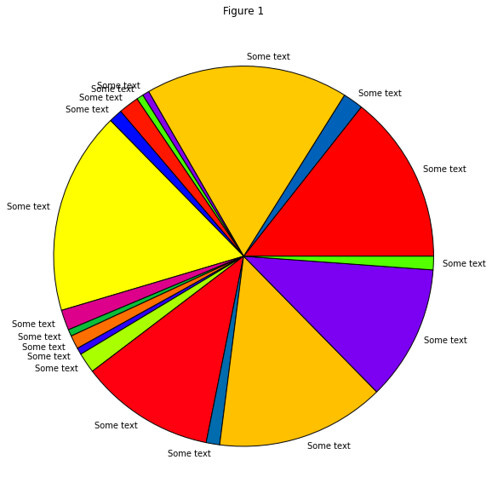
The very first thing that comes to mind is that the black edges doesn’t really work. So as a first action, lets make them white. Unfortunately there’s no keyword for edgecolor in pie, so we need to go through the patches for the slices and change each of their edge color property.
fig = plt.figure(figsize=[10, 10]) ax = fig.add_subplot(111) pie_wedge_collection = ax.pie(slices, colors=colors, labels=labels, labeldistance=1.05); for pie_wedge in pie_wedge_collection[0]: pie_wedge.set_edgecolor('white') ax.set_title("Figure 2");
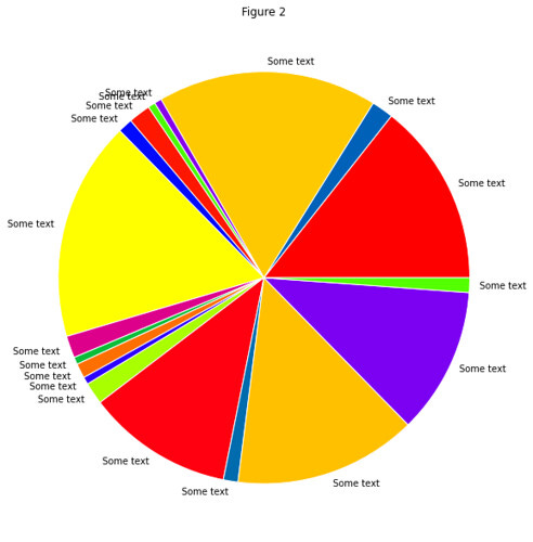
Ok, so the point I originally wanted to make with this point, is what you can notice in the top left corner of the pie chart. The label text overlaps when thin slices are too vertical.
Let’s go through some steps on how to mend this. First, if we sort the data by size, we will at least now for sure where the thin slices will end up.
slices = sorted(slices) fig = plt.figure(figsize=[10, 10]) ax = fig.add_subplot(111) pie_wedge_collection = ax.pie(slices, colors=colors, labels=labels, labeldistance=1.05); for pie_wedge in pie_wedge_collection[0]: pie_wedge.set_edgecolor('white') ax.set_title("Figure 3");
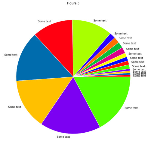
That’s good, however, firstly, if we have more thin slices they will still after a while end up being too vertical and the label texts will again overlap. Secondly, in my opinion, it looks a bit odd.
For a nicer solution, take the sorted slices, and make four sections; two with large slices, and two with small slices.
large = slices[:len(slices) / 2] small = slices[len(slices) / 2:] reordered = large[::2] + small[::2] + large[1::2] + small[1::2] fig = plt.figure(figsize=[10, 10]) ax = fig.add_subplot(111) pie_wedge_collection = ax.pie(reordered, colors=colors, labels=labels, labeldistance=1.05); for pie_wedge in pie_wedge_collection[0]: pie_wedge.set_edgecolor('white') ax.set_title("Figure 4");
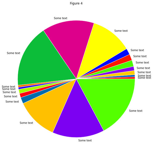
That looks much nicer, but it would be ideal if the thin slices where all as close to horizontal as possible. This we can fix by calculating the angle in degrees that we would need to shift the pie chart in order to get the first small section aligned around the horizontal axis.
fig = plt.figure(figsize=[10, 10]) ax = fig.add_subplot(111) angle = 180 + float(sum(small[::2])) / sum(reordered) * 360 pie_wedge_collection = ax.pie(reordered, colors=colors, labels=labels, labeldistance=1.05, startangle=angle); for pie_wedge in pie_wedge_collection[0]: pie_wedge.set_edgecolor('white') ax.set_title("Figure 5");
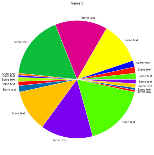
Perfect!
The code for making the pie charts can also be seen in this gist

