
High contrast stacked distribution plots

A while ago a colleague showed me an image of a beautiful way of plotting several distributions to make them easily comparable. I have since failed to find these plots or managed to figure out what they are called. But the concept was to plot densities for several variables in such a way that they appeared behind each other in depth.
Let me first illustrate the effect before we get to an implementation.
%pylab inline import pandas as pd import seaborn as sns sns.set_style('white') xx = np.linspace(0, 4 * np.pi, 512)
We just make some random sinus curves for illustration
df = pd.DataFrame() for i in range(1, 32): df[i] = np.sin((np.random.rand() + 0.5) * xx) + 1 figsize(16, 16) for i, ind in enumerate(df): offset = 1.1 * i plt.fill_between(xx, df[ind] + offset, 0 * df[ind] + offset, zorder=-i, facecolor='k', edgecolor='w', lw=3) sns.despine(left=True, bottom=True) plt.xticks([]) plt.yticks([]); plt.savefig('plots/1.png');
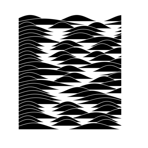
There are just a few small tricks to the effect. The zorder=-i parameter makes the curves stack in the correct order. Making the edge colors the same color as the background gives the effect of depth. Personally I like the very high contrast style of using black fills. (Another colleague who saw these plots called them “Moomin plots” )
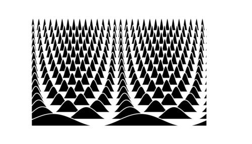
You can also make some pretty, regular, patterns with this look.
df = pd.DataFrame() for i in range(1, 16): df[i] = np.sin(i * xx) + 1 figsize(14, 8) for i, ind in enumerate(df): offset = 1.1 * i plt.fill_between(xx, df[ind] + offset, 0 * df[ind] + offset, zorder=-i, facecolor='k', edgecolor='w', lw=3) sns.despine(left=True, bottom=True) plt.xticks([]) plt.yticks([]); plt.savefig('plots/2.png');
So how can we plot distribution for comparison with this technique? First let us create some simulated data. In this case I’m randomly mixing unimodal and bimodal normally distributed data, this is what a lot of the data we study in my research group looks like. Letting the mean be between 0 and 16 is arbitrary of course, and I just picked the variance to be 2 because I thought it looked good.
def unimodal(): m = random.randint(0, 16) return random.randn(256) * 2 + m def bimodal(): m1 = random.randint(0, 16) s1 = random.randn(128) * 2 + m1 m2 = random.randint(0, 16) s2 = random.randn(128) * 2 + m2 return np.hstack((s1, s2)) df = pd.DataFrame() distributions = [unimodal, bimodal] for i in range(16): distribution = random.choice(distributions) df[i] = distribution()
We’ll use the Gaussian KDE from scipy for this.
from scipy.stats import kde
Now we pick an x-axis which should cover the entire range of the data in all the columns of the DataFrame we keep the data in.
We handle the y-offsets of the data by picking half the height of the previous density plot. This can be tweaked and give slightly different effect dependong on what fraction of the height is used. I found half height to be most generally good looking though.
To make it easy to relate a label to a distribution we plot a line the density can “rest on”. If it is thick enough it will give the effect of the density growing up from it.
figsize(6, 8) xx = np.linspace(df.min().min(), df.max().max(), 256) yy = None offset = 0 offs = [offset] for i in df: if yy is not None: offset += 0.5 * yy.max() offs.append(offset) s = df[i] f = kde.gaussian_kde(s) yy = f(xx) plt.fill_between(xx, yy + offset, 0 * yy + offset, zorder=-i, facecolor='k', edgecolor='w', lw=3) plt.axhline(y=offset, zorder=-i, linestyle='-', color='k', lw=4) sns.despine(left=True, bottom=True) plt.yticks(offs, ['Sample {}'.format(s + 1) for s in df.columns]); plt.tight_layout() plt.savefig('plots/3.png');

I like these a lot, though it looks a bit messy. Of course, with real data the ordering of the variables on the y-axis would be informed by some prior knowledge so that trends could be easily spotted.
But even so, if we don’t know how we should order these for easy comparison between the distributions, we can use hierarchical clustering to arrange the distribution so they become more comparable.
import fastcluster as fc from scipy.cluster.hierarchy import dendrogram figsize(6, 8) link = fc.linkage(df.T, method='ward') dend = dendrogram(link, no_plot=True) dend['leaves'] xx = np.linspace(df.min().min(), df.max().max(), 256) yy = None offset = 0 offs = [offset] for i, ind in enumerate(df[dend['leaves']]): if yy is not None: offset += 0.5 * yy.max() offs.append(offset) s = df[ind] f = kde.gaussian_kde(s) yy = f(xx) plt.fill_between(xx, yy + offset, 0 * yy + offset, zorder=-i, facecolor='k', edgecolor='w', lw=3) plt.axhline(y=offset, zorder=-i, linestyle='-', color='k', lw=4) sns.despine(left=True, bottom=True) plt.yticks(offs, ['Sample {}'.format(s + 1) for s in df[dend['leaves']].columns]); plt.tight_layout() plt.savefig('plots/4.png');
