How to read PCA plots

Over the years I have been looking at hundreds of Principal Component Analysis (PCA) plots of single cell RNA-seq data. PCA is an extremely useful technique for initial exploration of data, it is easy to interpret and fast to run.
I have noticed some general patterns across datasets and studies. These I have seen either in papers or presentations, or by analysing our own or public data. Sketches of these patterns are shown on the right. I thought it would be useful to list out potential causes for these patterns. I'll do this here by simulating data to generate them.

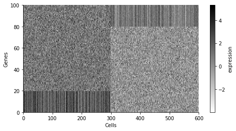
To try to be concrete, we will consider 100 "genes", and throughout we will generate 600 "cells" from two "cell types". Different ways of generating these cell types will lead to different patterns in the PCA plot.
First, let us say that expression for all genes is generated at random (normally), but with different global means for each cell type. An expression matrix would look like below.
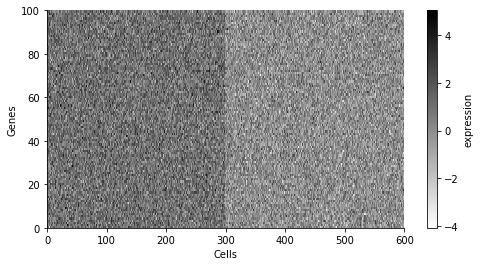
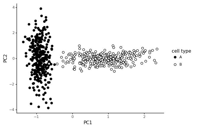
The first 300 cells are from cell type A, and the last 300 cells from cell type B. If we run a PCA on this, and color the cells by cell type, we get the following plot.
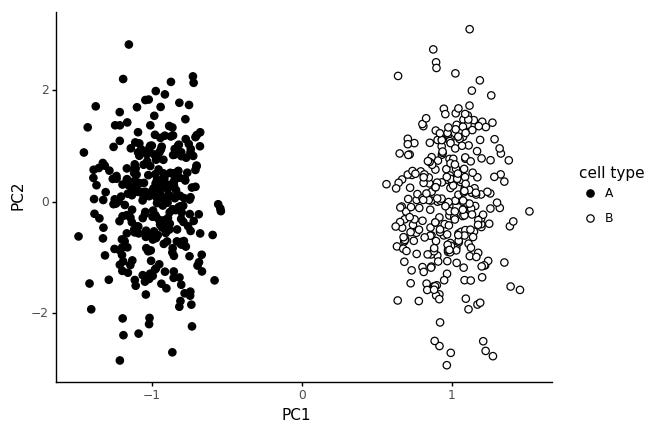
We get a pretty clear seperation between the cell types in PC1, and random variation in PC2. This is not a particularly realistic model for cell types however.
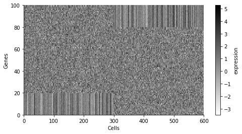
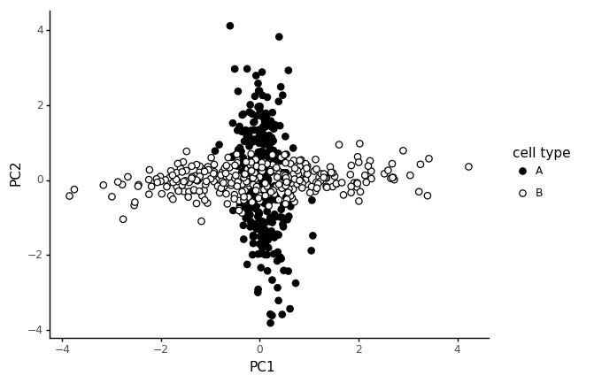
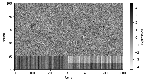
In stead, let us consider a cell type to be defined by a limited set of expressed markers. We assign 20 genes to cell type A, and 20 other genes to cell type B.
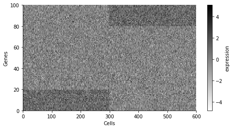
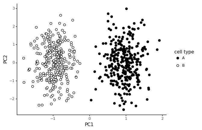
This way of generating the data gives rise to the same style of PCA pattern: two clear blobs.
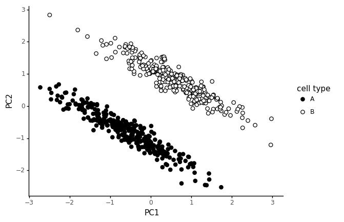
This assumes all the marker genes have independently increased expression level for their respective cell type. The variability of each gene is independent. Consider instead a system where an underlying gene module determine cell type. This gene module consists of a collection of genes which increase or decrease expression together. The genes expression are correlated.
As an illustration, let us say that the 20 marker genes are only correlated in their respective cell type, and in the other cell type they only correspond to random noise. We simulate the data with multivariate normal distributions, with two different block structured covariance matrices, which only have covariance for the marker genes in the corresponding cell type.
In this type of data the PCA finds the two independent "modules", one as PC1 and the other as PC2.
Now we add the additional propoerty of increasing the mean expression of the cell type modules for the corresponding cell type.
Now we get a V shape, which is quite common in real data. The two cell type clusters meet when both module's average expression are low. This could be interpreted as a trajectory, and I guess in one way it is? But note that we only simulated the data with two distinct cell types in mind.
Now, let us add a global mean shift for one of the cell types.
In this type of data we get a T shape, it is also quite common in real data. Why would this happen? We said we don't think global means shifts are reasonable in the beginning! Well, it could be that one cell type has less RNA, causing systematically lower counts. Or there could be a technical effect causing systematic differences between the cell type. What we see though, is that the combination of these types effect creates T shaped PCA plots. A particular danger here is that it is tempting to interpret this as a bifurcation in the data.
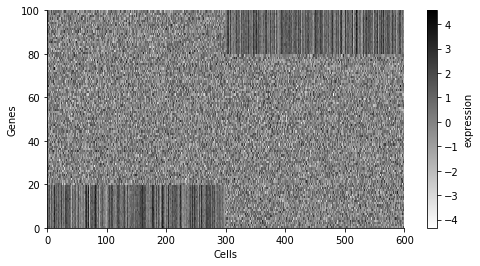
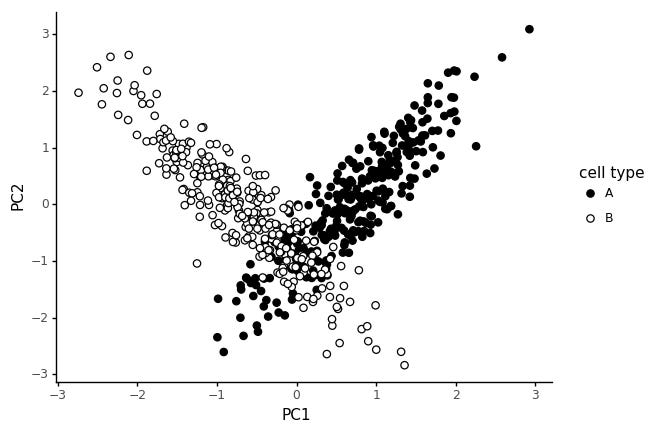
Finally, let us consider a different scenario. Say a number of genes are correlated in both cell types, but in one cell type, some marker genes are shifted.
These slanted clusters are very common in real data too. Most likely, these happen because the shift in marker genes is a real effect, but some common technical factor is causing expression values of expressed genes to be globally correlated.
There are probably other ways to generate these typical patterns, but these were the first ones I stumbled on that made some sense. I've tried to keep the simulated expression matrices as simple as possible.
I haven't tried looking at this in the context of more cell types. In this setting with two types, we can get the patterns we see often.
The code to produce these figures and analysis is available here