
VAE's are explainable - differential expression in scVI

The scRNA-seq analysis package scVI can both be used to find representations of data and perform differential expression analysis at the same time. This is achieved by using a generative model for the observed data in the form of a variational autoencoder (VAE). How to go from the representation to the differential expression results is not directly intuitive. This post visually goes through the steps to get to such a result to illustrate how the process works.
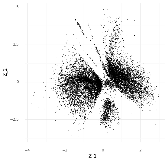
To give a practical and visual illustration of how the differential expression in scVI works we will make use of a simple dataset consisting of one sample from Ren et al. 2021. This sample consists of peripheral blood mononuclear cells collected from a man in Shanghai. It has 14,565 cells where 27,943 genes were measured. For the sake of simplicity, the genes are filtered to a small targeted panel of 141 genes known to be markers of various blood cells.
We will use a simplified version of scVI with a 2-dimensional embedding space ( Z ) and a simple Poisson generative model for the observed count data.
NOTE: If you want to use scVI in practice I recommend the default 10-dimensional embedding space and a negative binomial observation model by setting the optional parameter gene_likelihood = ‘nb’ in the model constructor.
With the 2-dimensional embedding we can directly look at it with a scatter plot.
Comparing two single cells
Let us start small. Say we want to compare just two cells, “cell a” (red) and “cell b” (blue).
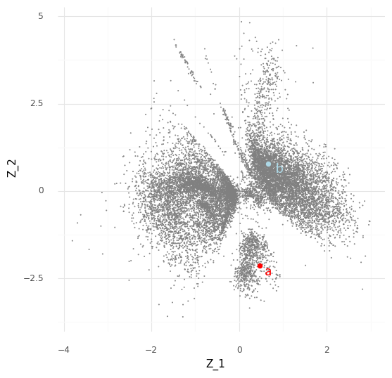
Typically when looking at the Z embedding from scVI of the single cells we look at the mean Z values for each cell. However, the variational autoencoder in scVI approximates the entire posterior distribution P(Z|Y). For our two cells a (red) and b (blue) we have access to (an approximation of) the posterior distribution P(za|Y) and the posterior distribution P(zb|Y). Instead of plotting the mean E(P(za|Y)) we can plot 512 samples drawn from P(za|Y), and the same for cell b.
We can see that these samples cover an area in the Z representation. The interpretation of this is that based on our observed data Y the cell a can have a representation somewhere in that covered area which is compatible with the observed counts ya from the cell. (Aside: there is probably an opportunity here to create an unsupervised clustering algorithm that segments areas by how likely they are to be reached by posterior samples of cells.)
These samples can be pushed through the entire data generating process which the scVI model tries to capture. For an individual sample z∗∼P(za|Y) we can generate a Poisson rate ω∗=f(z∗). We can then take this ω∗ together with the library size ℓa for cell a to sample a count observation from the Poisson observation model
These sampled posterior counts (also known as samples from the posterior predictive distribution) can be compared with the observed count data (a process usually referred to as posterior predictive checks). This is generally a good idea to look at occasionally to make sure your model is faithfully capturing your data generation process (Mimno and Blei 2011; Gelman, Meng, and Stern 1996). Here we can plot the sampled counts from the posteriors for the cells a and b for 10 example genes from the 141 gene panel.
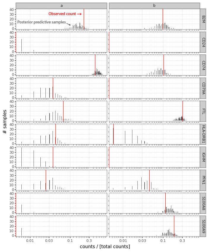
In this plot the red bar shows the observed counts ya and yb. The black bars represent a histogram of scaled count values from the 512 samples from each cell passed through the data generation process. Generally we see that the observed counts (red) are at least somewhat compatible with the samples from the posterior predictive distribution.
To get back to the problem of comparing the cells a and b, we want to work on the inferred ω values, since these represent expression levels on a continuous scale before the technical effect of the library size is introduced in the data generation process.
We can make the same plot as above, but with the ω∗ samples from the cells a and b for the 10 example genes.
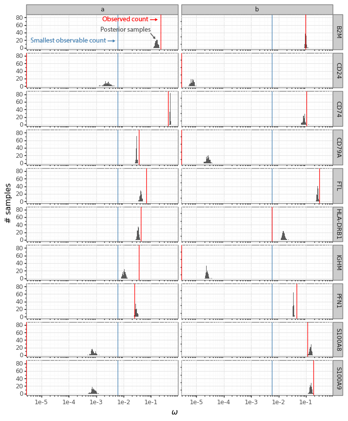
The histograms now reflect the likely expression levels which can generate counts compatible with the observed data. A benefit is that these ω values have much higher resolution than the counts. Here the red line, as above, indicates the observed count values. The blue lines in this plot represent the smallest observable expression value from each cell, which is 1 / [library size]. For cell a this is 1 / 162 = 0.0062 and for cell b this is 1 / 175 = 0.0057.
In Boyeau et al. 2019 the authors phrase the problem of identifying differential expression for a gene as a decision problem. To compare the expression of a gene in cell a with the expression in cell b we want to look at the log fold change ra,bg=log2ωa,g−log2ωb,g and learn the probability that |ra,bg|>δ for a threshold δ (by default in scVI δ=0.25).
Let us zoom in specifically on the gene CD24.
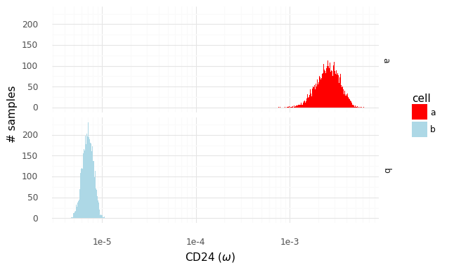
We have access to these samples of P(ω|z) from which we can create P(ra,bg|za,zb). Through integration, we can express the posterior P(ra,bg|ya,yb) as
In practice, since we have the ability to quickly obtain samples from (the approximations of) P(za|ya) and P(zb|yb), we can take several samples za∗ and zb∗ to create samples from the distribution P(ra,bg|ya,yb).
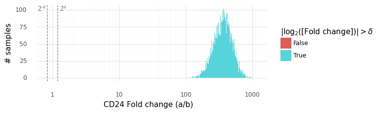
In this plot above the grey dashed lines indicate the interval (2−δ,2δ). The histogram displays the samples from the distribution P(ra,bg|ya,yb). We can be extremely certain that the expression level of CD24 is higher in cell a than in cell b, with an average fold change of ~300x.
Comparing two populations of cells
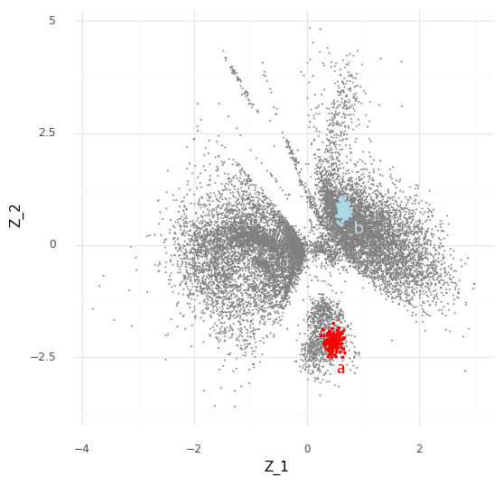
The process described above can be extended to compare cells in arbitrary regions of the Z representation. Say we want to know why the model learns the representation for a group of cells which are in a specific area of Z. We can stratify the cells into a group of interest (A) and all other cells (B).
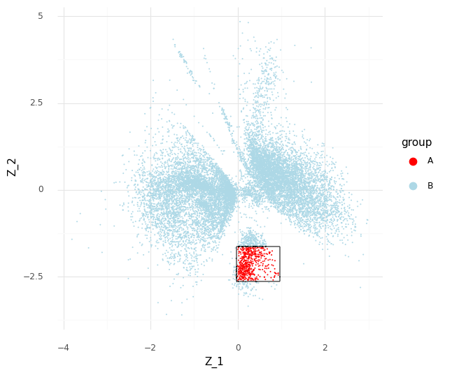
In the plot above we have simply selected a box around cell a of arbitrary size and assigned this as group A of cells. All other cells are assigned to group B. We want to investigate the distribution of fold changes of CD24 between group A and group B given the data. If A=(a1,…,aI) and B=(b1,…,bJ) the distribution of population fold changes P(rA,Bg|Y) can be expressed as
where P(a)=U(a1,…,aI) and P(b)=U(b1,…,bJ). We can obtain samples from this distribution by sampling from 1I∑iIP(zai|yai) and 1J∑jJP(zbj|ybj).
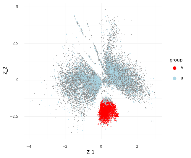
This plot above shows mean embeddings E(P(Z|Y)) for all cells in grey color in the background. The red dots shows 5,000 samples from P(za|ya)P(a) and 5,000 samples from P(zb|yb)P(b) as blue dots.
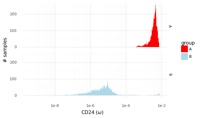
The two histograms above show samples from the distributions of population expression levels P(ωA|YA) and P(ωB|YB). These can be used to sample from the fold change distribution P(rA,Bg|YA,YB).
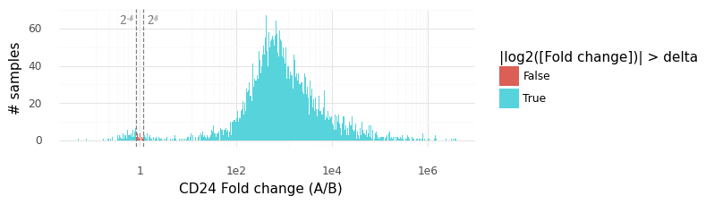
Above is a histogram of the samples from the P(rA,Bg|YA,YB) distribution for CD24. The vast majority of samples lie outside the rejection interval (2−δ,2δ), from which we can surmise that P(|rA,Bg|>δ) is large (here we have estimated it to be 0.9954).
Conveniently, the way sampling works with scVI, we get samples from these distributions for all the genes used in the model at the same time. The samples from the distributions can be summarized in two ways that are familiar in the world of RNA sequencing: we can calculate the median fold change among the samples, and we can calculate the probability that a gene is not differentially expressed. With these quantities for each gene, we can create something roughly equivalent to a volcano plot in standard differential expression analysis.
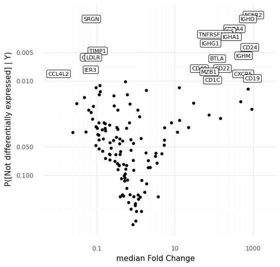
This plot above shows the median inferred fold changes between A and B, vs probability of no differential expression between A and B, for all 141 genes in the panel we are modeling here. Since we are comparing a specific subpopulation of cells with all other cells, we see the most dramatic fold changes are positive, consistent with how we typically think about markers for cell types or cell states reflecting an active transcriptional program defining a cell type.
To step back: what we did here was to make a model that represents cell-to-cell variation through a latent representation in the space of Z. We noted that a number of cells ended up in a specific region in the latent representation. By taking advantage of the generative nature of the representation model we were able to use a number of sampling strategies to investigate exactly why the model put these cells close to each other in the representation. These cells are distinguished by high expression of e.g. CD24, IGHD, CXCR5, or CD19, compared to other cells that were modeled.
Even though the link from the latent representation to the gene expression levels goes through a non-linear neural network with no direct interpretation, it is possible to find an explanation for the geometry in the representation.
We can demonstrate how CD24 is a marker for the selected cell population A by coloring the Z scatter plot by the observed count expression levels and compare our region with the other regions of Z.
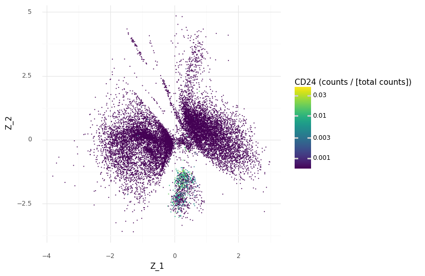
We see that we have higher scaled counts in the small cluster at the bottom for CD24.
However, since we have our generative model which predicts continuous expression levels ω from Z, we can go a step further and see how the model would generate the expression levels for CD24 depending on the Z coordinates.
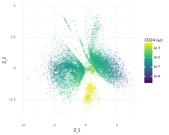
These predicted expression levels of CD24 are latent parameters for each cell before generating count observations corresponding to the measurement process. Of course, it would be better to include uncertainty in these predictions, since as we saw in the histograms of the samples of the ω expression levels a few plots above, there are ranges of plausible values for any gene. Unfortunately, this is difficult to communicate through colors in a scatter plot. But we can see how the model makes the decision to put the group A cells in the same clump based on the modeled expression level of CD24.
Thanks to Eduardo Beltrame and Adam Gayoso for helpful feedback on this post.
The code used to generate these figures are available at https://github.com/vals/Blog/tree/master/220308-scvi-de
References
Boyeau, Pierre, Romain Lopez, Jeffrey Regier, Adam Gayoso, Michael I. Jordan, and Nir Yosef. 2019. “Deep Generative Models for Detecting Differential Expression in Single Cells.” Cold Spring Harbor Laboratory. https://doi.org/10.1101/794289.
Gelman, Andrew, Xiao-Li Meng, and Hal Stern. 1996. “POSTERIOR PREDICTIVE ASSESSMENT OF MODEL FITNESS VIA REALIZED DISCREPANCIES.” Statistica Sinica 6 (4): 733–60.
Mimno, David, and David Blei. 2011. “Bayesian Checking for Topic Models.” In Proceedings of the 2011 Conference on Empirical Methods in Natural Language Processing, 227–37.
Ren, Xianwen, Wen Wen, Xiaoying Fan, Wenhong Hou, Bin Su, Pengfei Cai, Jiesheng Li, et al. 2021. “COVID-19 Immune Features Revealed by a Large-Scale Single-Cell Transcriptome Atlas.” Cell 184 (7): 1895–1913.e19.
