Visualizing overlapping intervals

Visualizing overlapping intervals
Rather often I find myself wanting to see a pattern of how some interval data looks. I never found a good package for this, so always reverted to either drawing the intervals after each other on the x = y line. Or pile the intervals to histogram like graphs.
But today I got an idea how I could do it rather simply. What I want to do is stack the intervals so they don’t overlap, but also doesn’t need too much space on the Y-axis.
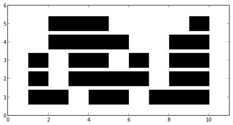
First let’s create some intervals that we want to try stacking.
intervals = [(2, 6), (7, 10), (1, 3), (4, 6), (8, 10), (1, 2), (3, 7), (9, 10), (1, 2), (3, 5), (6, 7), (8, 10), (2, 5), (8, 10)]
Here is the basic idea: We sort the intervals by the start values. We give the first interval an initial Y-value. For the next interval, we check if the lower value is smaller than the upper value of the previous interval. If not, we just place the interval after the previous one. But if, we increment the Y-value, and check the same thing for the previous interval in that Y-category.
Here is a python implementation of this Y-categorization.
def intervals2layers(si): layers = [[si[0]]] for p in si[1:]: for lay in layers: if lay[-1][-1] < p[0]: lay.append(p) break else: layers.append([p]) return layers
Let’s try it out!
si = sorted(intervals, key=lambda p: p[0]) layers = intervals2layers(si) figsize(8, 4) for i, lay in enumerate(layers): x1, x2 = zip(*lay) plt.hlines([i + 1] * len(x1), x1, x2, lw=30) plt.xlim(0, 11) plt.ylim(0, 6);
This works quite nicely. Let’s try something more problematic; we’ll generate 1024 intervals and see how these end up stacking using this strategy.
intervals = [] for i in range(1024): x1 = random.normalvariate(0.5, 0.25) x2 = x1 + random.random() / 16 intervals.append((x1, x2)) figsize(20, 10) for i, lay in enumerate(layers): x1, x2 = zip(*lay) plt.hlines([i + 1] * len(x1), x1, x2) ax = plt.gca() adjust_spines(ax,['bottom']);
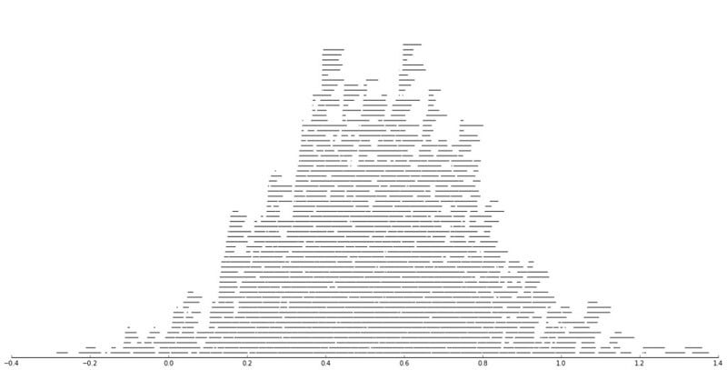
Precisely what I’m after! One can see overall patterns of the distribution of all the intervals, but it’s also possible to see certain subintervals which might be interesting.
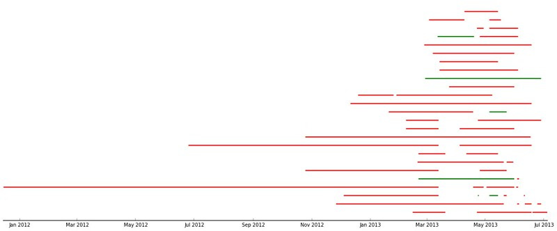
This is how some real data looks like.