Tracking grocery expenses

An interesting trend is the increase in online services providing APIs with a cost per query. This seems particularly useful for data extraction on parsing tasks. Obtaining usable data from various sources is not necessarily difficult, but automated solutions such as data munging scripts can be tedious. Once you have finished a parser you tend to be sapped of the creativity you went in with for uses of the data.

I came across the parsing service Parseur, which charges a few cents to extract data from a document, in particular emails.

To test the service, I thought of something I have been curious about for a while: whether my monthly grocery spending has changed over the last couple of years. I order groceries from Whole Foods, and some time in the last year I changed the frequency of how often I get groceries. Since I don’t order groceries at regular intervals, and the intervals have changed over time, it is hard to compare order-to-order regarding how much I’m spending on them.

In my email inbox I had 106 Whole Foods order receipts starting from November 2019. I signed up for Parseur, and forwarded all of them to my Parseur email for the task. Over the years, the format of the receipt emails has changed slightly, and getting general parsing templates took some trial and error.

After parsing the emails, I could download a CSV file with the extracted information. One column in the CSV has the timestamp of the order, and another column has the order amount.

To account for variation in order frequency over time, created a running window of 91 days, and calculated the sum of the orders in each running window. By dividing the results by three, I get an average monthly grocery spend value.

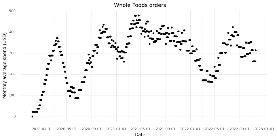
This way I learned that at the moment I am spending about $300 per month on groceries, with about +/- $50 month-to-month variation.

The first rise in the trend in 2019 is from starting to use the service and the running sum building up. The first drop is from the service breaking down at the beginning of the COVID pandemic, at which point limited deliveries were available. I don’t remember what happened at the end of 2020, but that was probably also related to the pandemic. Since then my spending was largely stable after the first quarter of 2021. The dip in the first quarter of 2022 is probably a reflection of a long vacation I had in April where I went to restaurants much more often than I usually do.

It took me a couple of hours getting the email parsing templates working. I also messed up in how I forwarded a number of the emails, making me waste ‘documents’ that I paid for parsing. In the end, I think I saved a lot of times compared to figuring out how to download the emails and parsing them by myself. I was pretty impressed by how well the GUI from Parseur worked for creating parsing templates.

The notebook for creating the plot is available on Github: https://github.com/vals/Blog/tree/master/221121-tracking-grocery

Making coffee

The benefit of manual pour over compared to drip coffee from a machine is the ability to ensure more of the coffee grounds gets exposed to water for extraction. As water falls onto the grounds and travels through them, channels form.

Classical pour over methods call for the water to be added and drained a bit at a time. This way new channels form with each pour of water and more of the grounds get exposed to water.

There are alternative and equivalent strategies that require less thinking and monitoring. You can add all the water to the grounds, then use a spoon to stir the grounds as the extraction and draining through the filter is happening. Because this means dirtying a spoon, I prefer the orbital shaking method. After adding all the water to the grounds, move the holder of the filter, coffee grounds, and water in an orbital motion so that they keep mixing as the water is draining.

For a long time, this is how I have made my coffee in the morning. I’ve gotten my grind sizes, water temperature, and grounds-to-water ratio to a place where I really enjoy the coffee I get from this process.

The problem with this process is the physical activity it requires. Especially after just having woken up in the morning, spinning the entire coffee making contraption can be a challenge, at times ending with coffee grounds and boiling water all over the kitchen counter.

This general idea of gently spinning liquids in an orbit is generally used in biology labs. This is to blend materials in cell cultures, assuring uniform concentrations of the material that the cells need to take up.

I looked into getting an orbital shaker to use for making coffee, and some of them are relatively affordable. You can also get spare ones from labs, they often have old ones they don’t want anymore. They are however quite large, and I didn’t want to dedicate so much counter space in my kitchen. The affordable ones I found also have pretty garish colors that don’t fit with my kitchen.

Instead, I figured the mechanism is pretty simple, and I could probably build one myself.


I got all the components from Amazon. The biggest challenge was imaging some mechanical parts I feel must exist, but having no idea what they would be called. I spent about two evenings searching for things like ‘plate with hole for rod’, ‘stable feet for hobby projects’, ‘box to put electronics in’, or ‘sideways ball bearing’. Eventually I found terms that produced the results I needed (but I have since forgotten them).

To turn the orbital shaker I used a DC motor with a speed controller, and by aligning two lids from two hobby boxes I got a surface that could orbit using an offset axis.

Simply drilling and screwing things together took a lot longer than I had expected. Yet it was extremely satisfying! I didn’t draw out any plans, and that might have made things simpler, but it was a joy to just take the components and figure out how I would put them together.

Once the orbital shaker was finished I felt a great deal of pride, and I even liked the result aesthetically. I did have to add a friction pad to my coffee scale though to keep the pot from gliding off.

For about a month I was using my orbital shaker for the spinning method of pour over coffee brewing. As I was doing this, I was growing tired of the primary step: pouring the water into the filter with coffee grounds. With the passing days, fueled by the success of the orbital shaker, I couldn’t help thinking if I could solve this problem as well with the same strategy.

Initially I was overthinking it. I started looking up components to build a temperature controlled boiler from scratch. Eventually I learned from a friend that there are tiny portable and cheap kettles. So instead I figured that I could drill a shole in one and connect tubing to a pump to provide boiling water to the coffee.

After another Amazon/Google session, I learned about the different kinds of pumps there are, food safe tubing, and standards for tube sizes and the various adapters to make it all fit. I figured I could use a speed controller also for the water pump to make sure the coffee isn’t blasted by the pump. I found a hobby box large enough to contain the base of the stand and the electronics in the same style as the orbital shaker.

The challenge that appeared was the outlet for the water from the pump. Just using a normal nozzle at the end of the water tub made a harsh beam of water that didn’t wet the grounds properly, and it was easy to create too much pressure, pushing the grounds up along the sides of the filter. To my surprise, I couldn’t find a small shower head to attach at the end of the tube. In the end I made one by drilling holes in a plastic stopper that I connected to a couple of adapters.

So I ended up with a coffee machine.

Unlike a traditional coffee machine though, I have control of water temperature, how much water is added, and I can ensure even extraction using the orbital shaker.

The coffee system takes up more space than I’d like. And it doesn’t taste quite as good as when I make it manually. My theory is the water gets cooled as it travels through the pump and the tubes.

Many people who make pour over coffee enjoy the feeling that you are really making it yourself. As do I. Now every morning I have the additional joyous feeling that I’m making it with a device I made.

In all, I really enjoyed this as a hobby project. And it’s empowering to know that if you have a problem, you can make your own solution to it, using nothing but off the shelf components from Amazon. I didn’t even need to learn how to use a 3D printer or CAD!

Policy under spatial constraints

A few years ago we published a paper on SpatialDE, a method to identify genes which follow spatial patterning in tissues measured with spatial transcriptomics methods. Methods for measuring entire transcriptomes in spatial context have exploded in the last couple of years, including the release of commercial platforms such as Visium or Xenium instruments from 10x genomics and the MERSCOPE instrument from VizGen. Hopefully SpatialDE will be useful for users of these methods.

SpatialDE also comes with the automatic expression histology (AEH) method which identifies global spatial structures in tissues which explain the expression of a number of spatially covarying genes.

When encountering a type of data you are not familiar with, the first thing you do is first think of the question you want to answer from the data. Secondly you look for analysis methods to make use of the data. It appeared that the form of data in spatial transcriptomics data was unique. Spatial statistics is a classical field with many well developed theories and analysis methods, but what to do when measuring thousands of variables over spatial coordinates had not been explored. So we were led to develop our own method for analysis, and a particular question we wanted to address was how to find spatially constrained patterns of gene expression. But are there other cases than histology where this form of analysis can be interesting?

One case could be spatially constrained policy. There are many cases where geographical regions for cultural reasons have different ideas of what a government should or shouldn’t do. This could directly fold into an effective definition of a country, a topic that often arises in the Caltech Sovereignty Club, a discussion club on international politics and history. In representational democracies, votes on bills by representatives from spatially defined regions can act as a proxy for the opinions of the regions. The bills are analogous to the “genes” and the geography of the country becomes the “tissue”. Can we identify cultural geographical divides from the voting records of representatives?

In 2016, the US house of representatives, which consists of 438 districts, voted on 621 bills. The spatial geographical information of the districts can be downloaded from http://cdmaps.polisci.ucla.edu/ (districts114.zip) as Shapefiles.

We can use the longitude/latitude coordinate centroids of the districts as spatial locations. Roll calls for each bill are made available at pages such as for example http://clerk.house.gov/evs/2016/roll621.xml for the 621st bill. All the XML files for bills can be downloaded and easily parsed to extract which representatives voted ‘yes’, ‘no’, or did not vote on the bill. We can encode these values as 1.0 for ‘yes’, -1.0 for ‘no’, and use 0.0 for the abstained votes.

Of the 621 bills, 521 are significantly correlated with spatial location. We fit the AEH model to these bills, asking for 3 spatial functions to explain variance, and a spatial length scale of 7 minutes (about 800 km).

The AEH model will group the bills into three categories, such that if you know the spatial coordinate you can predict the vote for the category. The full model for the 521 modeled bills and the three categories can be written as

$$ \begin{aligned} P(Y, \mu, Z, \sigma^2, \Sigma) &= P(Y | \mu, Z, \sigma^2) \cdot P(\mu | \Sigma) \cdot P(Z), \\ P(Y | \mu, Z, \sigma^2) &= \prod_{k = 1}^{3} \prod_{b = 1}^{521} \text{N}(\mu_k | 0, \Sigma), \\ P(\mu | \Sigma) &= \prod_{k = 1}^{3} \text{N}(\mu_k | 0, \Sigma), \\ P(Z) &= \prod_{k = 1}^{3} \prod_{b = 1}^{521} \left( \frac{1}{3} \right)^{z_{b, k}}. \end{aligned} $$

After the variational inference for the AEH model reaches convergence, we have three smooth functions over coordinates corresponding to bill-to-function allocation in the matrix . The interpretation is that if a function has a high value at a spatial coordinate, it means that that coordinate is likely to vote ‘yes’ on the bills that were assigned to the function.

Results

Pattern 1

Assigned bills (top 6):

  • Justice Against Sponsors of Terrorism Act
  • Anti-terrorism Information Sharing Is Strength Act
  • Housing Opportunity Through Modernization Act
  • Fair Investment Opportunities for Professional Experts Act
  • Expressing the sense of the House of Representatives to support the territorial intergrity of Georgia
  • To direct the Secretary of State to develop a strategy to obtain observer status for Taiwan in the International Criminal Police Organization, and for other purposes

Pattern 2

Assigned bills (top 6):

  • Accelerating Access to Capital Act of 2016
  • Satisfying Energy Needs and Saving the Environment Act
  • VA Accountability First and Appeals Modernization Act
  • Clarifying Congressional Intent in Providing for DC Home Rule Act of 2016
  • Regulatory Integrity Act of 2016
  • Motor Vehicle Safety Whistleblower Act

Pattern 3

Assigned bills (top 6):

  • Providing for consideration of H.R. 4361, Federal Information Systems Safeguards Act of 2016
  • Providing for consideration of H.R. 2745, the Standard Merger and Acquisition Reviews Through Equal Rules Act of 2015; and providing for proceedings during the period from March 24, 2016, through April 11, 2016
  • Iranian Leadership Asset Transparency Act
  • Energy Policy Modernization Act of 2016
  • Providing for consideration of the bill (H.R. 5325) making appropriations for the Legislative Branch for the fiscal year ending in September 30, 2017, and for other purposes
  • Expressing the sense of Congress that a carbon tax would be detrimental to the United States economy

For example, the two bills “Justice Against Sponsors of Terrorism Act” and “Anti-terrorism Information Sharing Is Strength Act” are both assigned to the first function. First, this means that support for these two bills is spatially correlated; in a spatial location where one bill is supported, the other is also likely to be supported. (In this particular case the names of these bills alone makes this pretty plausible). Secondly, this means that if we evaluate the first function on a map of the US, we can locate which spatial regions support these bills.

The spatial functions can be used to segment the country into spatially smooth regions where the house members largely agree on issues. For each house district, we can evaluate the three spatial functions and obtain the largest value. The identity of the spatial function producing the largest value defines which spatial region the house district belongs to.

This largely coincides with party affiliation of the house members from the districts.

Though we have obtained spatially constrained regions with similar political opinion, this is not optimal. Ideally the model would identify regions which are spatially connected, to avoid forming enclaves or exclaves. How to define a similar model which satisfies such connectivity constraints might be an interesting follow-up research project.

Jupyter notebooks and data for this post are available here.

VAE's are explainable - differential expression in scVI

The scRNA-seq analysis package scVI can both be used to find representations of data and perform differential expression analysis at the same time. This is achieved by using a generative model for the observed data in the form of a variational autoencoder (VAE). How to go from the representation to the differential expression results is not directly intuitive. This post visually goes through the steps to get to such a result to illustrate how the process works.

To give a practical and visual illustration of how the differential expression in scVI works we will make use of a simple dataset consisting of one sample from Ren et al. 2021. This sample consists of peripheral blood mononuclear cells collected from a man in Shanghai. It has 14,565 cells where 27,943 genes were measured. For the sake of simplicity, the genes are filtered to a small targeted panel of 141 genes known to be markers of various blood cells.

We will use a simplified version of scVI with a 2-dimensional embedding space ( Z ) and a simple Poisson generative model for the observed count data.

$$ \begin{aligned} \omega &= f(Z) \\ Y &\sim \text{Poisson}(\omega \cdot \ell) \end{aligned} $$

NOTE: If you want to use scVI in practice I recommend the default 10-dimensional embedding space and a negative binomial observation model by setting the optional parameter gene_likelihood = ‘nb’ in the model constructor.

With the 2-dimensional embedding we can directly look at it with a scatter plot.

Comparing two single cells

Let us start small. Say we want to compare just two cells, “cell a” (red) and “cell b” (blue).

Typically when looking at the \( Z \) embedding from scVI of the single cells we look at the mean \( Z \) values for each cell. However, the variational autoencoder in scVI approximates the entire posterior distribution \( P(Z | Y) \). For our two cells a (red) and b (blue) we have access to (an approximation of) the posterior distribution \( P(z_a | Y ) \) and the posterior distribution \( P(z_b | Y ) \). Instead of plotting the mean \( \mathbb{E}( P(z_a | Y ) ) \) we can plot 512 samples drawn from \( P(z_a | Y ) \), and the same for cell b.

We can see that these samples cover an area in the \( Z \) representation. The interpretation of this is that based on our observed data \( Y \) the cell a can have a representation somewhere in that covered area which is compatible with the observed counts \( y_a \) from the cell. (Aside: there is probably an opportunity here to create an unsupervised clustering algorithm that segments areas by how likely they are to be reached by posterior samples of cells.)

These samples can be pushed through the entire data generating process which the scVI model tries to capture. For an individual sample \( z^\ast \sim P(z_a | Y) \) we can generate a Poisson rate \( \omega^\ast = f(z^\ast) \). We can then take this \( \omega^\ast \) together with the library size \( \ell_a \) for cell a to sample a count observation from the Poisson observation model

$$ y^\ast_a \sim \text{Poisson}(\omega^\ast \cdot \ell_a). $$ These sampled posterior counts (also known as samples from the posterior predictive distribution) can be compared with the observed count data (a process usually referred to as posterior predictive checks). This is generally a good idea to look at occasionally to make sure your model is faithfully capturing your data generation process (Mimno and Blei 2011; Gelman, Meng, and Stern 1996). Here we can plot the sampled counts from the posteriors for the cells a and b for 10 example genes from the 141 gene panel.

In this plot the red bar shows the observed counts \( y_a \) and \( y_b \). The black bars represent a histogram of scaled count values from the 512 samples from each cell passed through the data generation process. Generally we see that the observed counts (red) are at least somewhat compatible with the samples from the posterior predictive distribution.

To get back to the problem of comparing the cells a and b, we want to work on the inferred \( \omega \) values, since these represent expression levels on a continuous scale before the technical effect of the library size is introduced in the data generation process.

We can make the same plot as above, but with the \( \omega^\ast \) samples from the cells a and b for the 10 example genes.

The histograms now reflect the likely expression levels which can generate counts compatible with the observed data. A benefit is that these \( \omega \) values have much higher resolution than the counts. Here the red line, as above, indicates the observed count values. The blue lines in this plot represent the smallest observable expression value from each cell, which is 1 / [library size]. For cell a this is 1 / 162 = 0.0062 and for cell b this is 1 / 175 = 0.0057.

In Boyeau et al. 2019 the authors phrase the problem of identifying differential expression for a gene as a decision problem. To compare the expression of a gene in cell a with the expression in cell b we want to look at the log fold change \( r_{a, b}^g = \log_2 \omega_{a, g} - \log_2 \omega_{b, g} \) and learn the probability that \( | r_{a,b}^g | > \delta \) for a threshold \( \delta \) (by default in scVI \( \delta = 0.25 \)).

Let us zoom in specifically on the gene CD24.

We have access to these samples of \( P(\omega | z) \) from which we can create \( P(r_{a, b}^g | z_a, z_b) \). Through integration, we can express the posterior \( P( r_{a, b}^g | y_a, y_b) \) as

$$ P(r_{a, b}^g | y_a, y_b) = \int \int P(r_{a, b}^g | z_a, z_b) P(z_a | y_a) P(z_b | y_b) d z_a d z_b. $$

In practice, since we have the ability to quickly obtain samples from (the approximations of) \( P(z_a | y_a) \) and \( P(z_b | y_b) \), we can take several samples \( z_a^\ast \) and \( z_b^\ast \) to create samples from the distribution \( P(r_{a, b}^g | y_a, y_b) \).

In this plot above the grey dashed lines indicate the interval \( (2^{-\delta}, 2^{\delta}) \). The histogram displays the samples from the distribution \( P(r_{a, b}^g | y_a, y_b) \). We can be extremely certain that the expression level of CD24 is higher in cell a than in cell b, with an average fold change of ~300x.

Comparing two populations of cells

The process described above can be extended to compare cells in arbitrary regions of the \( Z \) representation. Say we want to know why the model learns the representation for a group of cells which are in a specific area of \( Z \). We can stratify the cells into a group of interest (A) and all other cells (B).

In the plot above we have simply selected a box around cell a of arbitrary size and assigned this as group A of cells. All other cells are assigned to group B. We want to investigate the distribution of fold changes of CD24 between group A and group B given the data. If \( A = (a_1, \ldots, a_I) \) and \( B = (b_1, \ldots, b_J) \) the distribution of population fold changes \( P(r_{A, B}^g | Y) \) can be expressed as

$$ P(r_{A, B}^g | Y) = \int \int P( r_{a, b}^g | y_a, y_b) P(a) P(b) da db,$$ where \( P(a) = U(a_1, \ldots, a_I) \) and \( P(b) = U(b_1, \ldots, b_J) \). We can obtain samples from this distribution by sampling from \( \frac{1}{I} \sum_i^I P(z_{a_i} | y_{a_i}) \) and \( \frac{1}{J} \sum_j^J P(z_{b_j} | y_{b_j}) \).

This plot above shows mean embeddings \( \mathbb{E}( P(Z | Y) ) \) for all cells in grey color in the background. The red dots shows 5,000 samples from \( P( z_a | y_a ) P(a) \) and 5,000 samples from \( P( z_b | y_b ) P(b) \) as blue dots.

The two histograms above show samples from the distributions of population expression levels \( P(\omega_A | Y_A) \) and \( P(\omega_B | Y_B) \). These can be used to sample from the fold change distribution \( P( r_{A, B}^g | Y_A, Y_B ) \).

Above is a histogram of the samples from the \( P(r_{A, B}^g | Y_A, Y_B) \) distribution for CD24. The vast majority of samples lie outside the rejection interval \( (2^{-\delta}, 2^{\delta}) \), from which we can surmise that \( P( | r_{A, B}^g | > \delta ) \) is large (here we have estimated it to be 0.9954).

Conveniently, the way sampling works with scVI, we get samples from these distributions for all the genes used in the model at the same time. The samples from the distributions can be summarized in two ways that are familiar in the world of RNA sequencing: we can calculate the median fold change among the samples, and we can calculate the probability that a gene is not differentially expressed. With these quantities for each gene, we can create something roughly equivalent to a volcano plot in standard differential expression analysis.

This plot above shows the median inferred fold changes between A and B, vs probability of no differential expression between A and B, for all 141 genes in the panel we are modeling here. Since we are comparing a specific subpopulation of cells with all other cells, we see the most dramatic fold changes are positive, consistent with how we typically think about markers for cell types or cell states reflecting an active transcriptional program defining a cell type.

To step back: what we did here was to make a model that represents cell-to-cell variation through a latent representation in the space of \( Z \). We noted that a number of cells ended up in a specific region in the latent representation. By taking advantage of the generative nature of the representation model we were able to use a number of sampling strategies to investigate exactly why the model put these cells close to each other in the representation. These cells are distinguished by high expression of e.g. CD24, IGHD, CXCR5, or CD19, compared to other cells that were modeled.

Even though the link from the latent representation to the gene expression levels goes through a non-linear neural network with no direct interpretation, it is possible to find an explanation for the geometry in the representation.

We can demonstrate how CD24 is a marker for the selected cell population A by coloring the \( Z \) scatter plot by the observed count expression levels and compare our region with the other regions of \( Z \).

We see that we have higher scaled counts in the small cluster at the bottom for CD24.

However, since we have our generative model which predicts continuous expression levels \( \omega \) from \( Z \), we can go a step further and see how the model would generate the expression levels for CD24 depending on the \( Z \) coordinates.

These predicted expression levels of CD24 are latent parameters for each cell before generating count observations corresponding to the measurement process. Of course, it would be better to include uncertainty in these predictions, since as we saw in the histograms of the samples of the \( \omega \) expression levels a few plots above, there are ranges of plausible values for any gene. Unfortunately, this is difficult to communicate through colors in a scatter plot. But we can see how the model makes the decision to put the group A cells in the same clump based on the modeled expression level of CD24.

Thanks to Eduardo Beltrame and Adam Gayoso for helpful feedback on this post.

The code used to generate these figures are available at https://github.com/vals/Blog/tree/master/220308-scvi-de

References

Boyeau, Pierre, Romain Lopez, Jeffrey Regier, Adam Gayoso, Michael I. Jordan, and Nir Yosef. 2019. “Deep Generative Models for Detecting Differential Expression in Single Cells.” Cold Spring Harbor Laboratory. https://doi.org/10.1101/794289.

Gelman, Andrew, Xiao-Li Meng, and Hal Stern. 1996. “POSTERIOR PREDICTIVE ASSESSMENT OF MODEL FITNESS VIA REALIZED DISCREPANCIES.” Statistica Sinica 6 (4): 733–60.

Mimno, David, and David Blei. 2011. “Bayesian Checking for Topic Models.” In Proceedings of the 2011 Conference on Empirical Methods in Natural Language Processing, 227–37.

Ren, Xianwen, Wen Wen, Xiaoying Fan, Wenhong Hou, Bin Su, Pengfei Cai, Jiesheng Li, et al. 2021. “COVID-19 Immune Features Revealed by a Large-Scale Single-Cell Transcriptome Atlas.” Cell 184 (7): 1895–1913.e19.