Actionable scRNA-seq clusters

Recently Jean Fan published a blog post about "real" scRNA-seq clusters. The general idea is that if there is not differential expression between clusters, they should be merged. This is a good idea, and putting criteria like this highlights expectations of what we mean by clusters, and may in the future direct explicit clustering models that incorporate these.
The workflow Jean presents is similar to how I have been looking at these things recently, and the post inspired me to 1) write down my typical workflow for cell types or clusters, and 2) put my code in Python modules rather than copy-pasting it between Notebooks whenever there's new data to look at. Of course in this post I'll be making commands and images much more stylized than they would typically be, but the concept is representative.
Simulated data
To assess whether an approach is reasonable, it is good to make some simulations of the ideal case. To simulate cells from different cell types, I make use of 1) a theory that cell types are defined by "pathways" of genes, and 2) observations from interpreting principal component analysis from many datasets. These indicate that to produce a transcriptional cell type, a small number of genes are upregulated and covary among each other.
With this in mind, simulation is done by, for each cell type, creating a multivarate normal distribution for each cell type, which have increased mean and covariance for a defining "module" of genes. From this distribution a number of cells are sampled, and expression values are pushed through a softplus function to immitate the nonnegative scale and properties of log(counts + 1). The process is repeated for each cell type, leaving a number of genes as inactive background.
In this particular case I simulate 10 cluster spread over 1,000 cells, with 20 active marker gene per cluster, and finally add 300 "unused" genes.
from NaiveDE import simulate data = simulate.simulate_cell_types(num_clusters=10, num_cells=1000, num_markers_per_cluster=20, num_bg_genes=300, marker_expr=1.8, marker_covar=0.6)

Here a tSNE plot is used as a handy way to look at all the cells at once. The most unrealistic part of this simulation is probably the uniform distribution of cell numbers per cell type. In real data this is very uncommon.
To cluster cells it is pretty effective to work in the space of a number or principal components. I like to use Bayesian Gaussian mixture models to group cells into clusters in this space. First I will cluster with an overly large number of clusters.
from sklearn.decomposition import PCA pca = PCA(15) Y = pca.fit_transform(data) from sklearn.mixture import BayesianGaussianMixture def get_clusters(K): gmm = BayesianGaussianMixture(K, max_iter=1000) gmm.fit(Y) c = gmm.predict(Y) return c c = get_clusters(25)

In this tSNE plot each color correspond to a cluster. As Jean points out, for a cluster to be useful in followup experiments we must be able to define it with a small number of genes. That is, there should be some genes which will allow us to predict whether a particular cell belongs to the cell type or not. For many this is a bit reductionist, and t is not impossible functional cell types are defined by hugely complex nonlinear interactions of hundreds of genes. But in practice, we wouldn't know what to do with such cell types.
The definition of an actionable cell type being one we can predict leads to predictive models. In particular regularised logistic regression is good for this. By controlling the regularisation) so that each cluster has a "marker budget" of only a handful genes, we can ensure that a few markers can predict the types. It is very rare to look at more than ~5 top genes when assessing clusters in practice.
ROC curves from the predicted assignment probabilites in logistic regression is a practical way to assess whether we are able to predict the cell types correctly. Here I split the data into 50% training and testing, train logistic regression, then create the ROC curve for the test data, for each cell type.
The printed numbers in the training command are the number of positive markers for each cell type. I interactively change the sparsity parameter to keep these numbers generally low. In this regard this is all quite supervised and subjective, and far from automated.
from NaiveDE import cell_types test_prob, test_truth, lr_res, lr = cell_types.logistic_model(data, c, sparsity=0.5) [26 24 34 31 8 31 10 10 42 24 17 8 10 39 17 39 5 7 12 7 21 19 10 9 14] cell_types.plot_roc(test_prob, test_truth, lr)
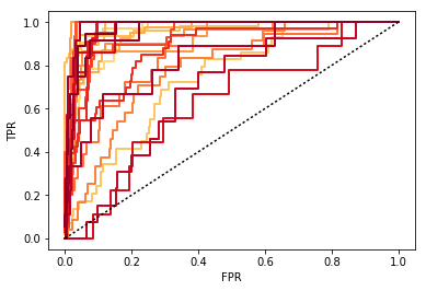
The colors of the curves here correspond to clusters. A number of the clusters are relatively close to the unit line, indicating that we have a hard time predicting these, and they will not end up being actionable. So we decrease the K and try again. We iterate this procedure until we are happy with the predictability of the clusters.
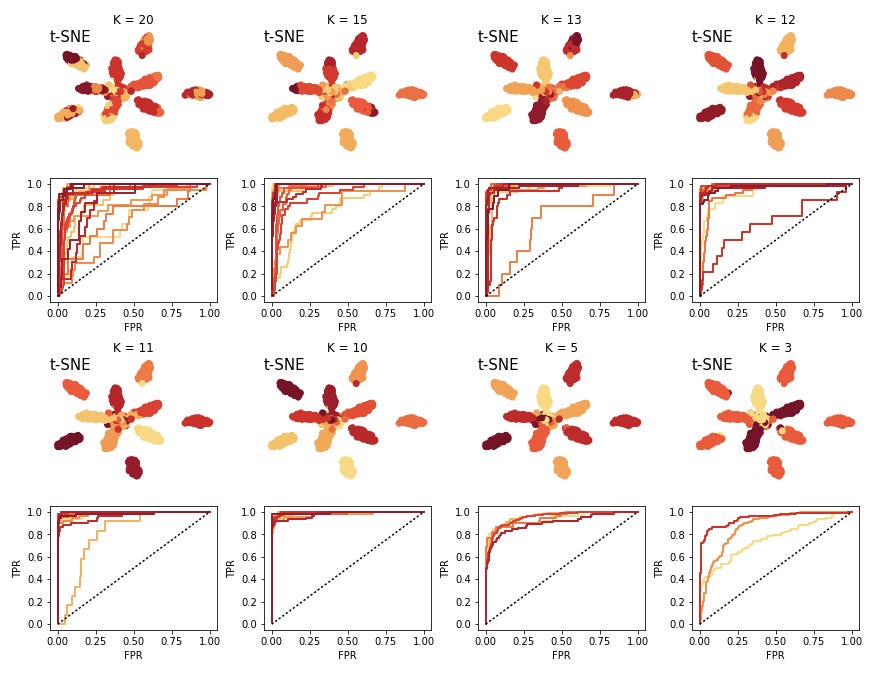
Here I have also plotted cases of "under clustering" the data. The larger clusters are still pretty predictice, but we would want to maximize the number of clusters which would be experimentally actionable.
In the case of K=10 (which is what we simulated), we can also look at which genes the predictive model is using for each cell type. We can use the get_top_markers command to extract the N largest weights for each class in a handy table.
top_markers = cell_types.get_top_markers(lr_res, 5)
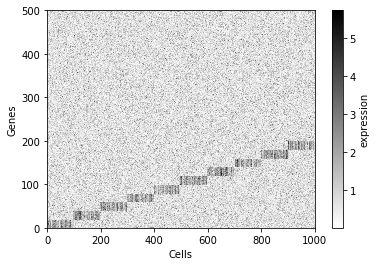
To visualise how these weight relate the expression of cells with different cluster annotations, we can plot a "marker map", which sorts cells by cluster, and plots the top marker genes in corresponding order on the Y axis. This is a very common plot in scRNA-seq cluster studies.
cell_types.plot_marker_map(data, c, top_markers)

We see that structure we simulated is largely recovered! The diagonal blocks indicate genes which predict the cell types.
Application to bone marrow data
Now we try this strategy on real data. In particular, we are using one of the batches of bone marrow data from the recently published Mouse Cell Atlas. This batch has 5,189 cells and expression values for 16,827 genes. For the sake of speeding up the analysis a little I randomly sample 3,000 of the cells.

Now we perform the same procedure of training GMM's and attempting to predict held out data with logistic regression.
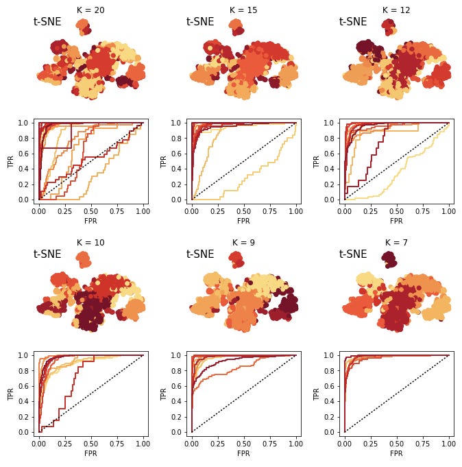
At 7 clusters I stop, here the clusters are very easy predict. Again we can create the marker map.

Obviosuly this is a lot noisier than the simulated data. Another thing we notice is that the number of cells per cluster is much less even than for the simulated data. This will cause some issues with interpreting the ROC curves, but in practice we want to try to have some minimal size for clusters in order to keep them reliable.
In order to quickly interpret the clusters, and read out what the predictive genes are, the plot_marker_table command will lay out predictive weights and names of top marker genes for each cluster, the colors relate to the colors in the plots.
cell_types.plot_marker_table(top_markers, lr)


I find this workflow fairly straightforward and quick to work around. There are some clear drawbacks of course: tt is quite manual, and we are not quantifying the uncertainty of these predictive weights, so we can't do proper statistics.
Notebooks for this post are available here.