Detecting scRNA-seq study duplicates using sentence embeddings

I have been maintaining a spreadsheet of publications that generated single-cell transcriptomics data for about five years. It is linked at the top of this website, and we wrote up a paper about it a few years ago (Svensson, da Veiga Beltrame, and Pachter 2020). Earlier today it had 1,933 entries.

Naturally, over time, mistakes such as inserting the same publication twice are bound to happen. I took some time today to identify accidental duplicates.

My initial approach was to search for entries with exactly the same DOI (digital object identifier; the unique string that identifies a publication). I found four papers with this strategy and deduplicated them.

In the spreadsheet, a DOI is the only required field, from which an author list, a title, a publication, and a date are collected automatically with a macro that calls the CrossRef API. Even though DOIs are unique identifiers of papers, sometimes the same study is duplicated with different DOIs. The main reason for this is that a paper gets a DOI when it is posted on a preprint server such as bioRxiv, and then a second DOI once it is published in a peer reviewed journal.

To identify preprint-journal duplicates, my first strategy was to find papers with exactly the same title. This identified five studies, all of which turned out to be the same but one being on bioRxiv and one being in a journal.

A paper that has been revised before being submitted to a journal, then further revised through the review process, and finally has to adhere to the style guide of the journal, is unlikely to retain exactly the same title. To find papers that were likely duplicates, I needed a way to identify titles that probably describe the same paper even if there are slight variations.

The quickest and simplest approach I came up with was to use the OpenAI API to create sentence embeddings of the titles. Then calculate all the pairwise distances between the embeddings, and look at the pairs of titles that were the closest to each other. This ended up being very simple and effective!

client = OpenAI()
responses = []
for chunk in tqdm(np.array_split(data, 10)):
    query = chunk['Title'].to_list()
    response = client.embeddings.create(input = query, model = 'text-embedding-ada-002')
    responses += [response]

embeddings_list = []
for response in responses:
    embeddings = np.array([d.embedding for d in response.data])
    embeddings_list += [embeddings]

embeddings = np.vstack(embeddings_list)
pdists = sklearn.metrics.pairwise_distances(embeddings)

mask = np.triu(np.ones(pdists.shape), k = 1).astype(bool)
pdistsl = pd.DataFrame(pdists).where(mask).stack().reset_index()

top_similar = pdistsl.sort_values(0).head(20)

for _, r in top_similar.iterrows():
    print('Distance:', r[0])
    d_r_0 = data.iloc[r['level_0'].astype(int)]
    d_r_1 = data.iloc[r['level_1'].astype(int)]
    print(d_r_0['DOI'], '\n|', d_r_0['Title'])
    print(d_r_1['DOI'], '\n|', d_r_1['Title'])
    print()


Distance: 0.04542879727657215
10.1101/2020.10.07.329839 
| Single-nucleus transcriptome analysis reveals cell type-specific molecular signatures across reward circuitry in the human brain
10.1016/j.neuron.2021.09.001 
| Single-nucleus transcriptome analysis reveals cell-type-specific molecular signatures across reward circuitry in the human brain

Distance: 0.051210665464434646
10.1101/2020.07.11.193458 
| Single-nucleus RNA-seq2 reveals a functional crosstalk between liver zonation and ploidy
10.1038/s41467-021-24543-5 
| Single-nucleus RNA-seq2 reveals functional crosstalk between liver zonation and ploidy

Distance: 0.07003401486501365
10.1101/2020.03.02.955757 
| Diversification of molecularly defined myenteric neuron classes revealed by single cell RNA-sequencing
10.1038/s41593-020-00736-x 
| Diversification of molecularly defined myenteric neuron classes revealed by single-cell RNA sequencing

Distance: 0.08156853865981699
10.1101/2021.07.19.452956 
| The Tabula Sapiens: a multiple organ single cell transcriptomic atlas of humans
10.1126/science.abl4896 
| The Tabula Sapiens: A multiple-organ, single-cell transcriptomic atlas of humans

Distance: 0.1182708273417854
10.1101/2020.04.22.056341 
| Deconvolution of Cell Type-Specific Drug Responses in Human Tumor Tissue with Single-Cell RNA-seq
10.1186/s13073-021-00894-y 
| Deconvolution of cell type-specific drug responses in human tumor tissue with single-cell RNA-seq

Distance: 0.14183682263019862
10.1101/2020.01.19.911701 
| Surveying Brain Tumor Heterogeneity by Single-Cell RNA Sequencing of Multi-sector Biopsies
10.1093/nsr/nwaa099 
| Surveying brain tumor heterogeneity by single-cell RNA-sequencing of multi-sector biopsies

Distance: 0.15672052837461234
10.21203/rs.3.rs-745435/v1 
| Single cell analysis of endometriosis reveals a coordinated transcriptional program driving immunotolerance and angiogenesis across eutopic and ectopic tissues.
10.1038/s41556-022-00961-5 
| Single-cell analysis of endometriosis reveals a coordinated transcriptional programme driving immunotolerance and angiogenesis across eutopic and ectopic tissues

Distance: 0.16437164718666886
10.1101/2020.06.17.156943 
| Chromatin potential identified by shared single cell profiling of RNA and chromatin
10.1016/j.cell.2020.09.056 
| Chromatin Potential Identified by Shared Single-Cell Profiling of RNA and Chromatin

Distance: 0.16911884570096825
10.1101/2021.04.24.441206 
| Single-cell landscapes of primary glioblastomas and matched organoids and cell lines reveal variable retention of inter- and intra-tumor heterogeneity
10.1016/j.ccell.2022.02.016 
| Single-cell landscapes of primary glioblastomas and matched explants and cell lines show variable retention of inter- and intratumor heterogeneity

Distance: 0.183893761793663
10.1101/2020.02.12.946509 
| No detectable alloreactive transcriptional responses during donor-multiplexed single-cell RNA sequencing of peripheral blood mononuclear cells
10.1186/s12915-020-00941-x 
| No detectable alloreactive transcriptional responses under standard sample preparation conditions during donor-multiplexed single-cell RNA sequencing of peripheral blood mononuclear cells

Distance: 0.18895108556159476
10.1101/2020.01.13.891630 
| Single-cell transcriptome analysis reveals cell-cell communication and thyrocyte diversity in the zebrafish thyroid gland
10.15252/embr.202050612 
| Single‐cell transcriptome analysis reveals thyrocyte diversity in the zebrafish thyroid gland

Distance: 0.2003776161396695
10.21203/rs.3.rs-599203/v1 
| A Single-cell Interactome of Human Tooth Germ Elucidates Signaling Networks Regulating Dental Development
10.1186/s13578-021-00691-5 
| A single-cell interactome of human tooth germ from growing third molar elucidates signaling networks regulating dental development

Distance: 0.23986737520644938
10.1101/2022.01.12.476082 
| Scalable in situ single-cell profiling by electrophoretic capture of mRNA
10.1038/s41587-022-01455-3 
| Scalable in situ single-cell profiling by electrophoretic capture of mRNA using EEL FISH

Distance: 0.25840869095237246
10.2337/db16-0405 
| Single-Cell Transcriptomics of the Human Endocrine Pancreas
10.1016/j.cels.2016.09.002 
| A Single-Cell Transcriptome Atlas of the Human Pancreas

Distance: 0.26278269347286093
10.15252/embj.2018100811 
| A single‐cell transcriptome atlas of the adult human retina
10.1093/nsr/nwaa179 
| A single-cell transcriptome atlas of the aging human and macaque retina

Distance: 0.26422422020526076
10.1038/s41467-018-08079-9 
| Single-cell transcriptomic analysis of mouse neocortical development
10.1101/2020.04.23.056390 
| Single-cell transcriptomic analysis identifies neocortical developmental differences between human and mouse

Distance: 0.2916387113759244
10.1038/s41586-022-04518-2  
| A single-cell atlas of human and mouse white adipose tissue
10.1038/s41467-023-36983-2 
| An integrated single cell and spatial transcriptomic map of human white adipose tissue

Distance: 0.29364709869497707
10.1016/j.devcel.2020.05.010 
| Single-Cell RNA Sequencing of Human, Macaque, and Mouse Testes Uncovers Conserved and Divergent Features of Mammalian Spermatogenesis
10.1016/j.devcel.2020.07.018 
| Single-Cell RNA Sequencing of the Cynomolgus Macaque Testis Reveals Conserved Transcriptional Profiles during Mammalian Spermatogenesis

Distance: 0.2940628150528307
10.1126/science.aar4362 
| Single-cell mapping of gene expression landscapes and lineage in the zebrafish embryo
10.1101/2021.10.21.465298 
| Spatiotemporal mapping of gene expression landscapes and developmental trajectories during zebrafish embryogenesis

Distance: 0.2991743187594748
10.1101/2022.02.01.478648 
| Single-cell RNA profiling of Plasmodium vivax liver stages reveals parasite- and host-specific transcriptomic signatures and drug targets
10.1371/journal.pntd.0010633 
| Single-cell RNA sequencing of Plasmodium vivax sporozoites reveals stage- and species-specific transcriptomic signatures

The majority of highly similar article titles were bioRxiv preprints with their matched journal publications, and a couple of medRxiv and ResearchSquare preprints. Some were genuinely different papers that just happened to have very similar titles. Through this process, I could remove 14 more duplicates. In total, I discovered 23 paper duplicates!

I was particularly impressed with how easy it is to get high quality sentence embeddings at this time. There are probably technically simpler strategies to get similar titles, such as removing punctuation and converting all characters to lowercase, both of which mostly depend on journal style guides. But in actuality, at this point, just getting text embeddings will be easier than any ad hoc strategy.

A notebook with code related to this post is available at Github

References

Svensson, Valentine, Eduardo da Veiga Beltrame, and Lior Pachter. 2020. “A Curated Database Reveals Trends in Single-Cell Transcriptomics.” Database: The Journal of Biological Databases and Curation 2020 (November). https://doi.org/10.1093/database/baaa073.

Interpreting scVI - adjusted expression levels

With single cell RNA-seq measurements, you observe molecule counts spread over genes of origin from a sample of the transcripts in individual cells. The small number of sampled molecules in relation to the number of genes used by cells to produce transcripts leads to sparse and discontinuous data that requires statistical analysis to properly interpret.

One statistical tool to explore and interpret this count data is the scVI model. As a reminder, the model can be written as $$ \begin{align*} z_n &\sim \text{N}(\mathbf{0}, I), \\ \rho_n &= f(z_n, s_n), \\ y_n &\sim \text{NB}(\rho_n \cdot \ell_n, \phi). \end{align*}$$

In this model, \( \rho_{n, g} \) represents a relative expression level of gene \( g \) in cell \( n \). After fitting a model, we get access to an estimate of \( \mathbb{E}[\rho_{n, g} \ | \ Y] \), which we can refer to as \( \hat{\rho}_{n, g} \). These estimates of expression levels are inferred using all observed counts of all genes in all cells, where the function \( f \) encodes various co-expression relationships between genes across cells based on the available evidence (if the model has fitted successfully). In scvi-tools models, these estimates are accessible through the .get_normalized_expression() method.

As an example, we can apply the scVI model to a dataset generated by (Garrido-Trigo et al. 2023). In this study, the authors made scRNA-seq measurements of 33,538 genes in 60,952 cells from colon biopsies of 18 donors. Six of the donors were healthy (HC-1 through HC-6), six of the donors had Crohn’s disease (CD-1 through CD-6), and six of the donors had ulcerative colitis (UC-1 through UC-6).

We fit the model, supplying the 18 donor identities as ‘batches’ (\( s_n \) in the model).

With the fitted model, we can generate the estimates for any genes we are interested in. In this case, we will look at the genes MS4A1 and TGFB1.

The gene MS4A1 (membrane-spanning 4A 1) encodes the protein CD20. Like all CD (cluster of differentiation) proteins, CD20 is a surface protein. Proteins are designated CD numbers at the ‘Human Leukocyte Differentiation Antigen Workshops’ if antibodies against the proteins can be used to isolate functionally distinct white blood cell populations. The protein encoded by MS4A1 was given the number CD20 in the 1984 workshop because it can be used to isolate B cells (Bernard and Boumsell 1984).

TGFB1 encodes the protein TGF-β1 (transforming growth factor β 1) which is a cytokine; a protein that is released from cells in order to communicate with other nearby cells, dictating them to change their current functions. TGF-β1 is released by most immune cells, including B cells.

In the above plot, the x-axis displays \( \hat{\rho}_{n, \text{MS4A1}} \) and the y-axis displays \( \hat{\rho}_{n, \text{TGFB1}} \) for all the 60,952 cells, colored by health status of the biopsy donor. As is apparent from the plot, there is a group of cells with particularly high expression of MS4A1 compared to all the other cells. These are likely B cells. The expression levels of TGFB1 appear to vary between disease states of the donors. To dig into this, we can instead plot a small multiple plot of the expression levels, where cells from all 18 of the donors are split out into individual facets.

In this plot, the distribution of all cells (regardless of donor) are displayed in the background as light gray points. This is a technique to make it easier to notice which subsets of a dataset correspond to certain regions of the range of the full dataset without having to look too closely at the axis labels.

From the plot we can learn that the variation in TGFB1 expression levels is not clearly related to health status of the donors, but rather related to independent donor-to-donor variation.

Suppose we want to classify cells into two levels: whether a cell is an immune cell, and then whether an immune cell is a B cell. Since we know that most immune cells secrete TGF-β1, we can argue that immune cells will express higher levels of TGFB1 than other cells. The expression levels of TGFB1 vary between donors, but a consistent pattern emerges: a dense group of cells with pronounced TGFB1 expression exists within each donor. But to decide whether a cell is an immune cell, we don’t want to set a different threshold for TGFB1 expression for each donor individually.

To solve this problem we can use the statistical technique of ‘adjusting’ the expression levels for donor identity. Another popular term for this technique is ‘regressing out’ donor identity, or the more descriptive term ‘keeping donor identity constant’. Another popular term for the same idea is ‘accounting for’ donor identity.

This technique is extremely common when using linear regression models for analysis. As a simple example, say we want to analyze how the weight of people depends on a choice between two different dietary choices. If you have some data on this, you would write a linear regression model as $$ \text{weight} = a \cdot [\text{diet}] + \epsilon. $$

However, you might worry that your dataset is biased in some way, where, for some reason, taller people choose one diet over the other. In that case you want to adjust for height in the model (or in other terms, ‘accounting for height’, ‘regressing out height’, or ‘keeping height constant’). To do this, you change the linear regression model to $$ \text{weight} = a \cdot [\text{diet}] + b \cdot [\text{height}] + \epsilon. $$

This way you can interpret the model and data in the unit of ‘height adjusted weight’ by fixing ‘height’ to a specific value while varying the value of ‘diet’. A common choice is to set \( \text{height} = 0 \), though, in the particular case of height it is a better choice to set it to the average height in the dataset, ensuring that predicted weight values remain within a realistic range.

The same ‘adjustment’ concept can be used with an scVI model. The estimated expression level \( \hat{\rho}_{n, g} \) produced through \( \rho_{n} = f(z_n, s_n) \), where \( s_n \) is the identity of the donor of the cell. To adjust the expression levels, so they are comparable between batches, we can fix \( s_n \) to a reference batch, e.g., donor HC-1. The choice of reference batch is arbitrary, and here we are choosing HC-1 just because it is the first healthy donor in the dataset. So we can produce adjusted estimated expression through $$ \hat{\rho}_{n, g \, | \, \text{HC-1}} = \mathbb{E}[ f(z_n, \text{HC-1} ) \ | \ Y ]. $$

In scvi-tools models, these adjusted expression levels can be obtained using the transform_batch argument in the .get_normalized_expression() method. In this particular case you would write .get_normalized_expression(transform_batch = ‘HC-1’).

Unlike in a linear regression model, the scVI model will adjust expression levels for different individual cells at different amounts, since the function \( f \) is a neural network which includes interactions between the cell representations \( z_n \) and the donor identities \( s_n \).

After producing the estimated adjusted expression levels, we can again plot the small multiples plot.

In this plot, the gray cells in background use the original estimated expression levels (from all donors regardless of facet), while the colored cells in the foreground display the adjusted estimated expression levels \( \hat{\rho}_{n, \text{MS4A1} \, | \, \text{HC-1}} \) and \( \hat{\rho}_{n, \text{TGFB1} \, | \, \text{HC-1}} \). On top of the cells, a small sample of cells have arrows between the estimated expression levels and the adjusted estimated expression levels, to illustrate how the scVI model adjusts expression for different individual cells.

On the scale of these adjusted estimated expression levels, the ranges of TGFB1 expression levels are comparable between the donors. This would allow us to isolate the dense region of cells with high TGFB1 expression which likely indicate immune cells.

A notebook for producing the figures in this plot is available on GitHub.

References

Bernard, A., and L. Boumsell. 1984. “[Human leukocyte differentiation antigens].” Presse medicale 13 (38): 2311–16. https://www.ncbi.nlm.nih.gov/pubmed/6239187.

Garrido-Trigo, Alba, Ana M. Corraliza, Marisol Veny, Isabella Dotti, Elisa Melón-Ardanaz, Aina Rill, Helena L. Crowell, et al. 2023. “Macrophage and Neutrophil Heterogeneity at Single-Cell Spatial Resolution in Human Inflammatory Bowel Disease.” Nature Communications 14 (1): 4506. https://doi.org/10.1038/s41467-023-40156-6.

Lyft priority pickup waiting times

When I moved to California at the beginning of the year I didn’t have a drivers’ license. To get to the office in the morning and back home in the afternoon I used Lyft rides.

Lyft rides have an add-on option called ‘Priority Pickup’, where you can spend a couple of dollars to decrease the amount of time you wait before your ride is available.


The ride ordering screen shows estimated waiting times for the different services ‘Priority Pickup’ and ‘Standard’. Once you choose a service you are matched with a driver, and you get a different estimate of when that particular driver will arrive to pick you up.

After having used Lyft every day for a couple of weeks, it seemed that the estimate for the ‘Priority Pickup’ waiting time was never accurate compared to how long I had to actually wait. It seemed that I could have just picked the ‘Standard’ pickup option.

To test this, I started gathering data. Every time I ordered a Lyft ride I saved a screenshot of the screen showing the estimated waiting times for the two different services, picked ‘Priority Pickup’, and then saved a second screenshot showing the time to arrival for the driver I had matched with.

Over the course of about a month, I collected screenshot pairs from 43 lyft rides, and then copied the different estimated times into a spreadsheet.

For every post-match estimated waiting time, there are two pre-booking estimated waiting times: one for ‘Priority Pickup’ and one for ‘Standard’. Naturally, pre-booking ‘Priority Pickup’ waiting times are always shorter than ‘Standard’.

Once you are matched with a driver after selecting ‘Priority Pickup’, is that estimated waiting time typically closer to the promised ‘Priority Pickup’ estimate or the ‘Standard’ estimate?

We can look at the distribution of the differences between the ‘Priority Pickup’ pre-booking estimate and the post-match estimate, and at the distribution of the differences between the ‘Standard’ pre-booking estimate and the post-match estimate. Then we can compare these distributions.

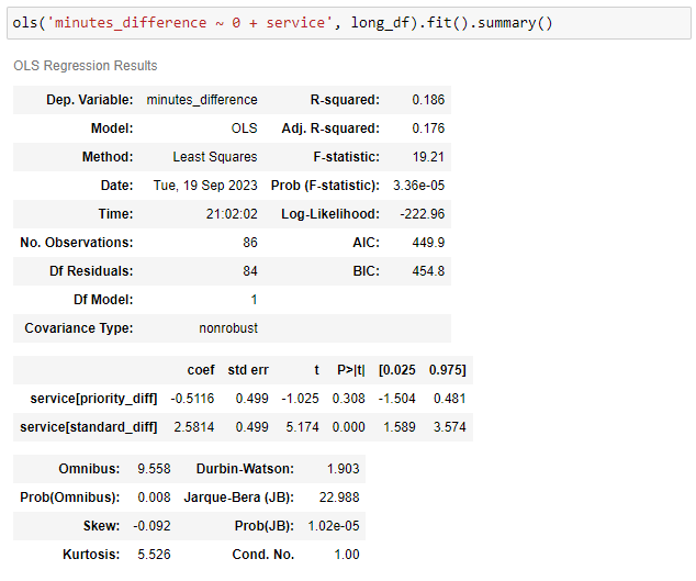
Visually we can see that the ‘Standard’ difference from the post-match estimate is shifted to the right of 0. So the post-match estimated waiting times are typically better than the pre-booking ‘Standard’ estimated waiting times.

Through linear regression we can learn that, on average, the post-match estimated waiting times after selecting ‘Priority Pickup’ are two and a half minutes shorter than the pre-booking estimated waiting time for ‘Standard’.

The post-match waiting times are, on average, half a minute longer than the pre-booking estimates, but there is uncertainty in the estimation of this average, where the possibility of pre-booking estimates being spot-on is contained in the 95% confidence interval.

It turns out my impression of the ‘Priority Pickup’ option not improving waiting times was wrong. There are a few cases where the post-match estimates are much longer than the pre-booking waiting times estimated for ‘Priority Pickup’, visible as the red dots in the upper left corner of the scatter plot above. My original impression is a very common cognitive bias, where the cases when I had to wait for the ride for longer than I had paid for are more memorable due to the associated disappointment. Without collecting this data I would have continued to believe that selecting the ‘Priority Pickup’ option wouldn’t make a difference.

A notebook with the code for the analysis is available at GitHub

Training scVI — Summarizing posterior predictive distributions

How good is a trained scVI model? The objective when training a model is to minimize the evidence lower bound (ELBO). The ELBO consists of two parts: the KL divergence between the approximate posterior of \( Z \) and the prior of \( Z \), \( \text{KL}(Q(Z) || P(Z)) \), and the reconstruction error. The reconstruction error is the negative log likelihood, meaning the probability of the observed data given the fitted model, \( -\log P(Y | Z) \).

The single reconstruction error number for a model consists of the sum of the likelihoods for all genes in each cell, then further summarized to the mean of those compound likelihoods across all the cells:

$$ \texttt{reconstruction_error} = - \frac{1}{N} \sum_{n = 1}^N \sum_{g = 1}^G \log P(y_{n, g} \ | \ z_n). $$

This final reconstruction error value might be, e.g., 3,783, for a fitted model. It is hard to understand the implications of this number, and how this relates to practical implications for interpreting and using the model.

In a previous post we looked at how monitoring the posterior predictive distribution of a tiny slice of data for different values of ELBO (or reconstruction error) could help build intuition about general performance of the model.

Can we build upon this idea to get an alternative performance quantification for the model that is more intuitive?

The likelihood reflects how often the observed value is sampled from the model when generating posterior samples. If the model is performing well, samples of UMI counts from the posterior will often coincide with the observed UMI count from a cell-gene pair. The posterior probability distribution of the molecule counts can be viewed as a mass, and we can consider ranges where the majority of this mass is located. If e.g., 90% of the mass falls within the interval of 200 to 100,000 molecules, this is referred to as the 90% confidence interval of the distribution. In the example below, the observed molecule count falls within this confidence interval.

On the other hand, in cases where the model is performing poorly, the observed value is rarely generated through sampling. In the example below, the observed count is outside the 90% confidence interval.

These two cases give us a way of summarizing model performance in an intuitive way. Out of all the cell-gene pairs in the data, what fraction are cases of the observed counts falling outside the 90% confidence interval?

This can be estimated by sampling counts from the posterior 200 times for each cell-gene pair, then checking if the observed molecule count is between the 5% quantile and the 95% quantile of the samples of UMI counts from the posterior.

Here we are using a dataset from (Garrido-Trigo et al. 2023), where the authors used single-cell RNA-sequencing data from colon tissue from multiple donors to investigate differences between healthy donors and donors with ulcerative colitis or Crohn’s disease. Here we are using a random subset of 10,000 cells out of the total 60,952 cells from these donors with measurements of 33,538 genes.

As an experiment to learn about the relation between the reconstruction error and the fraction of observed counts observed within the 90% confidence intervals, the process can be performed after each epoch of training of a model.

We can see with this quantification, that the fraction of observed counts within 90% confidence intervals, increases very slowly after around 20 epochs. The decrease in reconstruction error after 20 epochs appears more dramatic than the increase in fractions within 90% CI.

In this case, after training for 40 epochs, 99.5% of observations from cell-gene pairs are contained within the 90% confidence interval. What kinds of practical implications would this have? As one example, if a cluster of 1,000 cells all have high expression of a certain gene according to scVI, the model might be wrong about this expression level for 5 of those 1,000 cells.

One aspect of the posterior predictive distributions that are not captured by this quantification is the breadth of the confidence intervals. The likelihood value itself on the other hand will reflect this. If the confidence interval is small and the model is accurate in the sense that the observed count is within the interval, this means the observed count will be sampled even more often than if the interval was wide. I can’t think of an easy way to summarize the widths of the confidence intervals that isn’t as abstract as the likelihood itself.

Notebooks to reproduce this analysis are available at github.

References

Garrido-Trigo, Alba, Ana M. Corraliza, Marisol Veny, Isabella Dotti, Elisa Melón-Ardanaz, Aina Rill, Helena L. Crowell, et al. 2023. “Macrophage and Neutrophil Heterogeneity at Single-Cell Spatial Resolution in Human Inflammatory Bowel Disease.” Nature Communications 14 (1): 4506. https://doi.org/10.1038/s41467-023-40156-6.

Training scVI - Posterior predictive distributions over epochs

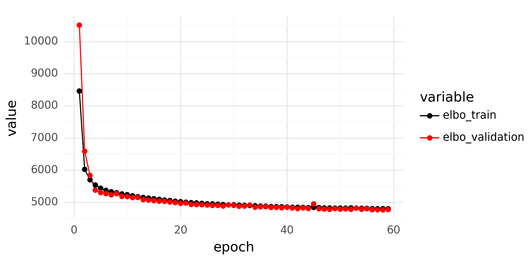
When fitting an scVI model for scRNA-seq data it is important to inspect the loss curves over epochs after finishing training. An example is shown below.

There are a couple of key features to look for when inspecting the loss curve. The validation loss should not dramatically deviate from the training set loss, as this indicates overfitting. A judgment call must also be made to determine whether to consider the training ‘finished,’ or if you should train for additional epochs. Once the loss plateaus, further training epochs yield no improvement. However, when is the curve ‘flat enough’ to be satisfactory?

The scVI model is formulated as:

$$ \begin{align*} z_n &\sim \text{N}(\mathbf{0}, I), \\ \rho_n &= f(z_n, s_n), \\ y_n &\sim \text{NB}(\rho_n \cdot \ell_n, \phi). \end{align*} $$

In the loss curves, model performance, representing estimation of gene expression for all cells and all genes in the data, is summarized by a single number. The loss reported during scVI training is the evidence lower bound (\( \text{ELBO} \)), defined as \( \text{ELBO} = \log p(y | z) - \text{KL}(q_\phi (z) || p(z)) \).

For smaller models, like univariate linear regression models represented as \( y \sim \text{N}(a \cdot x + b, \sigma) \), beyond looking at a single performance metric, it is beneficial to explore the posterior predictive distribution in relation to the observed data. In this linear regression example, the parameters \( a \), \( b \), and \( \sigma \) have the joint posterior distribution \( p( a, b, \sigma \ | \ x, y) \). The posterior predictive distribution describes the distribution of potential observations \( \tilde{y} \) given the seen observations \( y \) and the model, represented as $$ p(\tilde{y} \ | x, y) = \int_{a, b, \sigma} p(\tilde{y} \ | \ a, b, \sigma) p(a, b, \sigma \ | \ x, y) d (a, b, \sigma). $$

Analyzing a posterior predictive distribution allows a user to understand potential variation in the data that the model might overlook, or determine the breadth of the posterior predictive distribution.

With Bayesian models, examining the posterior predictive distribution requires sampling from the posterior distribution of the parameters, integrating these parameters into the likelihood distribution, and then drawing samples from the combined distribution. For the scVI model, the procedure is:

$$ \begin{align} \tilde{Z} &\sim p(Z | Y), \\ \tilde{\rho} &= f(\tilde{Z}, s), \\ \tilde{Y} &\sim \text{NB}(\tilde{\rho} \cdot \ell, \phi). \end{align} $$

As an illustrative example of looking at posterior predictive distributions from an scVI model, an scRNA-seq dataset from (Zhu et al. 2023) is chosen. The full dataset comprises 139,761 blood cells with measurements for 33,528 genes from 17 human donors. For illustrative purposes a random sample of 20,000 cells from this dataset is selected, ensuring each epoch provides 20,000 examples to the model (using the entire dataset leads to rapid convergence, making it challenging to observe the training effect).

Reviewing the posterior predictive distribution for an scVI model involves examining distribution densities for tens of thousands of genes across tens of thousands of cells. To obtain a general understanding of the posterior predictive distribution, a smaller subset of cells and genes is chosen, and the posterior posterior predictive distributions for this subset are analyzed.

By employing this limited set of cells and genes, it is possible to sample from the posterior predictive distribution after each training epoch. This process allows for an understanding of how decreases in the model’s loss function correlate with its ability to emulate training data.

The animation below shows UMI count histograms of 128 samples from the posterior predictive distributions of an scVI model as black bars for five cells and 10 genes across 60 epochs of training. The red bar marks the observed UMI count for each cell-gene combination.

After the first epoch, most samples from the posterior predictive samples are zeros or show very low counts compared to the observed counts indicated by the red lines. Following the second epoch, the posterior predictive distribution undergoes a significant shift, producing very broad count ranges for each cell-gene combination. In subsequent epochs, the posterior predictive distributions become more focused and align closer with the observed counts. Histograms of posterior predictive distribution counts for observations of zero shrink to mostly generate zeros.

Beyond the 40th epoch, the posterior predictive distributions remain largely unchanged. By the 60th epoch, all observed counts for this cell-gene subset overlap with samples from the posterior predictive distributions.

Jupyter notebooks for generating posterior predictive distributions are available on GitHub.

Tutorial - Label transfer with scVI and scHPL

One of the most time-consuming and challenging steps in single-cell RNA-seq analysis is the assignment of cell types based on clustering marker genes. There are numerous variations on settings, all equally valid but slightly different, and never align perfectly with expected biology. This challenge is compounded by the ambiguous literature regarding which marker genes should appear where.

To leverage the hard work that has already been done, strategies for label transfer have been developed. In this scenario, unlabeled data is labeled based on its similarity to already labeled cells.

The scHPL package (Michielsen, Reinders, and Mahfouz 2021; Michielsen et al. 2022) is an excellent tool for this task. It uses k-nearest neighbor classifiers and incorporates a powerful feature that takes into account a tree structure of cell type labels. This approach not only enables the use of known labels at a lower resolution than some other labels but also prevents overly confident label transfers for highly resolved sub-labels that may not be realistic.

Although this tool is generally straightforward to use, it requires some initial setup in the form of upstream tasks. Some helper code can also make it more approachable.

ImYoo, a biotech startup (www.imyoo.health), has provided a pre-labeled scRNA-seq dataset. This dataset, composed of capillary blood samples self-collected by three participants. Included are their custom labels, specifically incorporated for creating a comprehensive tutorial on label transfer using tools such as scVI and scHPL. Those interested in exploring rich single-cell gene expression datasets, particularly those related to the human immune system, or seeking more information on decentralized blood sampling, are encouraged to contact ImYoo through their website.

To start, you’ll need to import a number of packages that will be used throughout the tutorial.

import anndata
import numpy as np
import pandas as pd
import plotnine as p
import matplotlib.pyplot as plt
import scvi
from scvi.model.utils import mde
import scHPL
import torch

import matplotlib.pyplot as plt
%matplotlib inline
%config InlineBackend.figure_format='retina'

import warnings
warnings.filterwarnings('ignore')
from IPython.display import display

With these packages, you can proceed to read data stored in the h5ad format.

adata = anndata.read_h5ad('imyoo_capillary_blood_samples_76535_pbmcs.h5ad')
adata

AnnData object with n_obs × n_vars = 87213 × 36601
    obs: 'barcode', 'Sample IDs', 'Participant IDs', 'Cell Barcoding Runs', 'cell_type_level_1', 'cell_type_level_2', 'cell_type_level_3', 'cell_type_level_4'
    var: 'name', 'id'

This dataset has 87,000 cells sourced from three independent donors, which have been processed over multiple experimental samples.

adata.obs['Participant IDs'].value_counts()

Participant IDs
3     49170
2     30917
51     7126
Name: count, dtype: int64

In this tutorial, we assume that the cell type labels for participants 2 and 3 are known, and the goal is to transfer these labels to participant 51.

Participant IDs are confounded with Sample IDs. To make cell type labels consistent across participants and experimental samples, you will need to learn an scVI cell representation where variation due to Sample IDs is removed.

scvi.model.SCVI.setup_anndata(
    adata,
    batch_key = 'Sample IDs',
)

Once the AnnData dataset has been set up for scVI, you can proceed to construct an scVI model.

model = scvi.model.SCVI(
    adata, 
    n_layers = 2,
    gene_likelihood = 'nb'
)

model.view_anndata_setup()

Anndata setup with scvi-tools version 0.20.3.


Setup via `SCVI.setup_anndata` with arguments:


{
│   'layer': None,
│   'batch_key': 'Sample IDs',
│   'labels_key': None,
│   'size_factor_key': None,
│   'categorical_covariate_keys': None,
│   'continuous_covariate_keys': None
}


        Summary Statistics         
┏━━━━━━━━━━━━━━━━━━━━━━━━━━┳━━━━━━━┓
┃     Summary Stat Key     ┃ Value ┃
┡━━━━━━━━━━━━━━━━━━━━━━━━━━╇━━━━━━━┩
│         n_batch          │  32   │
│         n_cells          │ 87213 │
│ n_extra_categorical_covs │   0   │
│ n_extra_continuous_covs  │   0   │
│         n_labels         │   1   │
│          n_vars          │ 36601 │
└──────────────────────────┴───────┘


              Data Registry                
┏━━━━━━━━━━━━━━┳━━━━━━━━━━━━━━━━━━━━━━━━━━━┓
┃ Registry Key ┃    scvi-tools Location    ┃
┡━━━━━━━━━━━━━━╇━━━━━━━━━━━━━━━━━━━━━━━━━━━┩
│      X       │          adata.X          │
│    batch     │ adata.obs['_scvi_batch']  │
│    labels    │ adata.obs['_scvi_labels'] │
└──────────────┴───────────────────────────┘


                    batch State Registry                     
┏━━━━━━━━━━━━━━━━━━━━━━━━━┳━━━━━━━━━━━━┳━━━━━━━━━━━━━━━━━━━━━┓
┃     Source Location     ┃ Categories ┃ scvi-tools Encoding ┃
┡━━━━━━━━━━━━━━━━━━━━━━━━━╇━━━━━━━━━━━━╇━━━━━━━━━━━━━━━━━━━━━┩
│ adata.obs['Sample IDs'] │     20     │          0          │
│                         │     95     │          1          │
│                         │    329     │          2          │
│                         │    424     │          3          │
│                         │    892     │          4          │
│                         │    894     │          5          │
│                         │    909     │          6          │
│                         │    911     │          7          │
│                         │    952     │          8          │
│                         │    953     │          9          │
│                         │    958     │         10          │
│                         │    959     │         11          │
│                         │    970     │         12          │
│                         │    971     │         13          │
│                         │    977     │         14          │
│                         │    978     │         15          │
│                         │    1004    │         16          │
│                         │    1005    │         17          │
│                         │    1071    │         18          │
│                         │    1072    │         19          │
│                         │    1170    │         20          │
│                         │    1171    │         21          │
│                         │    1176    │         22          │
│                         │    1177    │         23          │
│                         │    1382    │         24          │
│                         │    1385    │         25          │
│                         │    1394    │         26          │
│                         │    1395    │         27          │
│                         │    1553    │         28          │
│                         │    1585    │         29          │
│                         │    1593    │         30          │
│                         │    1643    │         31          │
└─────────────────────────┴────────────┴─────────────────────┘


                    labels State Registry                      
┏━━━━━━━━━━━━━━━━━━━━━━━━━━━┳━━━━━━━━━━━━┳━━━━━━━━━━━━━━━━━━━━━┓
┃      Source Location      ┃ Categories ┃ scvi-tools Encoding ┃
┡━━━━━━━━━━━━━━━━━━━━━━━━━━━╇━━━━━━━━━━━━╇━━━━━━━━━━━━━━━━━━━━━┩
│ adata.obs['_scvi_labels'] │     0      │          0          │
└───────────────────────────┴────────────┴─────────────────────┘

This model is designed to learn a representation for the 87,000 cells, where variation due to the 32 Sample IDs has effectively been eliminated by treating each Sample ID as a separate batch.

With 87,000 cells, running the model for 50 epochs will allow it to process just over four million examples during the fitting process. This should be more than sufficient to reach convergence, a good rule of thumb being to allow a model to process at least one million examples.

model.train(50, check_val_every_n_epoch = 1)

GPU available: True (cuda), used: True
TPU available: False, using: 0 TPU cores
IPU available: False, using: 0 IPUs
HPU available: False, using: 0 HPUs
LOCAL_RANK: 0 - CUDA_VISIBLE_DEVICES: [0]
Epoch 50/50: 100%|█████████████████████████████████████████████████████████████████████████████████████████████████████████████████████████████████| 50/50 [12:45<00:00, 15.51s/it, loss=7.36e+03, v_num=1]
`Trainer.fit` stopped: `max_epochs=50` reached.
Epoch 50/50: 100%|█████████████████████████████████████████████████████████████████████████████████████████████████████████████████████████████████| 50/50 [12:45<00:00, 15.31s/it, loss=7.36e+03, v_num=1]

To ensure the effectiveness of the model fitting, examining the loss curves over the training period is advisable. These curves indicate whether the model is converging as well as highlight if there are issues with overfitting.

history_df = (
    model.history['elbo_train'].astype(float)
    .join(model.history['elbo_validation'].astype(float))
    .reset_index()
    .melt(id_vars = ['epoch'])
)

p.options.figure_size = 6, 3

p_ = (
    p.ggplot(p.aes(x = 'epoch', y = 'value', color = 'variable'), history_df.query('epoch > 0'))
    + p.geom_line()
    + p.geom_point()
    + p.scale_color_manual({'elbo_train': 'black', 'elbo_validation': 'red'})
    + p.theme_minimal()
)

p_.save('fig1.png', dpi = 300)

print(p_)


The decrease in loss between epochs 40 and 50 is extremely small, with the validation loss showing stability. With this level of performance, the model is now ready to estimate representation vectors for all the 87,000 cells.

adata.obsm['X_scvi'] = model.get_latent_representation(adata)

To aid in visualizing the representations, the PyMDE package can be utilized to generate a 2D representation of the neighborhood graph of the scVI representation vectors. This package is conveniently available as a utility within scvi-tools.

adata.obsm['X_mde'] = scvi.model.utils.mde(adata.obsm['X_scvi'])

for i, y in enumerate(adata.obsm['X_mde'].T):
    adata.obs[f'mde_{i + 1}'] = y

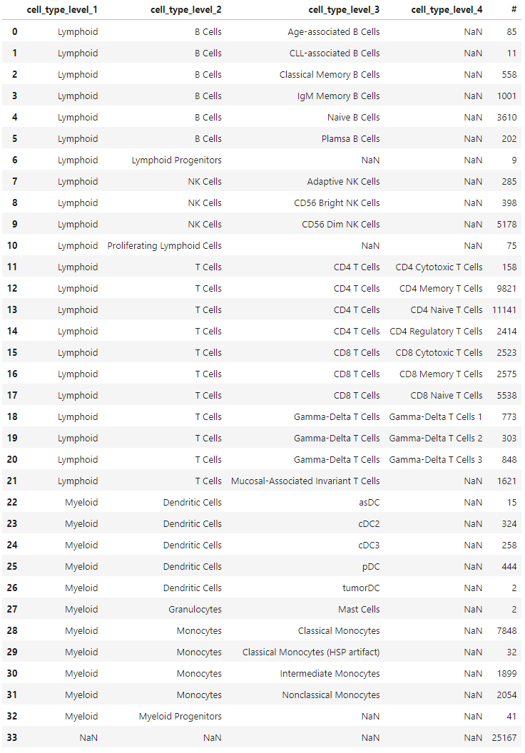
The labels in the dataset are organized in four columns, each representing different levels. Some cells may only be labeled in the second column, without labels in the third or fourth columns. Conversely, some cells might have labels in all four columns. Absence of labels is indicated by NaNs.

(
    adata
    .obs
    .groupby(
        ['cell_type_level_1', 'cell_type_level_2', 'cell_type_level_3', 'cell_type_level_4'],
        observed = True,
        dropna = False
    )
    .size()
    .rename('#')
    .reset_index()
)

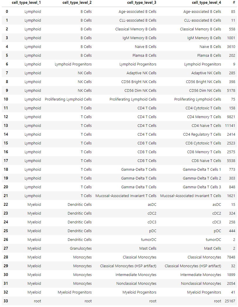
In order to make this label structure compatible with scHPL, there needs to be a single column of labels for each cell, along with a separate tree structure that indicates how these labels relate to each other. Moreover, cells without specific labels must be labeled as ‘root’ in order for scHPL to function properly. This label indicates that the cell can originate from any branch of the tree.

for i in range(1, 4 + 1):
    adata.obs[f'cell_type_level_{i}'] = adata.obs[f'cell_type_level_{i}'].pipe(np.array)

# Propagate upper level labels

adata.obs.loc[adata.obs.query('cell_type_level_1.isna()').index, 'cell_type_level_1'] = 'root'

If a cell has a label in a column representing a higher level, but lacks a label at the current level, the label from the higher level must be propagated to the next level.

for i in range(2, 4 + 1):
    idx_ = adata.obs.query(f'cell_type_level_{i}.isna()').index
    adata.obs.loc[idx_, f'cell_type_level_{i}'] = adata.obs.loc[idx_][f'cell_type_level_{i - 1}'].values

(
    adata
    .obs
    .groupby(
        ['cell_type_level_1', 'cell_type_level_2', 'cell_type_level_3', 'cell_type_level_4'],
        observed = True,
        dropna = False
    )
    .size()
    .rename('#')
    .reset_index()
)

The reformatted label structure encapsulates all necessary information about the cell type labels encoded in the fourth column, eliminating any NaNs.

The tree structure, which can be visually understood from the grouped summary table, must be represented by a precise tree data structure. This can be achieved by encoding the structure as a nested set of dictionaries.

# Empty dicts indicates leaves.
tree = {
    'root': {
        'Lymphoid': {
            'T Cells': {
                'Mucosal-Associated Invariant T Cells': {},
                'Gamma-Delta T Cells': {
                            'Gamma-Delta T Cells 1': {},
                            'Gamma-Delta T Cells 2': {},
                            'Gamma-Delta T Cells 3': {},
                },
                'CD8 T Cells': {
                            'CD8 Memory T Cells': {},
                            'CD8 Cytotoxic T Cells': {},
                            'CD8 Naive T Cells': {},
                },
                'CD4 T Cells': {
                            'CD4 Naive T Cells': {},
                            'CD4 Memory T Cells': {},
                            'CD4 Regulatory T Cells': {},
                            'CD4 Naive T Cells': {},                    
                            'CD4 Regulatory T Cells': {},
                            'CD4 Cytotoxic T Cells': {}
                }          
            },

            'NK Cells': {
                'CD56 Dim NK Cells': {},
                'Adaptive NK Cells': {},
                'CD56 Bright NK Cells': {}
            },
            'B Cells': {
                'Naive B Cells': {},
                'IgM Memory B Cells': {},
                'Plamsa B Cells': {},
                'Age-associated B Cells': {},
                'Classical Memory B Cells': {},
                'CLL-associated B Cells': {},
            },    
            'Lymphoid Progenitors': {}
        },
        'Myeloid': {
            'Monocytes': {
                'Classical Monocytes': {},
                'Intermediate Monocytes': {},
                'Classical Monocytes HSP artifact': {},
                'Nonclassical Monocytes': {}
            },
            'Dendritic Cells': {
                'asDC': {},
                'pDC': {},
                'cDC3': {},
                'tumorDC': {}
            },

            'Granulocytes': {
                'Mast Cells': {}
            },
            'Myeloid Progenitors': {}
        }
    }
}

scHPL utilizes trees defined in the Newick format to construct a tree structure of classifiers. The nested dictionary structure can be conveniently converted into a Newick string using a small helper function.

# This lets you define trees as a dict of dicts. It converts it to a Newick string that you can give to scHPL

def dict2newick(tree, name):

    if len(tree[name]) == 0:
        return f'{name}'

    else:
        child_strings = [dict2newick(tree[name], child) for child in tree[name]]
        return f'({", ".join(child_strings)}){name}'

tree1 = scHPL.utils.create_tree(dict2newick(tree, 'root'))

Once the scHPL tree has been created, a graphical representation can be plotted to verify the accuracy of the structure.

scHPL.utils.print_tree(tree1)
 

The tree structure, now delineating the relationship between the different cell type labels, facilitates the training of a tree of k-nearest neighbor classifiers using these labels in scHPL. In the continuous scVI embedding space, cells with similar vectors will produce statistically compatible UMI counts. Cell types within this space will manifest as dense regions of embedded cells, but without any expectation that these regions are linearly separable, which makes k-nearest neighbor classifiers a compelling choice for label transfer. k-nearest neighbor classifiers are also highly resistant to class imbalance, particularly for small k values with large volumes of training data. Cell types are often significantly imbalanced due to biology; for example, in this dataset 70% of the cells are T cells.

Before starting the training process, labels from participant 51, which are assumed to be unknown in this tutorial, need to be renamed to ‘Unknown’ (or some other arbitrary name).

adata.obs['tree_label'] = adata.obs['cell_type_level_4']

# We are ignoring known labels for participant 51, so here we rename these

adata.obs.loc[adata.obs.query('`Participant IDs` == 51').index, 'tree_label'] = 'Unknown'

adata.obs['participant_ids'] = adata.obs['Participant IDs']

Equipped with these labels, we can visualize the cells’ representations along with their given labels using scatter plots.

p.options.figure_size = 12, 15

tmp_ = adata.obs.sample(20_000)

p_ = (
    p.ggplot(p.aes(x = 'mde_1', y = 'mde_2', color = 'tree_label'), tmp_)
    + p.geom_point(shape = '.', size = 0.1, color = 'lightgrey', data = tmp_.drop(['participant_ids'], axis = 1))
    + p.geom_point(shape = '.', size = 0.2)
    + p.theme_minimal()
    + p.guides(color = p.guide_legend(override_aes = {'size': 10}))
    + p.facet_grid('participant_ids ~ .', labeller = 'label_both')
)

p_.save('fig3.png', dpi = 300)

print(p_)

When initiating the training process for the tree, the data from participant 51 is deliberately excluded.

adata_train = adata[adata.obs.query('participant_ids != 51').index].copy()

Finally, the cell representations from scVI, the known labels, and the tree structure of the labels, are all fed into the training function in scHPL. This process generates a trained classifier tree.

trained_tree = scHPL.train_tree(
    adata_train.obsm['X_scvi'],
    adata_train.obs['tree_label'],
    tree1,
    dimred = False,  # These two options for compatibility with scVI
    useRE = False
)

Once trained, the classifier tree can be applied to all cells to generate their predicted labels.

adata.obs['predicted_label'] = scHPL.predict_labels(adata.obsm['X_scvi'], trained_tree)

Comparing the results of the label transfer with the given labels allows for an assessment of their consistency with their continuous scVI representation vectors. A confusion matrix is an ideal tool for this, as it displays the distribution of predicted labels for each given label.

Since scHPL utilizes the hierarchical structure of the labels, and can ‘stop’ at higher levels of labels if lower levels are ambiguous, it is beneficial to order the confusion matrix in a manner that preserves this hierarchical structure. Such ordering can be achieved through a recursive depth-first traversal of the label tree.

def get_depth_first_order(tree):

    label_order = []
    depth = 0 - 1

    def depth_first_order(node, label_order, depth):
        depth += 1
        label_order += [{'name': node.name[0], 'depth': depth}]

        for child in node.descendants:
            depth_first_order(child, label_order, depth)

        depth -= 1

    depth_first_order(tree[0], label_order, depth)

    return pd.DataFrame(label_order).reset_index().rename(columns = {'index': 'order'})

label_order = get_depth_first_order(tree1)

scHPL.evaluate.heatmap(
    adata.obs['tree_label'],
    adata.obs['predicted_label'],
    order_rows = label_order['name'].to_list() + ['Unknown'],
    order_cols = label_order['name'].to_list() + ['Rejection (dist)'],
    shape = (12, 11)
)

for i in label_order.query('depth == 1')['order'].values:
    plt.axhline(i, color = 'black', lw = 1)
    plt.axvline(i, color = 'black', lw = 1)

for i in label_order.query('depth == 2')['order'].values:
    plt.axhline(i, color = 'grey', lw = 0.5)
    plt.axvline(i, color = 'grey', lw = 0.5)

for i in label_order.query('depth == 3')['order'].values:
    plt.axhline(i, color = 'grey', lw = 0.2, ls = (0, (5, 10)))
    plt.axvline(i, color = 'grey', lw = 0.2, ls = (0, (5, 10)))

plt.tight_layout()

plt.savefig('fig5.png', dpi = 300)

The majority of the cells are predicted as the lower level label given to the classifier. Cells where the prediction ‘stopped’ at a higher level would be visible below the diagonal, adjacent to the separating lines in the confusion matrix plot. Cells with the given label ‘root’ are distributed among the possible labels in the ‘predicted labels’ axis; it is impossible to determine the accuracy of these predictions as there is no ground truth. Some cells receive the predicted label ‘Rejection (dist)’, indicating that these cells are distant from others to infer their potential label.

Cells bearing the ‘Unknown’ label are also distributed among the possible predicted labels, in line with the objective of this tutorial.

The two-dimensional visualization process can be reiterated with the transferred labels. This time, the cells from participant 51 will also have cell type labels.

p.options.figure_size = 12, 15

tmp_ = adata.obs.sample(20_000)

p_ = (
    p.ggplot(p.aes(x = 'mde_1', y = 'mde_2', color = 'predicted_label'), tmp_)
    + p.geom_point(shape = '.', size = 0.1, color = 'lightgrey', data = tmp_.drop(['participant_ids'], axis = 1))
    + p.geom_point(shape = '.', size = 0.2)
    + p.theme_minimal()
    + p.guides(color = p.guide_legend(override_aes = {'size': 10}))
    + p.facet_grid('participant_ids ~ .', labeller = 'label_both')
)

p_.save('fig4.png', dpi = 300)

print(p_)

With this, the task is completed! The transferred labels can be utilized for downstream analysis. For instance, you could compare the proportions of the cell types in participant 51 with the other participants. Alternatively, a differential expression analysis between participant 51 and the other participants could be performed to identify any genes that are uniquely expressed in the samples from the donor, for each cell type.

As a bonus, in this specific case, there were already existing labels for the cells from participant 51. As such, the confusion matrix plot from earlier can be replicated, this time comparing the originally given labels with the transferred labels for this subset of data that wasn’t utilized during the tree training phase.

scHPL.evaluate.heatmap(
    adata.obs.query('participant_ids == 51')['cell_type_level_4'],
    adata.obs.query('participant_ids == 51')['predicted_label'],
    order_rows = label_order['name'].to_list(),
    order_cols = label_order['name'].to_list() + ['Rejection (dist)'],
    title = 'Participant IDs == 51 (held out)',
    shape = (12, 11)
);


for i in label_order.query('depth == 1')['order'].values:
    plt.axhline(i, color = 'black', lw = 1)
    plt.axvline(i, color = 'black', lw = 1)

for i in label_order.query('depth == 2')['order'].values:
    plt.axhline(i, color = 'grey', lw = 0.5)
    plt.axvline(i, color = 'grey', lw = 0.5)

for i in label_order.query('depth == 3')['order'].values:
    plt.axhline(i, color = 'grey', lw = 0.2, ls = (0, (5, 10)))
    plt.axvline(i, color = 'grey', lw = 0.2, ls = (0, (5, 10)))

plt.tight_layout()

plt.savefig('fig6.png', dpi = 300)

The transferred labels largely align with the original labels; cells typically reside within their own hierarchical ‘box’, although the resolution is not as consistent as with the data used for training. One notable deviation is the group of NK cells, many of which received labels from T cells. Some gamma-delta T cells are assigned as other T cells. None of the cells annotated as cytotoxic T cells are recognized, and some age-associated B cells cannot be predicted with higher precision than the overarching B cells label.

Although this workflow is somewhat extensive, it offers significant reliability. While the prediction step from scHPL can be time-consuming (it took about 10 minutes for these 87,000 cells), the accuracy and clarity of the outcome makes it a worthwhile effort. The usage of k-nearest neighbor classifiers adds robustness against class imbalance, a common challenge when dealing with cell types in biological samples. Parametric classifiers may be more efficient, but they struggle with class imbalance. By examining the predictions within the hierarchies, users can identify potentially unrealistic subclass definitions. If there is significant mixing between predicted cell types, it suggests that the original labels do not align well with the low-dimensional representation of the cells.

A Jupyter notebook for running the entire workflow is available on Github: https://github.com/vals/Blog/tree/master/230608-scHPL-tutorial

The dataset used for this tutorial is available on Zenodo: https://dx.doi.org/10.5281/zenodo.8020792

Thanks to Eduardo Beltrame for useful feedback on this tutorial, and to ImYoo for providing the dataset.

Michielsen, Lieke, Mohammad Lotfollahi, Daniel Strobl, Lisa Sikkema, Marcel Reinders, Fabian J. Theis, and Ahmed Mahfouz. 2022. “Single-Cell Reference Mapping to Construct and Extend Cell Type Hierarchies.” bioRxiv. https://doi.org/10.1101/2022.07.07.499109.

Michielsen, Lieke, Marcel J. T. Reinders, and Ahmed Mahfouz. 2021. “Hierarchical Progressive Learning of Cell Identities in Single-Cell Data.” Nature Communications 12 (1): 2799. https://doi.org/10.1038/s41467-021-23196-8.

Cells in the center of scVI latent space

When modeling scRNA-seq data with scVI, it is common to notice that some cells of mixed cell types appear in the center of the representation space. Often these are lower quality cells, or in cases where snRNA-seq data is mixed with scRNA-seq data, the snRNA-seq data tend to appear closer towards the middle. This leads to difficulties when assigning cell type labels to these cells, or using label transfer workflows. Why does this happen?

With scVI, gene expression levels in cells are modeled by latent variables, representing their state in a way that is compatible with the observed molecule counts of the transcriptomes. A substantially simplified version of the model can be defined by

$$ \begin{align*} Z &\sim \text{N}(\mathbf{0}, \mathbf{1}), \\ \omega &= f(Z), \\ Y &\sim \text{Poisson}(\omega \cdot \ell). \end{align*} $$

Here \( Z \) is the latent representation of the cells, \( \omega \) are observation probabilities for the genes in the cells, and \( \ell \) are the total observed UMI count depths for the cells. This turns the \( \omega \cdot \ell \) term into rate parameters for the Poisson distribution which is used to generate the UMI counts \( Y \). The goal of scVI is to infer the posterior distribution of \( Z \) given the observed counts \( Y \): \( P(Z \ | \ Y) \).

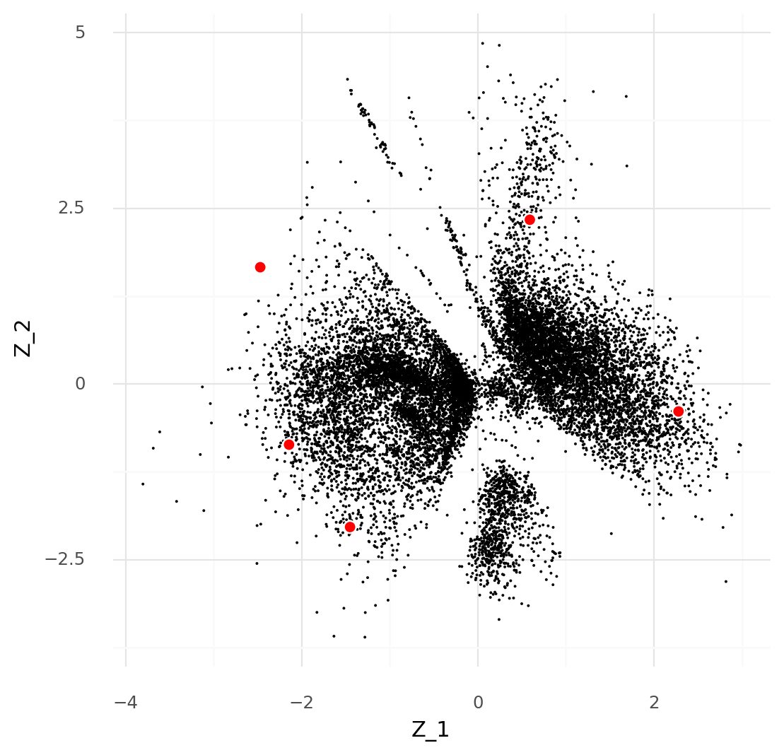
For an illustration, a simple dataset consisting of one sample from (Ren et al. 2021) can be used as in a previous post. This example has 14,545 cells limited to 141 genes known to be markers of various blood cells. Here the scVI model is fitted with a 2-dimensional representation for the sake of a simple visualization.

After fitting the model we get the following plot of the latent representations for the cells:

To investigate the effect of counting fewer mRNA molecules than were actually counted, binomial thinning can be used. The observed counts are used to estimate probabilities of all observations:

$$ P_{c, g} = \frac{Y_{c, g}}{\sum_{g} Y_{c, g}}. $$

These are passed to a binomial distribution where the number of trials are set to the a number \( n \), lower than the observed number, from which new counts are sampled:

$$ \hat{Y}^n \sim \text{B}(n, P). $$

Picking a few cells, these can be binomially thinned to different depths while keeping track of which cells they originated from. These new thinned cells \( \hat{Y}^n \) can be used to infer \( P( \hat{Z}^n \ | \ \hat{Y}^n ) \).

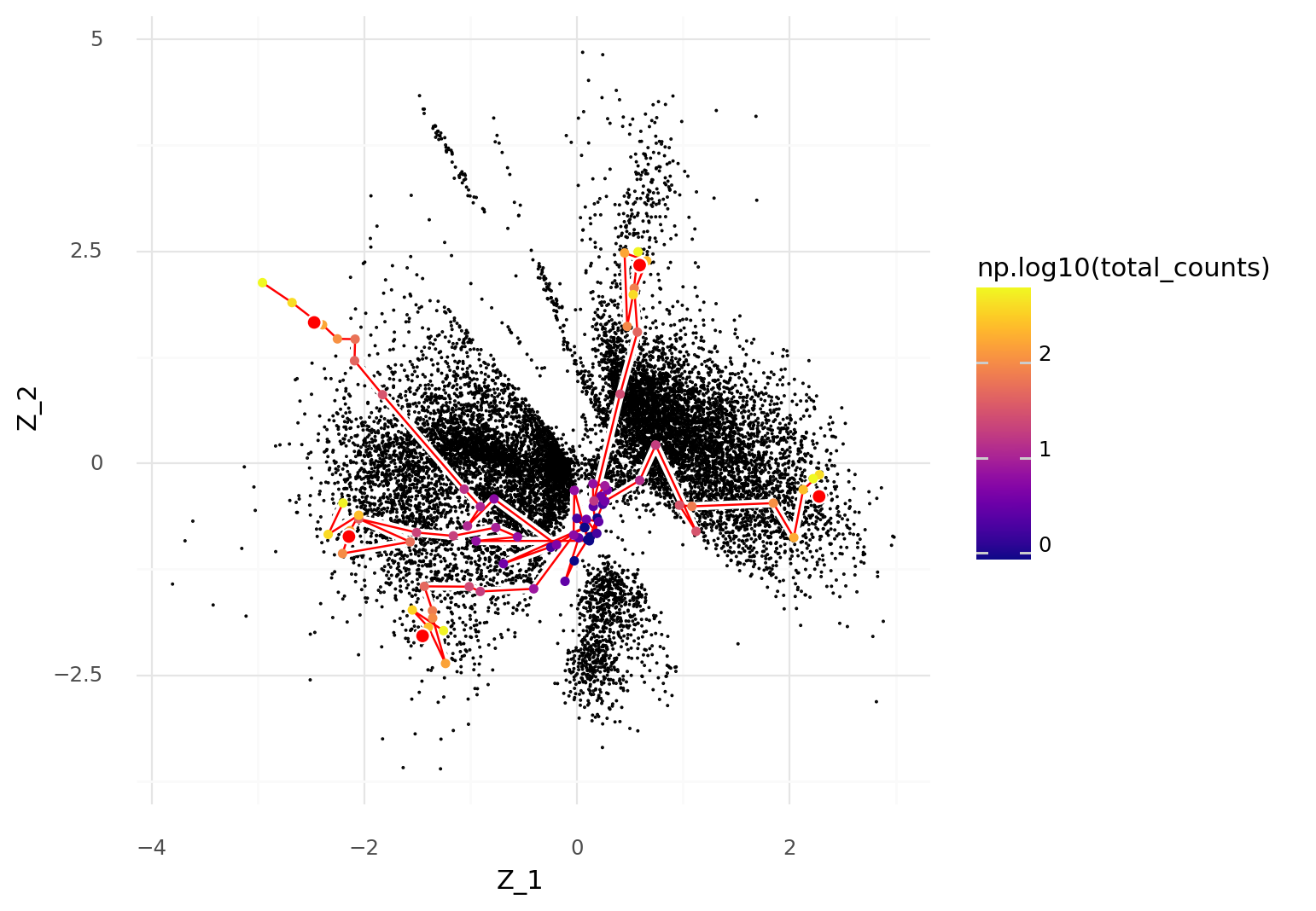
In the plot below five cells were selected for thinning and then used to obtain latent representations \( Z \). The thinned versions of the cells are connected by red lines depending on which their original cell was. These thinned cells are colored by their UMI count depth after thinning.

The plot illustrates that as the UMI count depth decreases, the more likely a cell is to be represented by central coordinates, close to the origin, in the scVI latent space.

This effect can be explained by investigating the loss function used for the scVI model. The posterior \( P(Z \ | \ Y) \) is approximated by a parameterized distribution \( Q(Z) \) specifically where \( Q(z_{c, d}) = \text{N}(\mu_{c, d}, \sigma_{c, d}) \) and

$$ \texttt{loss} = \sum_{c, g, d} \left( -\log P(Y | Z) + \text{KL}(Q(Z) || P(Z)) \right). $$

In inference, the loss is minimized. In this particular version with a Poisson likelihood,

$$ \begin{align*} \texttt{log_prob}_c &=\sum_g \log \text{Poisson}(\mathbf{y}_g \ | \ \omega_{c, g} \cdot \ell_c) \\ &= \sum_g \left( \mathbf{y}_g \cdot \log( \omega_{c, g} \cdot \ell_c) - \omega_{c, g} \cdot \ell_c - \log \Gamma (\mathbf{y}_g + 1) \right). \end{align*} $$

It is worth pointing out that \( \ell_c = \sum_g y_{c, g} \) in most situations, so \( \max{\mathbf{y}_g} \leq \ell_c \) The consequence of this is that the \( \texttt{log_prob}_c \) term is limited by the total UMI count depth \( \ell_c \).

The KL term quantifies how far the approximation of the posterior \( Q(Z) \) is from the prior \( P(Z) \). Since the prior consists of unit Gaussian distributions, the KL term is

$$ \begin{align*} \texttt{kl}_c &= \sum_d \text{KL}(Q(\mathbf{z}_d) \ || \ P(\mathbf{z}_d)) \\ &= \sum_d \text{KL}(\text{N}(\mathbf{\mu}_{c, d}, \mathbf{\sigma}_{c, d}) \ || \ \text{N}(0, 1)) = \sum_d \left( -\log \sigma_{c, d} + \frac{{\sigma_{c, d}}^2 + {\mu_{c, d}}^2}{2} - \frac{1}{2} \right). \end{align*} $$

When inferring the approximate posterior \( Q(\mathbf{z}_c) \), the magnitude of \( \texttt{log_prob}_c \) term need to beat the magnitude of the \( \texttt{kl}_c \) term to escape the isotropic unit Gaussian prior \( \text{N}(\mathbf{0}, \mathbf{1}) \).

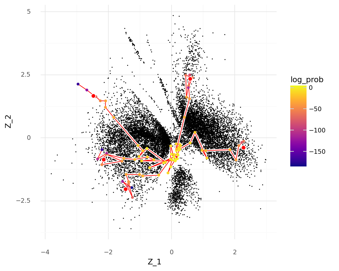
This can be illustrated by repeating the plot above, but coloring the thinned cells by the \( \texttt{log_prob}_c \) term instead of the UMI count depth.

As the \( \texttt{log_prob}_c \) term decreases, cells are more likely to be represented inside the prior \( \text{N}(\mathbf{0}, \mathbf{1}) \).

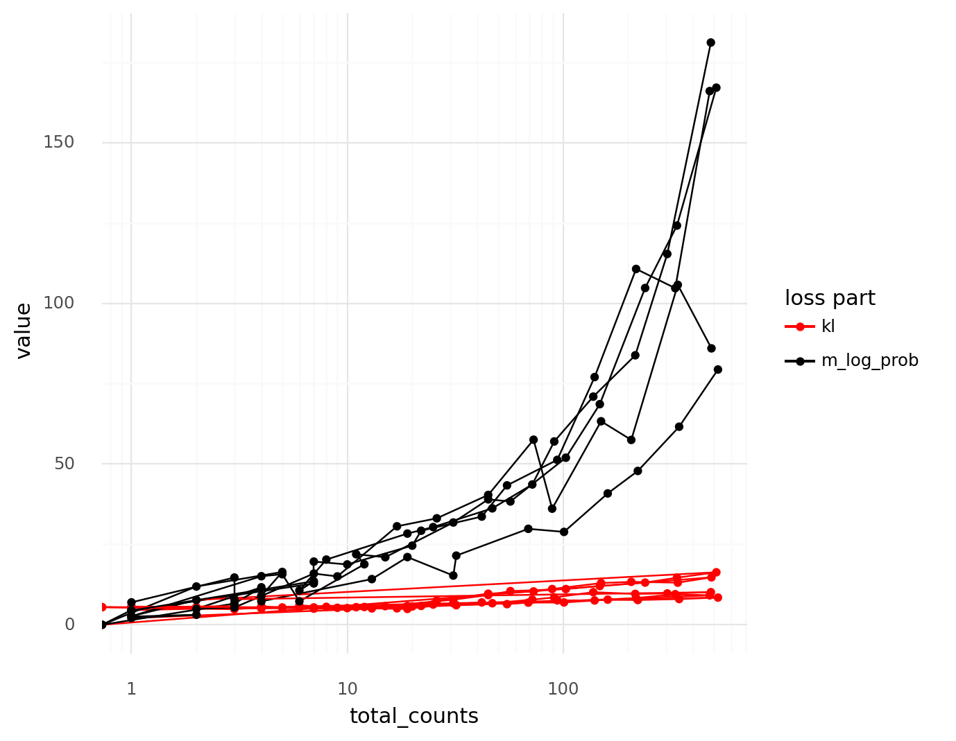
The thinned cells can be used to visualize how the relation between the \( \texttt{log_prob}_c \) term and the \( \mathtt{kl}_c \) term depend on the total UMI count depth \( \ell_c \).

Below a threshold, the magnitude of the \( -\texttt{log_prob}_c \) term is of the same magnitude as the \( \texttt{kl}_c \) term.

This explains the phenomenon of lower quality cells with fewer UMI counts landing in the center of the latent scVI representation. The intuition to keep in mind is that for count distributions, when you count fewer items you have less information than when you count more items. In these cases, information from the prior is used instead, which constrains the representations to the center.

This also highlights the value of obtaining cells with high UMI counts. If all cells in an analysis have extremely low UMI counts, it will be hard to escape the prior to learn cell states (which manifest as dense regions of the latent representation space). When working with cells that have low UMI counts, be comfortable with their identities being ambiguous; you simply can’t learn as much from them as cells with higher counts.

Notebooks for the analysis in this post are available on Github at https://github.com/vals/Blog/tree/master/230524-center-of-scvi-space.

Ren, Xianwen, Wen Wen, Xiaoying Fan, Wenhong Hou, Bin Su, Pengfei Cai, Jiesheng Li, et al. 2021. “COVID-19 Immune Features Revealed by a Large-Scale Single-Cell Transcriptome Atlas.” Cell 184 (23): 5838. https://doi.org/10.1016/j.cell.2021.10.023.

Keyboard switches on a Squarp Pyramid MIDI sequencer

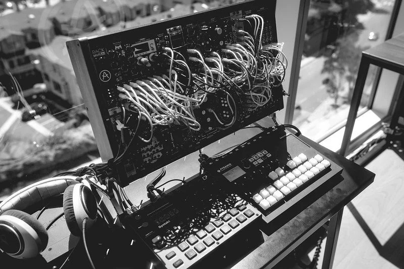
Over the last couple of years I have gotten interested in synthesizers and electronic music. I can't really play any instrument, but I enjoy noodling and making sounds and little melodies that I find pleasant. One of my favorite tools for this is the Squarp Pyramid MIDI sequencer. The workflow suits me very well and it lets me control several voices at once (usually a lead, a bass, drums, samples, and triggering effects). I tend to start with some small ideas that I build out across the different tracks, then expand with variations that I store as 'patterns' that can be switched between with some key combinations. It's a compact yet powerful device.

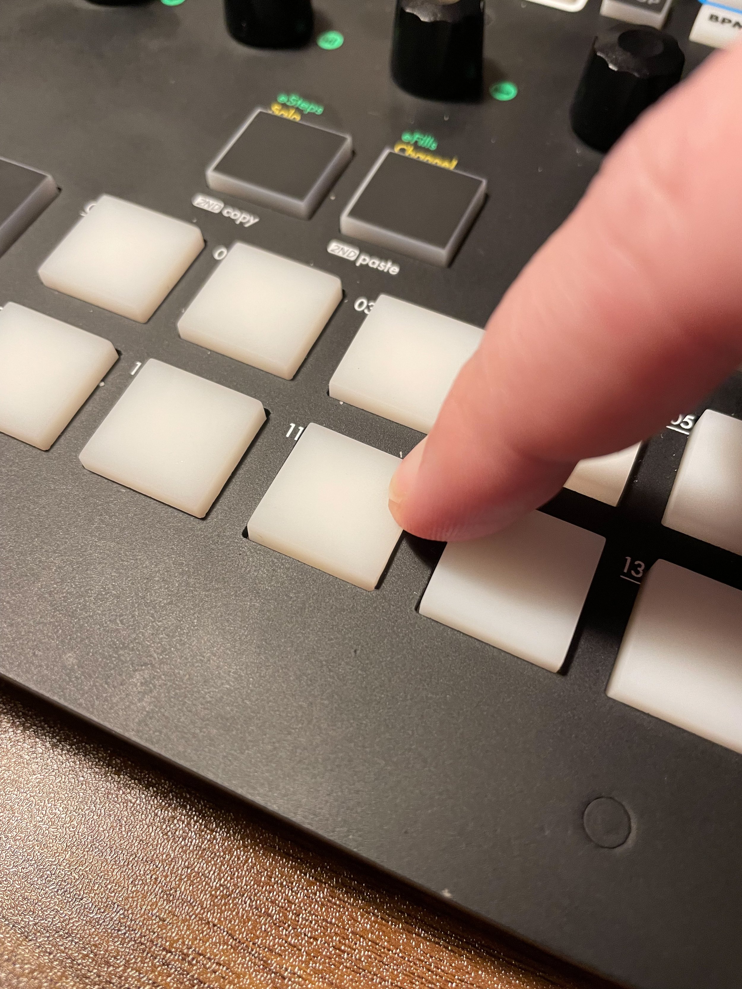
One aspect I did not enjoy was the membrane buttons used to control the sequencer. They are serviceable for programming the device, but when testing out melodies and beats it was often difficult to activate the buttons reliably. This in particular made fast switching between 'patterns' and in particular playing live sections near impossible.

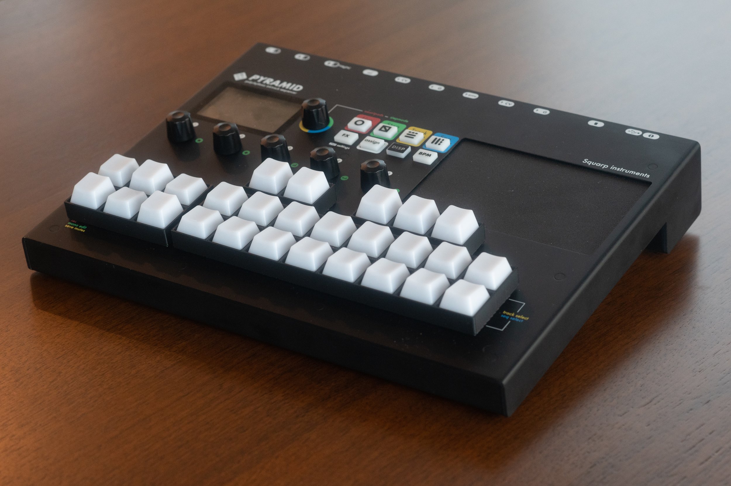
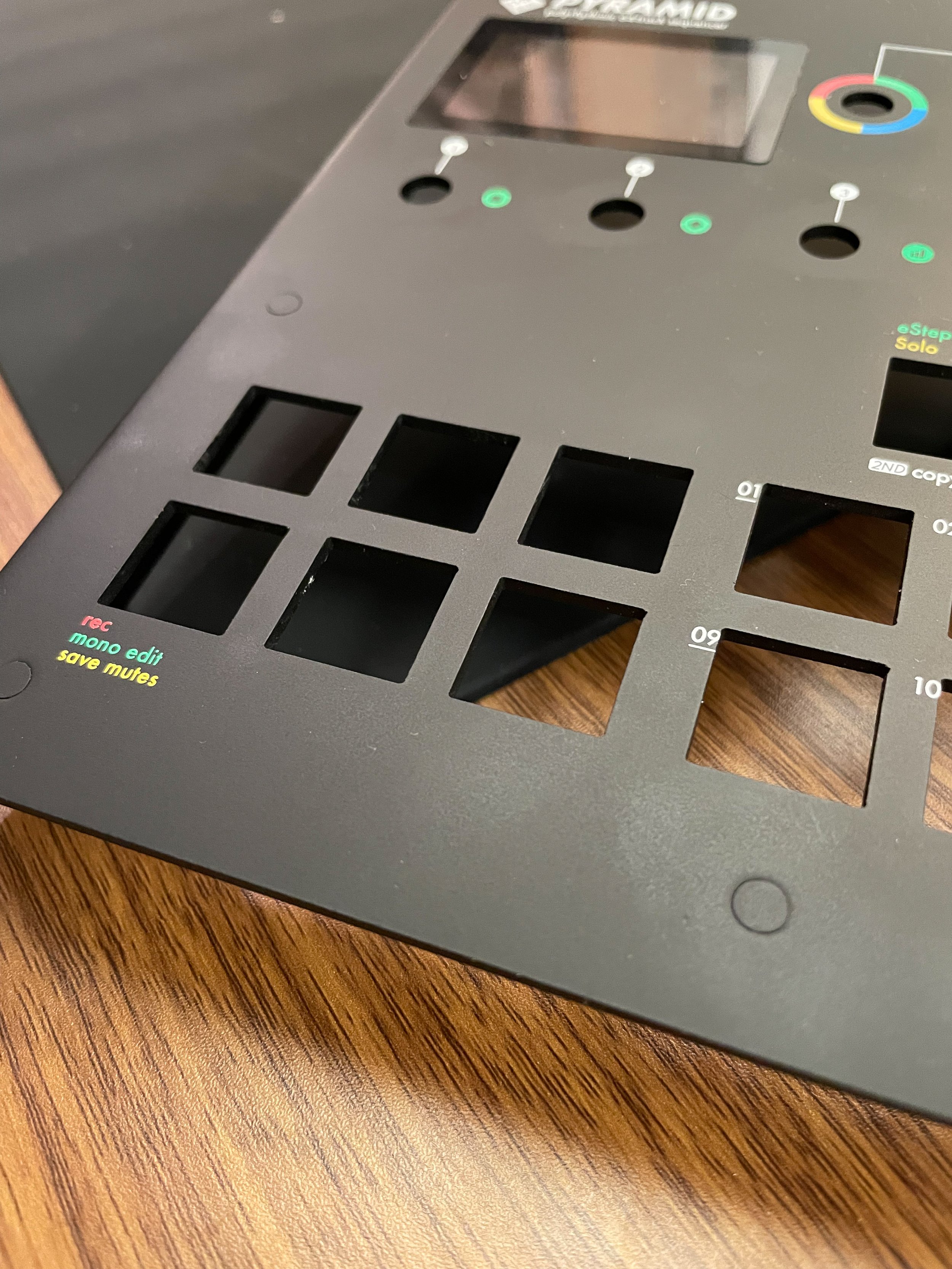
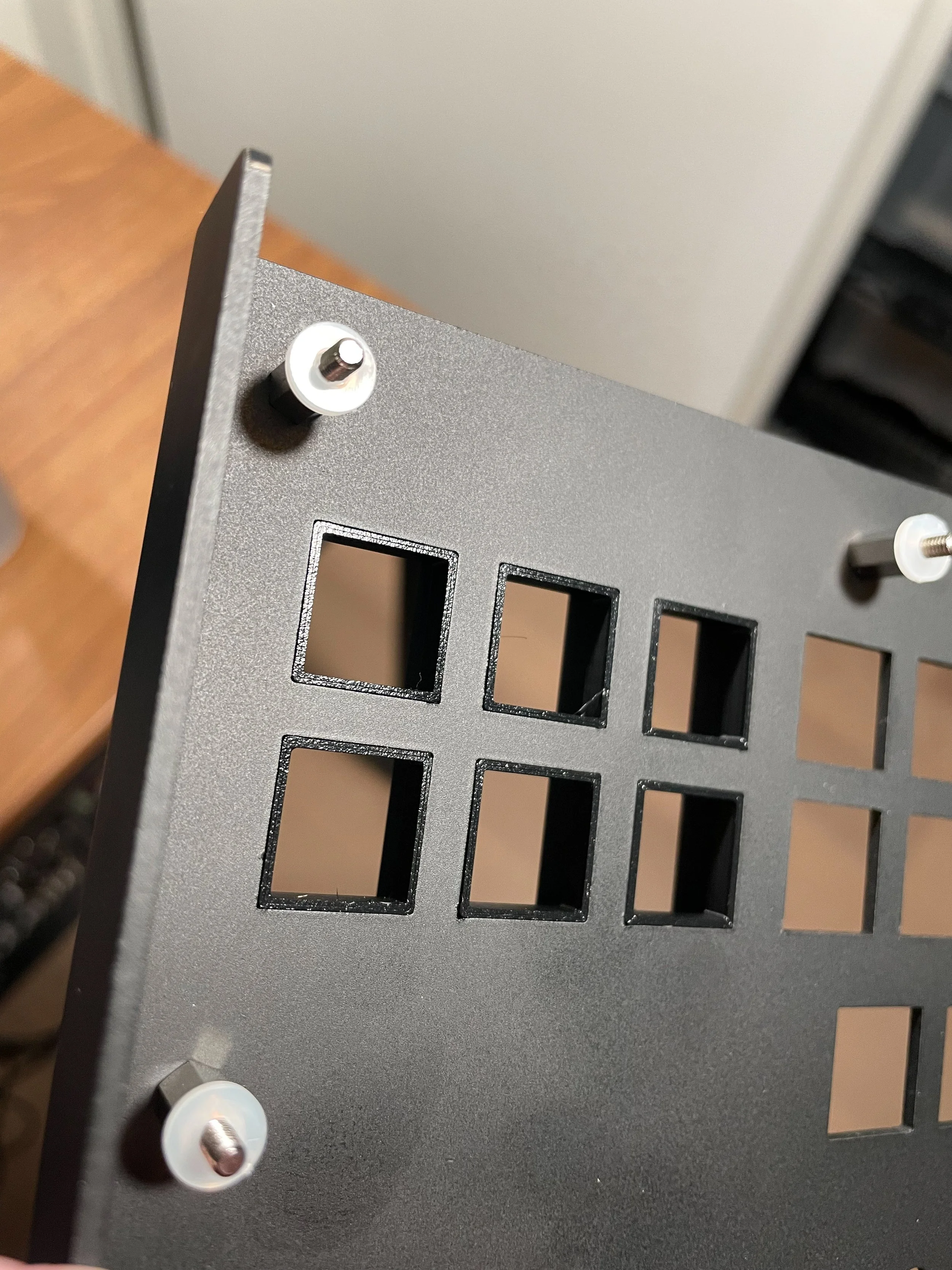
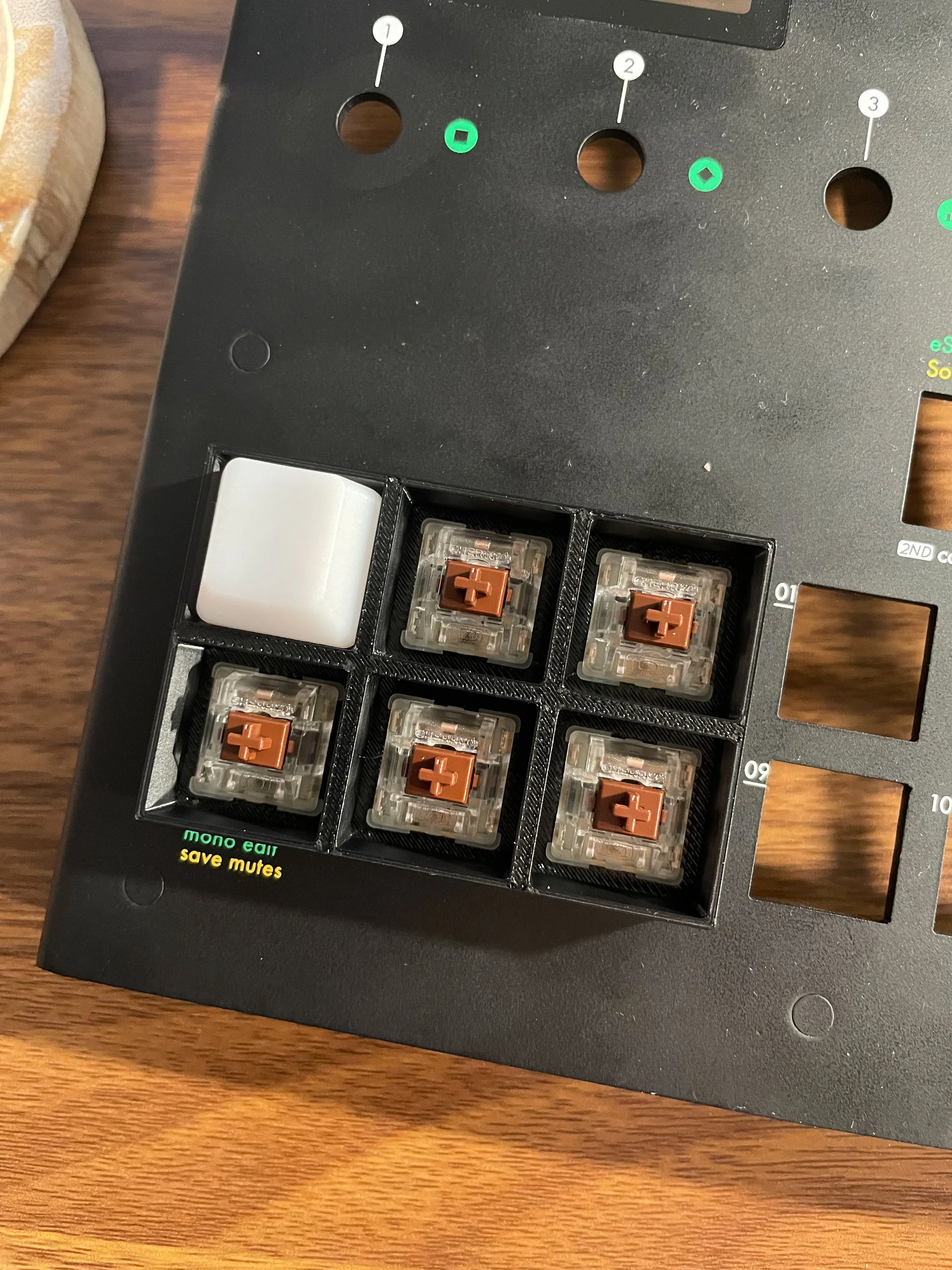
I had the sequencer placed next to my keyboard on my desk, and I noticed that the membrane buttons were very close in size to standard computer keyboard keys. I took some measurements and found that indeed, Cherry MX switches with keycaps would fit through the holes on the top of the case.


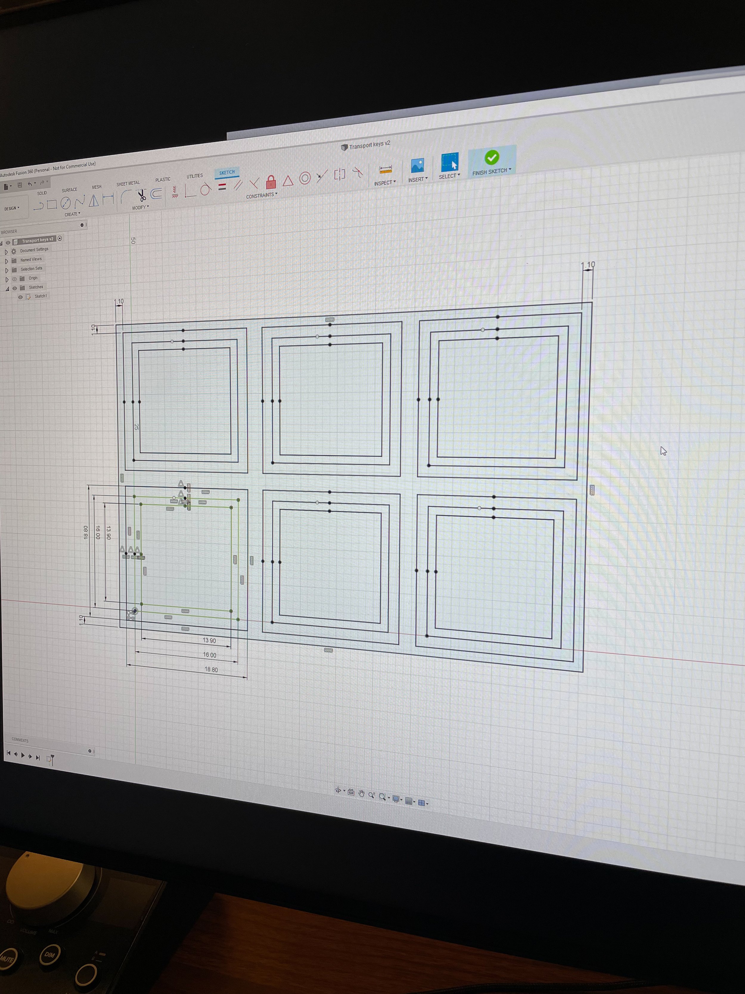
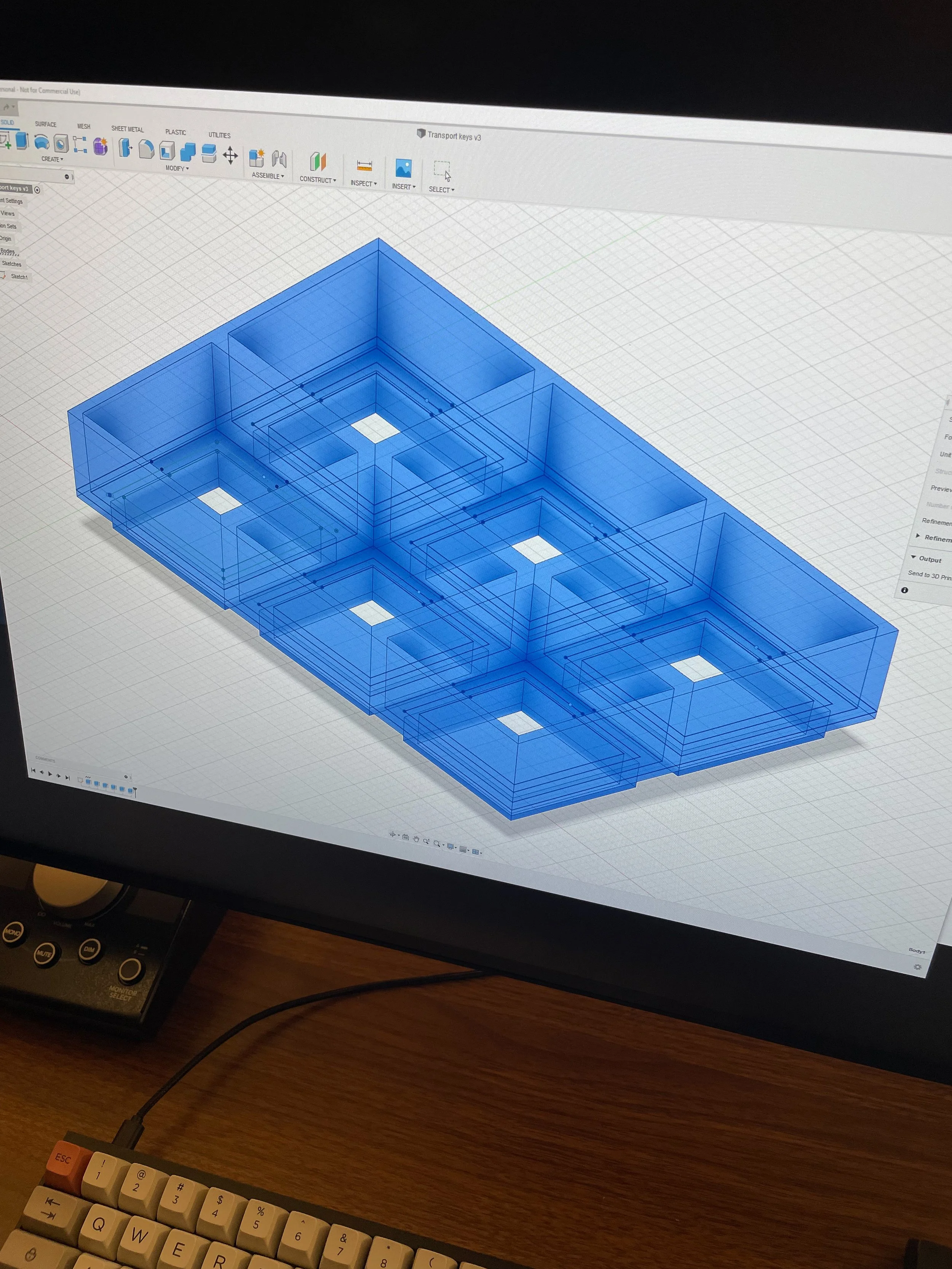
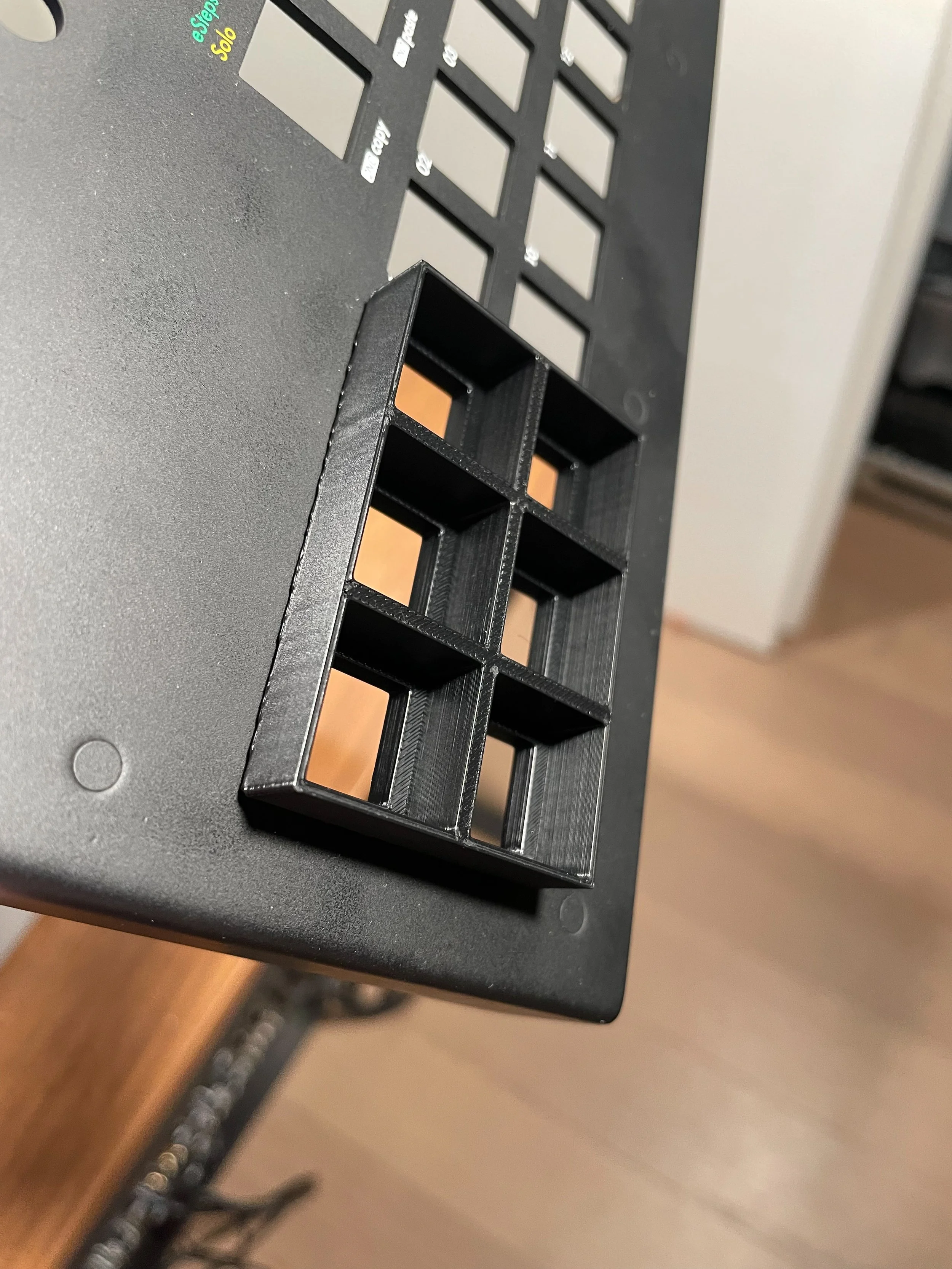
The holes were still a few millimeters too large to just plug in a switch, so I designed an adaptor with a bottom that would fit Cherry MX switches and a top that would allow keycaps to fit.


After trying a 3D print of the adaptor, to my great amazement, it worked out perfectly, on the first try! I had expected I would need to make a few iterations before arriving at a design that would actually work.

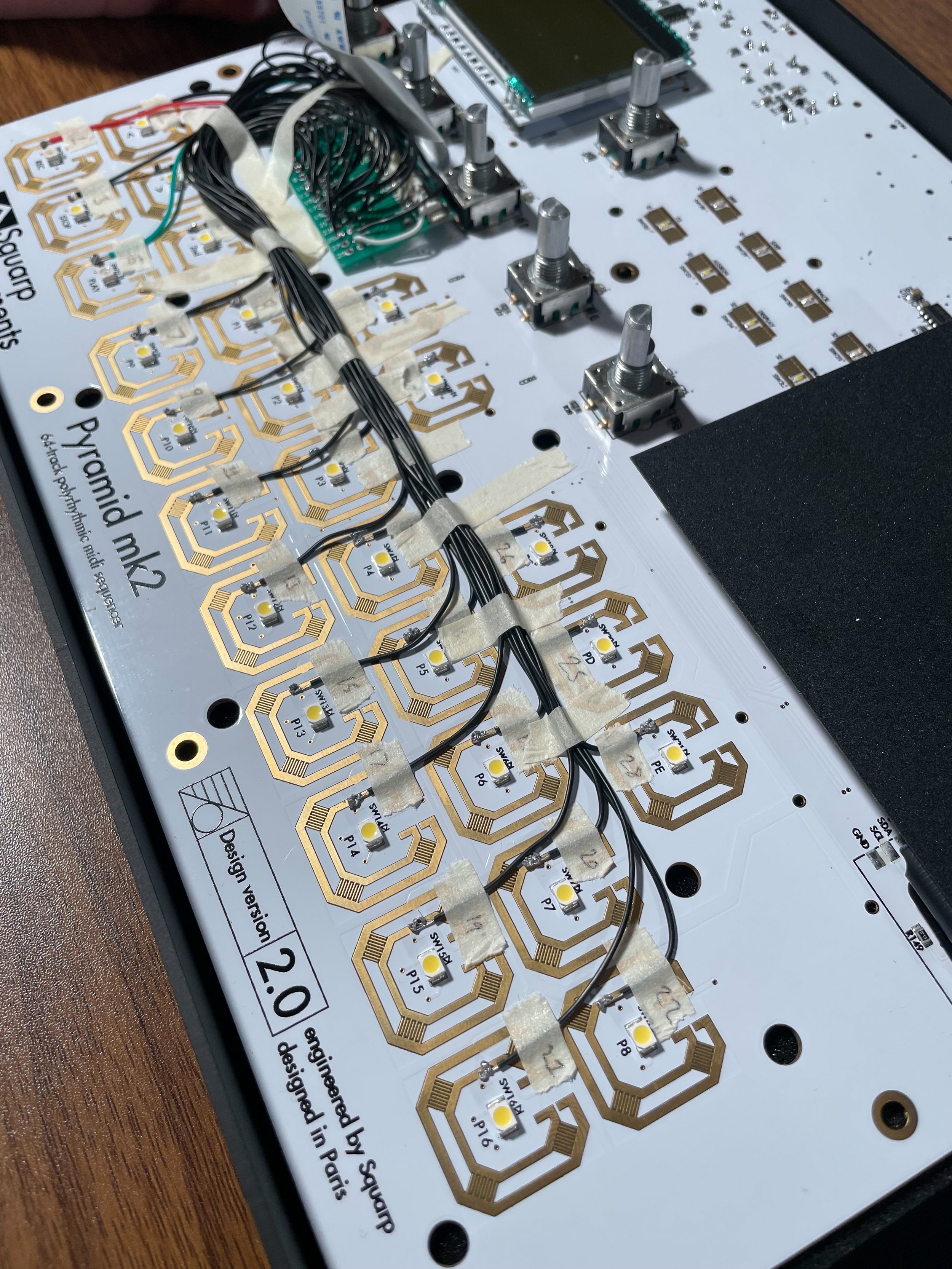
I installed switches with clear enclosures and white keycaps designed for keyboards with LEDs, hoping the lights from the LEDs on the PCB of the sequencer would shine through. It does shine through, but not nearly as strong as with the membrane buttons. It is still functional though, even if they are quite hard to see in daylight you can detect some faint light.

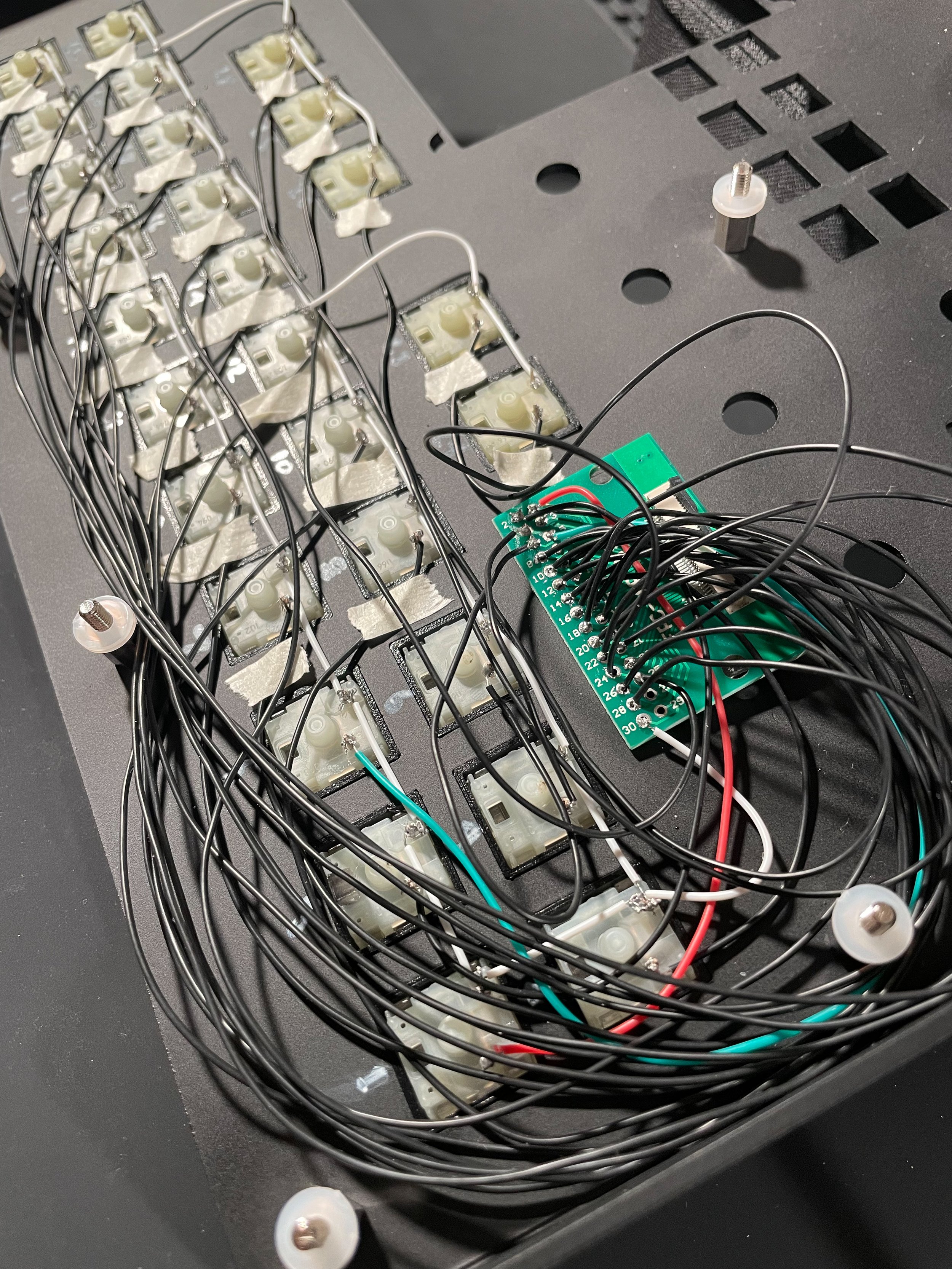
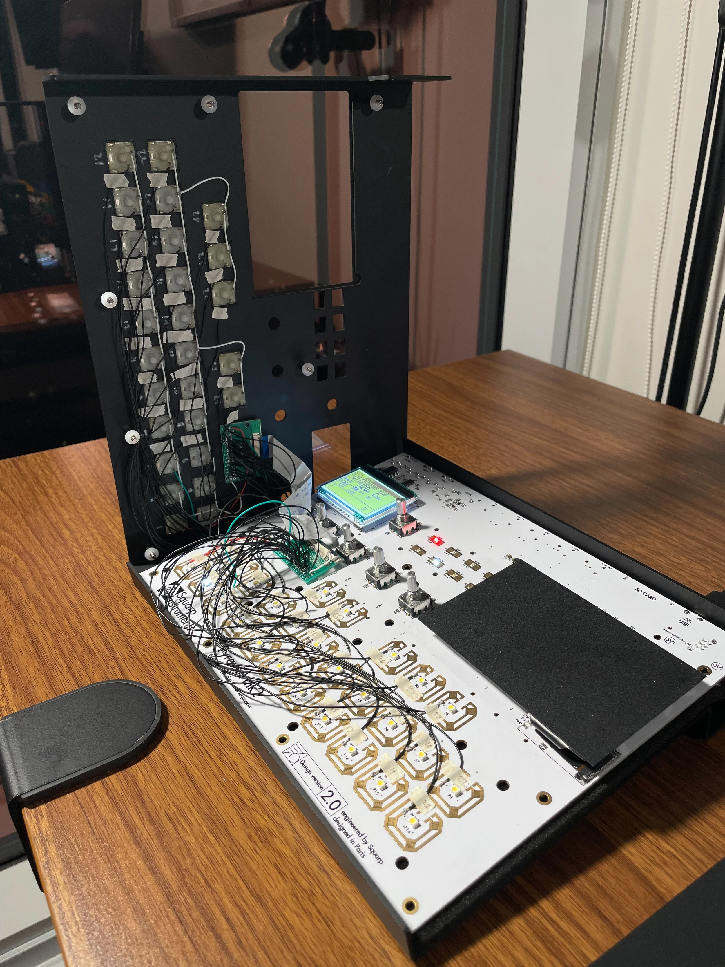
It took some experimentation to figure out how the membrane switches on the PCB could be activated with the Cherry MX switches. I soldered connections to an FFC (flat flexible cable) connector, so I could run the circuit to the cover of the sequencer where the keys are attached so I would be able to assemble and/or disassemble the sequencer more easily. Then I soldered the corresponding connections at the other end to the appropriate keys.

It took some work to fit the wiring and the FFC adaptors under the cover. In the process some connections came loose and I had to re-solder them.

Finally I got the sequencer together in a working state. In the video below I made a quick demonstration of the functionality by controlling some software instruments in Ableton Live using the modified Squarp Pyramid sequencer.

It is unfortunate the lights on the keys are as faint as they are (I was thinking of installing LEDs in the switches, but that would require twice as much wiring as is there already).

In the end though I really do think the change to these keys has transformed my sequencer to an absolutely amazing tool. I am also very happy with how the final design turned out, everything ended up fitting together very neatly! It was also a fun project, I hadn't used a 3D printer before and it has been over twenty years since the last time I soldered anything.