Timecourse analysis with Sleuth

An extremely interesting application of RNA-sequencing analysis is to study samples over a time series. This allows you to identify patterns of expression over some response to a stimuli or developmental progression.

While Sleuth together with the Kallisto from the Pachter lab makes it easy to perform differential expression analysis in the two-condition case of an RNA-seq experiment, there is still some confusion about how to perform DE over a time series. I thought it would be useful to write an example text of how to detect DE transcripts over a time course with Sleuth.

The first problem is to define what we mean by differentially expressed in the context of a time series. For a treatment-vs-control type experiment it is simple: What genes are higher or lower expressed in the treatment condition compared to the control? The first generalization which comes to mind would be to find genes whose level increase or decrease with the time points. This means finding correlation with time points and boils down to linear regression of expression with time points. However, this will mask potentially interesting genes which could for example peak in the middle of the time series. What we want is to find if the expression of a gene follows a general pattern to a higher degree than just noise.

In a linear modelling framework, such as Sleuth, a common solution for this is to use natural splines. Given a number of degrees of freedom for a natural spline model, knots will be placed along the quantiles of the observations of the time axis, which will define basis polynomials with local support.

$$ Expression \sim \beta_0 + \sum_{i=1}^3 \beta_i B_{i}(Timepoint) + \varepsilon $$

The idea is now to compare the model of a genes expression which includes the polynomial terms, with a model that only includes the noise term.

$$ Expression \sim \beta_0 + \varepsilon $$

In the latest versions of Sleuth, there is a likelihood ratio test implemented for this sort of comparison of models. This is how time course analysis is implemented both in Ballgown and Monocle. The benefit of Sleuth is the ability of using the quantification bootstraps to attempt to separate technical variance from biological variance.

Let’s get to the actual practical example. We will be using data from the publication “High-resolution mapping of transcriptional dynamics across tissue development reveals a stable mRNA-tRNA interface”. In the paper they perform RNA-sequencing on a developmental time series of mice, from both brain and liver, at six time points. For the sake of this example, let us just focus on the brain samples.

We load Sleuth and define the locations for the Kallisto outputs.

library(sleuth)
sample_id <- list('do2174', 'do2175', 'do2176', 'do2177',
'do2183', 'do2184', 'do2185', 'do2186', 'do2187', 'do2188',
'do2189', 'do2190')
paths <- list('kallisto/do2174_RNAseq_brain_mmuBL6e15.5_CRI01p_kallisto_out',
'kallisto/do2175_RNAseq_brain_mmuBL6e18.5_CRI01p_kallisto_out',
'kallisto/do2176_RNAseq_brain_mmuBL6P0.5_CRI01p_kallisto_out',
'kallisto/do2177_RNAseq_brain_mmuBL6P4_CRI01p_kallisto_out',
'kallisto/do2183_RNAseq_brain_mmuBL6e15.5_CRI01p_kallisto_out',
'kallisto/do2184_RNAseq_brain_mmuBL6e18.5_CRI01p_kallisto_out',
'kallisto/do2185_RNAseq_brain_mmuBL6P0.5_CRI01p_kallisto_out',
'kallisto/do2186_RNAseq_brain_mmuBL6P4_CRI01p_kallisto_out',
'kallisto/do2187_RNAseq_brain_mmuBL6P22_CRI01p_kallisto_out',
'kallisto/do2188_RNAseq_brain_mmuBL6P29_CRI01p_kallisto_out',
'kallisto/do2189_RNAseq_brain_mmuBL6P22_CRI01p_kallisto_out',
'kallisto/do2190_RNAseq_brain_mmuBL6P29_CRI01p_kallisto_out')
names(paths) <- sample_id

s2c <- read.table("brain_times.tsv", header = TRUE, stringsAsFactors = FALSE)
s2c <- dplyr::mutate(s2c, path = paths)
s2c[] <- lapply(s2c, as.character)
s2c


In order to pass the spline based model to Sleuth, we need to make a design matrix. This can be done by using the splines library and pass a formula using the splines by the ns() functions to model.matrix.

library(splines)
day <- s2c$day
full_design <- model.matrix(formula(~ ns(day, df = 4)))
full_design


The df parameter essentially governs how smoothed the expression patterns will be over the time points. I picked 4 because it’s the default in Ballgown. In Monocle the default is 3, but it seems this smooths the expression too much. Lower values for the df parameters will capture less “dynamics”, but will have more statistical power. 

As described in the Sleuth vignette, it is quite handy to have the external gene name which is associated to every transcript, to quickly see roughly what gene we are looking at when we see a differentially expressed transcript.

library("biomaRt")
mart <- biomaRt::useMart(biomart = "ENSEMBL_MART_ENSEMBL",
dataset = "mmusculus_gene_ensembl",
host = "www.ensembl.org")
t2g <- biomaRt::getBM(attributes = c("ensembl_transcript_id",
"ensembl_gene_id",
"external_gene_name"),
  mart = mart)
t2g <- dplyr::rename(t2g,
target_id = ensembl_transcript_id,
ens_gene = ensembl_gene_id,
ext_gene = external_gene_name)


Now we are read to start performing the Sleuth analysis

so <- sleuth_prep(s2c, full_model = full_design, target_mapping = t2g)
so <- sleuth_fit(so)
so <- sleuth_fit(so, formula = ~ 1, fit_name = "reduced")
so <- sleuth_lrt(so, "reduced", "full")


Sleuth has an interactive Shiny application associated with it to browse the results of the analysis. It’s not mandatory to use it though, and many of the handy features in it mostly makes sense for the treatment-vs-control style of experiments.

plot_qq(so, test = 'reduced:full', test_type = 'lrt', sig_level = 0.05)


We can extract the results of the likelihood ratio test as a dataframe to look at closer

lrt_results <- sleuth_results(so, 'reduced:full', test_type = 'lrt')
table(lrt_results[,"qval"] < 0.05)

FALSE  TRUE 
49523  3083


This tells us that we find 3083 transcripts which have an expression pattern ove the time course which is significantly better explained by a natural spline over the time than by just random noise. Let’s have a look at the very top transcripts.

lrt_results %>% head(n = 20) %>% dplyr::select(target_id, qval, ens_gene, ext_gene)


I don’t know enough about brain development to say if these genes make any sense in the context. We can also plot a clustered heatmap of these top genes.

plot_transcript_heatmap(so, head(lrt_results, n = 20)$target_id, 'est_counts')


Unfortunately there doesn’t seem to be a way to rename the axis labels to some other information, or to enforce ordering the samples by time point. Let’s also plot the expression of a differntailly expressed transcript to see what it looks like.

tmp <- so$obs_raw %>% dplyr::filter(target_id == 'ENSMUST00000145067')
tmp <- dplyr::full_join(so$sample_to_covariates, tmp, by = 'sample')
tmp
tmp <- transform(tmp, day = as.numeric(day))
ggplot(tmp, aes(x=day, y=est_counts)) 
  + geom_point(shape=1) 
  + geom_smooth(method = loess)

Let me guess where you’re from

Let me guess where you’re from

On the website letmeguesswhereyourefrom.com you can enter a name, and an algorithm will print five countries the name seems come from. Try it out!

I made this web application as an exercise in applying machine learning, in this post I will describe

  • How I got data,
  • How I made the model,
  • How I optimized the model for use in a web application, and,
  • How I made the web application.

Getting training data

The first problem is where to get the data from. For the model to be representative I would want data from real people. There are many lists of “Most common names in …” for various countries. These however mostly consist of either first names or surnames. I doubted just for example first names would not contain enough information to train a model. For a while I thought I could get surname lists and first name lists and randomly pair elements from them to make larger training sets. Looking for real names, I found that Wikipedia has a list of people who have Wikipedia pages by country!

We can quickly get all this data

%pylab inline
import pandas as pd
import seaborn as sns
sns.set_color_codes()

import codecs
from unidecode import unidecode

import requests

wiki = 'https://en.wikipedia.org'
res = requests.get(wiki + '/wiki/Lists_of_people_by_nationality')


By inspecting the downloaded HTML I noticed a pattern on the rows that contain links to lists of people. So I parsed these and extract the country name and URL to the list.

list_urls = {}
for line in res.content.split('\n'):
    if line.startswith('<li><a href="/wiki/List_of_'):
        l =  line.split('<li><a href="')[-1] \
                 .split('" title=')[0]
        country = l.split('/wiki/List_of_')[-1]
        list_urls[country] = l

f1 = lambda s: s.startswith('<li><a href="/wiki/')
c1 = lambda s: s.split('" title="')[-1].split('"')[0]

lists = {}
for country in list_urls:
    content = requests.get(wiki + list_urls[country]).text.split('\n')
    lists[country] = map(unidecode, map(c1, filter(f1, content)))

with open('name_list.tsv', 'w') as fh:
    for country in lists:
        for name in lists[country]:
            fh.write('{}\t{}\n'.format(name, country))


There are some obvious problems with this. Not all lines I parse out are actually lists of names, but other lists. Additionally the larger countries have so many entries that they link to lists of sublists rather than actually lists. (This includes US and China.) The number of countries isn’t that high and it would be possible to just add these manually. But I don’t feel like doing that and will ignore those cases.

To make downstream analysis easier, I romanized all names using the unidecode package. This translates all characters in the names to ASCII.

In total the process fetches in total 68,634 names distributed over 214 countries.

Making the model

I knew that N-grams of words are commonly used for document classification, and thought I can make something similar for just letters in names. Turns out this was already nicely implemented in the scikit learn as a parameter to the CountVectorizer class.

For the most part I followed the scikit-learn text analytics tutorial. The tutorial said “bags of words” representations of documents typically have more than 100 0000 features. Since a “document” in my case is a name, there are not so many n-grams in each. To get a large number of featuers I set the CountVectorizer to consider all N-grams for all N between 1 and 5. I limited the maximum number of features to 100000 so that I would know how large the data sets would be.

As per the tutorial, I push the output of the CountVectorizer through a TfidfTransformer. The idea with this is to downscale weights of features that occur in many samples.

Finally, I use these features to train a Multinomial Naive Bayes model. (I’m not discussing much of the details of the methods here, as they are well described in the references. A thing about scikit-learn for applying machine learning that I like is also that you can use a lot of very nice tools without knowing much about the details.)

All these steps are combined to a pipeline, so we can easily just supply raw text and get a categorical prediction.

from sklearn.feature_extraction.text import CountVectorizer
from sklearn.feature_extraction.text import TfidfTransformer
from sklearn.naive_bayes import MultinomialNB
from sklearn.pipeline import Pipeline
from sklearn.cross_validation import train_test_split

name_clf = Pipeline([('vect', CountVectorizer(analyzer='char',
                                              ngram_range=(1,5),
                                              max_features=100000)),
                    ('tfidf', TfidfTransformer()),
                    ('clf', MultinomialNB())])


The data is read in, and split in to a training set that we will use to tune the model, and a testing set that we will finally use to evaluate the model.

df = pd.read_table('name_list.tsv', header=-1)
df.columns = ['name', 'country']
name_train, name_test, country_train, country_test = \
train_test_split(df.name, df.country, test_size=10000)


Now I could simply train the classifier using the training data.

name_clf.fit(name_train, country_train)

predicted = name_clf.predict(name_test)
np.mean(predicted == country_test)

Out []: 0.27860000000000001


While much better than randomly guessing countries (1 / 214 = 0.0047), it’s not a particularly impressive score.

Earlier the same day, I had listened to the Talking Machines podcast where Jennifer Listgarten described how they had trained a model to predict efficient CRISPR/Cas9 guide targets (avilable in a soon to be released service Azimuth). She said that predicting the best guide was a very hard problem. But predicting say the top 5 guides had very high accuracy. Trying a small number of guides is much more efficient than many possible guides anyway.

So I stole that strategy, and return a top 5 of predicted countries for a given name. Thus I change the model evaluation criterion. The strategy is very well suited for MultinomialNB, since prediction means evaluating the posterior probability for each class. We can just take these probabilities and sort out the highest ones.

t5 = name_clf.predict_log_proba(name_test).argsort(axis=1)[:,-5:]
a = country_test
b = name_clf.get_params()['clf'].classes_[t5]
np.mean((a[:, None] == b).max(1))

Out []: 0.4647


Better, but still not stellar.

The MultinomialNB model has a hyperparameter alpha. This is a smoothing parameter that helps with the problem that many features have 0 counts in any given document. This would cause the posterior probability to be 0. The default value for alpha is 1. We’ll try to do better by optimizing the alpha by randomized cross validation.

from sklearn.grid_search import RandomizedSearchCV

a = 10 ** np.linspace(-5, 0)
rscv = RandomizedSearchCV(name_clf,
param_distributions={'clf__alpha': a},
n_iter=10,
n_jobs=2)

rscv.fit(name_train, country_train)

rscv.best_params_

Out []: {'clf__alpha': 0.014563484775012445}


We plug this value in to out classifier pipeline, and try again.

name_clf = Pipeline([('vect', CountVectorizer(analyzer='char',
                                              ngram_range=(1,5),
                                              max_features=100000)),
                     ('tfidf', TfidfTransformer()),
                     ('clf', MultinomialNB(alpha=0.014563484775012445))])

name_clf.fit(name_train, country_train)

t5 = name_clf.predict_log_proba(name_test).argsort(axis=1)[:,-5:]
a = country_test
b = name_clf.get_params()['clf'].classes_[t5]
np.mean((a[:, None] == b).max(1))

Out []: 0.66959999999999997


This is quite nice! We can make a function to check how it performs in practice.

def top_countries(name):
    log_proba = name_clf.predict_log_proba([name])
    t5 = log_proba.argsort(axis=1)[:,-5:]
    b = name_clf.get_params()['clf'].classes_[t5]
    for c, lp in zip(b[0], log_proba[:,t5].flatten())[::-1]:
        print '{}\t\t{}'.format(c, np.exp(lp))

top_countries('angela merkel')

Vietnamese      0.893538897127
Greeks      0.0294758574644
Baltic_Germans      0.0194029861994
Irish_people        0.015581222622
Bulgarians      0.00674997108663


While some of the suggestions are… counterintuitive… there is some German there! The strategy to return a top 5 seem to work out.

Making the model deployable

While I thought it would be nice to make the model usable through a web application, I didn’t want to spend a fortune doing so! Heroku offers free web application hosting in their Free tier with the limitation of 512 MB of memory. Additionally, the final size of the compiled web application “slug” can only be 300 MB.

The training data is 58 000 examples with 100 000 features each. The MultinomialNB model needs to store two dense matrices of size (58 000, 100 000). Running the model in the Python interpreter requires a bit over 1 GB of RAM. Storing the model with joblib.dump() as recommended in the documentation creates around 700 MB of data, so we wouldn’t be able to deploy it on Heroku.

The strategy I settled for was to put in a step in the pipeline to ignore non-informative features. To find which features contain the most information I used TruncatedSVD, a dimensionality reduction technique known to work well for “bags of words” models.

from sklearn.decomposition import TruncatedSVD

tf_pipeline = Pipeline([('vect', CountVectorizer(analyzer='char',
                                                 ngram_range=(1,5),
                                                 max_features=100000)),
                        ('tfidf', TfidfTransformer())])

name_features = tf_pipeline.fit_transform(name_train)

tsvd = TruncatedSVD(n_components=400)

tsvd.fit(name_features)

tsvd.explained_variance_ratio_.sum()

Out []: 0.27138872714390422


I picked 400 components because sqrt(100000) = 316.23 and I rounded up. There’s no rule for this or so, but this let me fit the TruncatedSVD for the entire training set in a reasonable amount of time. The total variance explained by 400 components is about 27%. It doesn’t sound as much, but it can inform us on the importance of the features.

We extract importances in the TruncatedSVD by looking at the lengths of the singular vectors stored in TruncatedSVD.components_.

idx = np.linalg.norm(tsvd.components_[:, :], axis=0).argsort()


We make a “Reducer” class which we can plug in to the pipeline to tell the pipeline which features to pass on from the feature extraction step to the MultinomialNB classifier.

from sklearn.base import TransformerMixin

class Reducer(TransformerMixin):
def __init__(self, idx):
    self.idx = idx

def fit_transform(self, X, y=None, **fit_params):
    return self.transform(X)

def transform(self, X):
    return X[:, self.idx]

def get_params(self, *k, **kw):
    return {'': ''}


We could include the important feature selection in a fit method, but to speed this up, we perform that calculation offline and provide the indexes of the features to the constructor of the object.

I checked a range of the number of features to pass on to the MultinomialNB by looking at the model score. This is bad thing to do and you shouldn’t do it! Now I’m causing an information leak between the parameter selection and the model evaluation. However, I think it’s relatively obvious that the score will be monotonically increasing with the number of features. And I had already decided I wanted to use between 10 000 and 20 000 features for the final model due to the computational budget. I was just curious at what rate things would get better if I’d allow more features.

Now we train the model with a reducer step that passes the 15 000 most informative features to the classifier step.

name_clf = Pipeline([('vect', CountVectorizer(analyzer='char',
                                              ngram_range=(1,5),
                                              max_features=100000)),
                     ('tfidf', TfidfTransformer()),
                     ('reducer', Reducer(idx[-15000:])),
                     ('clf', MultinomialNB(alpha=0.014563484775012445))])

name_clf.fit(name_train, country_train)

t5 = name_clf.predict_log_proba(name_test).argsort(axis=1)[:,-5:]
a = country_test
b = name_clf.get_params()['clf'].classes_[t5]
s = np.mean((a[:, None] == b).max(1))
s

Out []: 0.62849999999999995


A pretty modest performance decrease given that the model only takes 15% of the memory needed before! As a side effect, the prediction operation in the model is now a lot snappier as well, which feels good in the web app.

With the indices for the features saved, it is actually relatively quick to just train the model from the total amount of raw data. So for deploying the web app, I just have it load the data and train when it launches. It takes about 30 seconds, and the raw data (the list of names and countries) is about 2 MB in total.

Web application

The web application itself is written using the microframework Flask. I define one entry point that provides an API, where the name is queried and the predictor is called to return the top scoring countries. The API returns these in JSON format. The second entry point just serves a HTML file, which in turn loads a Javascript file that connects the input box and buttons to the API.

To get access to scientific Python tools like scikit-learn on Heroku I use the Conda Buildpack.

You can see the full implementation of the app on GitHub, as well as the Jyputer notebook where I made the model.

Finally, have a look at the result!

letmeguesswhereyourefrom.com

Comparing unpublished RNA-Seq gene expression quantifiers

During the conference BoG a new RNA-Seq gene expression quantification tool called Kallisto was announced and released by the Pachter group. This tools have me excited because it is following the trend of Sailfish, RNASkim and recently Salmon. The classical approach for gene (or transcript) expression is aligning reads to genome, then by looking at coverage figuring out which transcripts are expressed at which levels. These new tools in stead use information contained in reads where exact mapping is not completely necessary, and use that to deconvolve the mixture proportions of transcripts in a sample.

To compare these quantifiers, and also using results from a classical TopHat + Cufflinks combination as a control I used five batches of single cell RNA-Seq from three different published data sets: SRP030617 (batch 1), SRP041736 (batch 2 & 3), and EGAS00001001204 (batch 4 & 5). These are all data from human cells, in total 284 samples. The data have between ~100 000 reads and ~5 000 000 reads.

All these data sets have had ERCC spike-ins added to them. To compare quantification accuracy, I first quantify expression for all genes / transcripts plus the spike-ins using the different tools. Then I extracted the TPM values for the spike-ins and looked at the Pearson correlation of the log transformed TPM values and the log transformed concentration of ERCC spike-ins. The plots below shows the distribution of these Pearson R values for the different tools over the different dataset batches. The n refers to the number of samples in a given batch.

They all perform well, at least equally well to TopHat + Cufflinks, and generally have pretty high correlation values (very few are below 0.8). In some cases Salmon seem to perform better.

To make the task a bit harder, we can look at the input dilution of ERCC’s included in the publications of the data sets and look only at spike-ins present at low levels. In this case given the concentration and dilution in to the volume of the experiments, we look only at the spike-ins present at between 1 and 50 RNA molecule copies.

All the methods perform equally, varying from surprisingly good to pretty bad depending on data set.

Regarding speed, the TopHat + Cufflinks combo took something along the lines of a half a day per sample, using multithreading over 12 cores for each sample. (I didn’t save the timings). The Salmon quantification took about 15 minutes per sample, also with 12 cores multithreading, while the Kallisto took about 10 minutes per sample and does not do any multithreading.

It should be noted that since there are no alternative splice forms for the ERCC spike-ins this doesn’t tell us anything about correction or quantification of alternative transcripts.

Modelling Measles in 20th Century US

A while ago some people at the Wall Street Journal published a number of heatmaps of incidence of infectious diseases in states of the US over the 20th century. This started a bit of a trend online where people remade the plots with their own sensibilites of data presentation or aestethics.

After the fifth or so heatmap I got annoyed and made a non-heatmap version.

I considered the states as individual data points, just as others had treated the weeks of the years in the other visualizations. Since the point was to show a trend over the century I didn’t see the point of stratifying over states. (The plot also appeared on Washinton Post’s Wonkblog)

The data is from the Tycho project, an effort to digitize public health data from historical records to enable trend analysis.

I thought it would be interesting to look at some other features of the data beside the global downward trend, and in particular how the incidence rate varies over time. In total there are about 150 000 data points, which I figured would also be enough to tell differences between states when considering the seasonal trend over a year as well.

We make a linear model by fitting a spline for the yearly trend, and a cosine curve for the seasonal change in measles incidence over a year. We also choose to be even more specific by finding different seasonal parameters for each state in the US.

$$ y = \sum_{i=0}^n c_i \cdot B_i\left(x_\text{year}\right) + \alpha_\text{state} \cdot \cos\left(\frac{2 \pi}{52}\cdot ( x_\text{week} - 1)\right) + \beta_\text{state} \cdot \sin\left(\frac{2 \pi}{52}\cdot ( x_\text{week} - 1)\right) $$

This way we will capture the global trend over the century, as well as a seasonal component which varies with the week of the year for every state. The global trend curve look very similar to the old version.


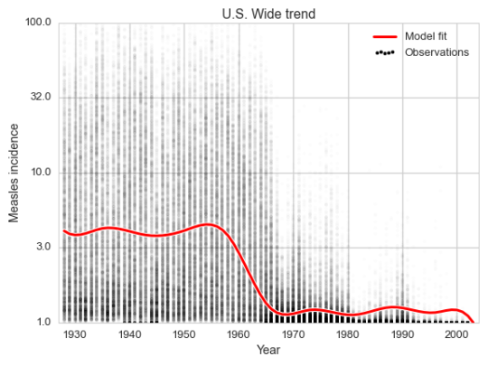
Every faint dot in the plot is a (state, week) pair. There are up to 2 600 of these in every year, so seeing them all at once is tricky. But we can still see the trend.

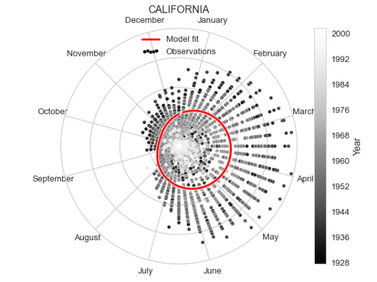
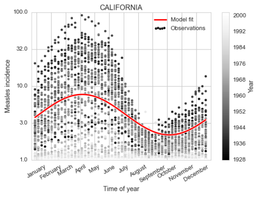
As a zoomed in example, let us now focus on one state and investigate a seasonal component.


It is fairly clear both from looking at the data and the fit of the cosine curve how the measles incidence (which is defined as number of cases per 100 000 people) changes over the year, peaking in early April.

As an alternative representation of the same plot, we can put it in polar coordinates to emphasise the yearly periodicity.

We fitted the model such that we will have a different seasonal component for each state. To visualize them all at once we take the seasonal component for each state, assign a color value based on it’s level on a given week, and put this on a map. We do this for every week and animate this over the year, resulting in the video below.


In the video green corresponds to high incidence and blue to low. There is an appearance of a wave starting from some states and going outwards towards the coasts. This means some states have different peak times of the measles incidence than others. We can find the peak time of a state’s seasonal component by doing some simple trigonometry.

$$ \rho \cos\left(\frac{2 \pi t}{l} - \phi\right) = \rho \cos(\phi) \cos\left(\frac{2 \pi t}{l}\right) + \rho \sin(\phi) \sin\left(\frac{2 \pi t}{l}\right) = $$ $$ = \alpha \cos\left(\frac{2 \pi t}{l}\right) + \beta \sin\left(\frac{2 \pi t}{l}\right) $$ $$ \alpha = \rho \cos(\phi), \ \beta = \rho \sin(\phi) $$ $$ \rho^2 = \alpha^2 + \beta^2 $$ $$ \phi = \arccos\left(\frac{\alpha}{\rho}\right) $$

So $ \phi $ will (after scaling) give us the peak time for a state (meaning the offset of the cosine curve). After extracting the offset for each state, we make a new map illustrating the peak times of measles incidence over the year.


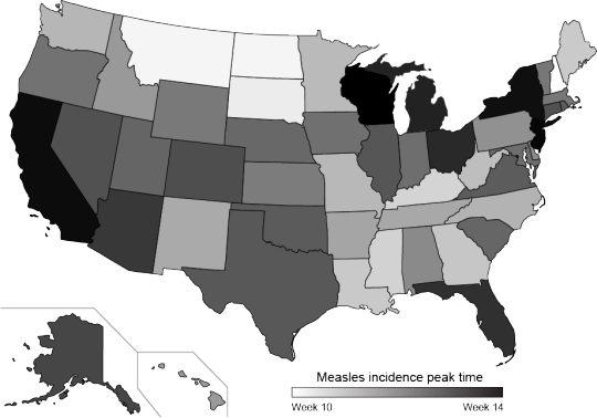
The color scale ranges from week 10 (white) in early March to week 14 (black) in early April. We didn’t provide the model with locations of the states, but the peak times do seem to cluster spatially.


Methodology

I also want to show how I did this.

%pylab inline

# Parsing and modelling
import pandas as pd
import seaborn as sns
import statsmodels.formula.api as smf

# Helps with datetime parsing and formatting
from isoweek import Week
import calendar

# For plotting the spline
from patsy.splines import BS
from scipy import interpolate

# For creating US maps
import us
from matplotlib.colors import rgb2hex
from bs4 import BeautifulSoup


The data we use from the Tycho project comes in a csv which we parse with Pandas.

measles = pd.read_csv('MEASLES_Incidence_1928-2003_20150413093130.csv', skiprows=2)
measles.index = pd.DatetimeIndex([Week(*t).monday() for t in zip(measles.YEAR, measles.WEEK)])
measles = measles.drop(['YEAR', 'WEEK'], 1)
measles = measles.convert_objects(convert_numeric=True)


Now we have tabular data of this form

measles.iloc[:5, :5]


ALABAMA ALASKA ARIZONA ARKANSAS CALIFORNIA
1928-01-02 3.67 NaN 1.90 4.11 1.38
1928-01-09 6.25 NaN 6.40 9.91 1.80
1928-01-16 7.95 NaN 4.50 11.15 1.31
1928-01-23 12.58 NaN 1.90 13.75 1.87
1928-01-30 8.03 NaN 0.47 20.79 2.38


This is a large matrix of states vs time points with incidence in each cell. For making a linear model we would prefer to have it in a form where each row is an observation, and the columns giving variables used.

year = []
week = []
state = []
incidence = []
for i in measles.index:
    for c in measles.columns:
        year.append(i.year)
        week.append(i.week)
        state.append(c)
        incidence.append(np.log10(measles.ix[i, c] + 1))

data = pd.DataFrame({'year': year,
                     'week': week,
                     'state': state,
                     'incidence': incidence})
data.iloc[:5, :5]


incidence state week year
0 0.669317 ALABAMA 1 1928
1 NaN ALASKA 1 1928
2 0.462398 ARIZONA 1 1928
3 0.708421 ARKANSAS 1 1928
4 0.376577 CALIFORNIA 1 1928


We can now use statsmodels to define and fit the linear model

df = 12
d = 3
model = smf.ols('incidence ~ bs(year, df=df, degree=d, include_intercept=True) \
                + np.cos(2 * np.pi / 52 * (week - 1)) : C(state) \
                + np.sin(2 * np.pi / 52 * (week - 1)) : C(state) \
                - 1', data=data).fit()


To be able to use the parameters fitted for the spline, a bit of plumbing is needed. We let patsy and statsmodels pick the knots for the spline, for which the coefficients are fitted by the OLS model. One could calculate these knots directly from the data. But it is simpler to grab the function for picking the knots from patsy. Then we extract the spline coefficients from the model parameters.

my_bs = BS()
my_bs.memorize_chunk(data.year, df=df, degree=d, include_intercept=False)
my_bs.memorize_finish()

coeffs = []

conf_int= model.conf_int(alpha=0.05)
for i in range(df):
    parameter_name = 'bs(year, df=df, degree=d, include_intercept=True)[{}]'.format(i)
    coeffs.append(model.params[parameter_name])

knots = my_bs._all_knots

tck = (np.array(knots), np.array(coeffs), 3)


The interpolate function from scipy uses triples of knots, coefficients and the degree of the basis polynomials as a parameter, which is used to evaluate any point in the domain of the spline.

x = np.arange(1928, 2004)
y = interpolate.splev(x, tck)


Once we have done this, we can create the first figure.

figsize(8, 6)

# For legend with high alpha dots
plt.scatter(-1, -1, c='k', edgecolor='w', label='Observations')
plt.scatter(data.year, data.incidence, alpha=0.01, edgecolor='w', c='k');

plt.plot(x, y, c='w', lw=5);
plt.plot(x, y, c='r', lw=3, label='Model fit');

plt.xlim(x.min() - 1, x.max() + 1);
plt.xlabel('Year')

plt.ylim(0, 2.);
loc, lab = plt.yticks()
lab = [np.round(10 ** l) for l in loc]
plt.yticks(loc, lab);
plt.ylabel('Measles incidence');

plt.legend(scatterpoints=5)

plt.title('U.S. Wide trend');

plt.tight_layout();
plt.savefig('per_year.png');


Next we extract the periodic component parameters for a given state and define a function of the week of the year.

state = 'CALIFORNIA'

alpha = model.params['np.cos(2 * np.pi / 52 * (week - 1)):C(state)[{}]'.format(state)]
beta  = model.params['np.sin(2 * np.pi / 52 * (week - 1)):C(state)[{}]'.format(state)]

def periodic(week):
    return alpha * np.cos(2 * np.pi / 52 * (week - 1)) + \
           beta * np.sin(2 * np.pi / 52 * (week - 1))


And using this we can create the second plot

figsize(8, 6)
fig = plt.figure()
ax = fig.add_subplot(1, 1, 1)
plt.scatter(data.query('state == "{}"'.format(state)).week,
            data.query('state == "{}"'.format(state)).incidence,
            c=data.query('state == "{}"'.format(state)).year,
            alpha=0.99,
            s=30,
            cmap=cm.Greys_r,
            edgecolor='w',
            label='Observations', color='k')

x = np.linspace(1, 52, 100)
year = 1950

yy = np.maximum(periodic(x) + y[year - 1928], 0)
plt.plot(x, yy, lw=5, c='w') + \
plt.plot(x, yy, lw=3, c='r', label='Model fit');

plt.xlim(x.min() - 1, x.max() + 1);
plt.ylim(0, 2);

loc, lab = plt.yticks()
lab = [np.round(10 ** l) for l in loc]
plt.yticks(loc, lab);
plt.ylabel('Measles incidence');

xtloc = 1.5 + 52. / 12 * np.arange(0, 13)
plt.xticks(xtloc, calendar.month_name[1:], rotation=30);
plt.xlabel('Time of year');

plt.title(state)
plt.legend(scatterpoints=5)

plt.colorbar(label='Year');

plt.tight_layout();
plt.savefig('ca_per_week.png');


To create the polar version of the same plot we don’t need to change much, just define the axis to be polar, and transform the x range from 1 to 52 to be between 0 and $2\pi$. Though we do also flip the orientation and rotate the 0 of the polar coordinates since having January 1st on top feels more intuitive, as well as clockwise direction.

fig = plt.figure()
ax = fig.add_subplot(111, projection='polar')

ww = data.query('state == "{}"'.format(state)).week
plt.scatter(np.pi / 2.0 - 2 * np.pi * ww / 52,
            data.query('state == "{}"'.format(state)).incidence,
            c=data.query('state == "{}"'.format(state)).year,
            alpha=0.99,
            s=30,
            cmap=cm.Greys_r,
            edgecolor='white',
            color='k',
            label='Observations')

x = np.linspace(1, 52, 100)

year = 1950
yy = np.maximum(periodic(x) + y[year - 1928], 0)
xx = np.pi / 2.0 - 2 * np.pi * x / 52
plt.plot(xx, yy, lw=5, c='w');
plt.plot(xx, yy, lw=3, c='r', label='Model fit');

plt.ylim(0, 2);

month_locs = np.pi / 2.0 + 2 * np.pi / 24 - 2 * np.pi / 12 * np.arange(13)
ax.set_xticks(month_locs);
ax.set_xticklabels(calendar.month_name);
ax.set_yticks([0.5, 1.0, 1.5, 2.0]);
ax.set_yticklabels([''] * 4);

ax.set_title(state);

plt.legend(scatterpoints=5, loc='upper center')

plt.colorbar(label='Year');

plt.tight_layout();
plt.savefig('ca_per_week_polar.png');


Now, the US state map (also known as a choropleth). This was WAY more complicated than I tought it would be! I imagined there would be some simple functions in matplotlib or similar package. But the ones I tried required map files I wasn’t familiar with and some of them I couldn’t get running. In particular I think GeoPandas is interesting, but I could not get it working.

After trying a bunch of packages and approaches, at some point I ended up with an SVG file with defined state paths. I’m not completely sure were it came from, it might have been from simplemapplot. Just to be sure, I put the SVG file up on a gist.

Before going on to making the visualization, let’s put all the states’ seasonal functions in a dictionary so we can easily use them.

def make_periodic(state):
    alpha = model.params['np.cos(2 * np.pi / 52 * (week - 1)):C(state)[{}]'.format(state)]
    beta  = model.params['np.sin(2 * np.pi / 52 * (week - 1)):C(state)[{}]'.format(state)]

    def periodic(week):
        return alpha * np.cos(2 * np.pi / 52 * (week - 1)) + \
               beta * np.sin(2 * np.pi / 52 * (week - 1))

    return periodic

periodics = {}
for state in data.state.unique():
    periodics[state] = make_periodic(state)


Ok, so the approach that we take is to use BeautifulSoup to parse and edit the SVG file.

svg = open('output_state_map.svg', 'r').read() 
soup = BeautifulSoup(svg)


The way to change the colors is to change the style attributes of each state element in the SVG. The inspiration for this strategy was this IPython notebook where the same is done on an Iowa map.

First we set up a baseline path style which we will append the color to.

path_style = "font-size:12px;fill-rule:nonzero;stroke:#000000;" + \
             "stroke-width:1;stroke-linecap:butt;stroke-linejoin:bevel;" + \
             "stroke-miterlimit:4;stroke-opacity:1;stroke-dasharray:none;" + \
             "marker-start:none;fill:"


So what we do with this is to loop over the weeks, and for each week color all the states according to their seasonal incidence functions. The colors are converted to hex codes and assigned to the corresponding state’s path. We save one SVG per week.

for w in range(1, 53):
    all_states = soup.findAll(attrs={'class':'state'})
    for p in all_states:
        state = us.states.lookup(p['id']).name.upper()
        p['style'] = path_style + rgb2hex(cm.winter(periodics[state](w) + 0.4))

    h = soup.find(attrs={'id': 'hdlne'})
    mnd = Week(1990, w).monday()
    h.string = calendar.month_name[mnd.month]

    fo = open("/tmp/state_map_{:02}.svg".format(w), "wb")
    fo.write(soup.prettify());
    fo.close()


The modified SVG files are saved as if they are HTML files by BeatifulSoup. The files will still be viewable in web browsers. But for using conversion tools or vector graphics editing tools these need to be in proper SVG format. This is farily easy to fix, one just need to remove the <body> and <html> tags from the file.

%%bash
for f in /tmp/state_map_*.svg; do
    grep -v "body\|html" $f > $f.tmp
    mv $f.tmp $f
done


Once this has beed fixed, we can create an animated gif using the convert command from ImageMagick.

%%bash
convert -delay 6 -loop 0 /tmp/state_map_??.svg animated_state_map.gif


Because having a constantly animating gif on the page was extremely annoying, I converted it to a video using ffmpeg.

%%bash
ffmpeg -f gif -i animated_state_map.gif animated_state_map.mp4


The final bit is making the map with the seasonal peak times. We simple solve the equations described above for each state to find te offset of the cosine function.

state_peak = {}
for state in data.state.unique():
    alpha = model.params['np.cos(2 * np.pi / 52 * (week - 1)):C(state)[{}]'.format(state)]
    beta = model.params['np.sin(2 * np.pi / 52 * (week - 1)):C(state)[{}]'.format(state)]
    rho = np.sqrt(alpha ** 2 + beta ** 2)
    theta = np.arccos(alpha / rho)

    peak_week = theta / (2 * np.pi) * 52
    state_peak[state] = peak_week

state_peak = pd.Series(state_peak)


Just like above we color the states by the value.

svg = open('output_state_map.svg', 'r').read() 
soup = BeautifulSoup(svg)

h = soup.find(attrs={'id': 'hdlne'})
h.string = 'Peak incidence'
h['x'] = 600

all_states = soup.findAll(attrs={'class':'state'})
for p in all_states:
    state = us.states.lookup(p['id']).name.upper()
    peak = state_peak[state]
    col = rgb2hex(cm.Greys((peak - state_peak.min()) / (state_peak.max() - state_peak.min())))
    p['style'] = path_style + col

fo = open("measles_spread.svg".format(w), "wb")
fo.write(soup.prettify());
fo.close()


To add the color bar I edited the resulting SVG file in Adobe Illustrator.

Improper applications of Principal Component Analysis on multimodal data

When reading papers I have noticed some strange PCA plots. An example of this I stumbled over today was this one, Figure 1B from Kim et al., 2015, Cell Stem Cell 16, 88–101.

The odd thing here is that there are two obvious subpopulations of points, but within each they appear to have the same slope of PC1 vs PC2. This indicates that there is a linear dependence between PC1 and PC2, with some other factor explaining the difference between the clusters. In the case of the paper they only make this plot as a way to illustrate the relation between the samples. But if there where to be any additional analysis of the components in this PCA, this relation between PC1 and PC2 tells us something is wrong.

I made an artificial example to highlight this issue using Python.

from sklearn.preprocessing import scale
np.random.seed(8249)

N = 500
mode = np.random.randint(0, 3, N) * 10

x = np.random.normal(0, 100, N)
y = mode + np.random.normal(0, 1, N)

X = np.vstack([x, y]).T
X = scale(X)

figsize(6, 6)

plt.scatter(X.T[0], X.T[1], c='k', edgecolor='w', s=50);
sns.axlabel('x', 'y');

plt.title('Generated data');


This data is 2-dimensional with one normally distributed variable accounting for the x-axis, and the y-axis being due to membership in one of three discrete classes, with some normally distributed noise added. Imagine that we don’t have the information about the two processes generating the points, and we wish to find a model for the points by latent factors. We apply principal component analysis to this data.

from sklearn.decomposition import PCA

pca = PCA()
Y = pca.fit_transform(X.copy())

figsize(6, 6)

plt.scatter(Y.T[0], Y.T[1], c='k', edgecolor='w', s=50);

sns.axlabel('Principal Component 1', 'Principal Component 2');

plt.title('Principal Component Analysis');


The issue is that principal component analysis seeks to primarilly find a projection of the data to one dimension which maximizes the variance. If your data is multivariately normally distributed the PCA will find the “longest” factor explaining the data. But this does not hold when the data one is working with is for example multimodal. Like in this trimodal case. The largest variance is obviosly over the diagonal of the square-like area spanned by the points. But for finding a latent factor model with this kind of data variance is simply not so useful as a measure.

In this case it might make sense to use Independent Component Analysis (ICA) in stead. It is a strategy for finding latent factors which aims to make the latent factors searched for as statistically independent as possible. It makes no assumption about the distribution of the data.

from sklearn.decomposition import FastICA

ica = FastICA()
Z = ica.fit_transform(Y.copy())

figsize(6, 6)

plt.scatter(Z.T[0], Z.T[1], c='k', edgecolor='w', s=50);
sns.axlabel('Independent Component 1', 'Independent Component 2');
plt.title('Independent Component Analysis');


One immidate caveat with ICA over PCA is that there is no longer an ordering of the components, component 1 does not necesarilly explain more of the variability of the data than component 2. They are both equally important for the inferred latent variable model.

It is clear here though that component 1 corresponds to the membership, and component 2 to the x-variable.

If you are expecting clusters in your data, PCA is probably not the right tool.