PCA with batch effects in Stan
In Principal Component Analysis (PCA), we wish to find a simple linear model that explain multidimensional data. If we have \( G \) variables:
\[ \require{color} \begin{align} y^g &= {\color{red} w_1^g} \cdot {\color{red} x_1} + {\color{red} w_2^g} \cdot {\color{red} x_2} + {\color{red} \mu^g} + \varepsilon \\ \varepsilon &\sim \mathcal{N}(0, {\color{red} \sigma^2}) \\ g &\in \{1, \ldots, G\} \\ (x_1, x_2) &\sim \mathcal{N}(0, I) \end{align} \]
The red parts of the formula indicate quantities we need to infer from the data.
(In a previous version of this post I hadn't specified the multivariate normal prior on \( X \). Mike Love pointed out that without it, the components will not be orthogonal.)
Let us look at an example and a simple implementation.
As an illustratory data set, let us use the classical Iris data set. This consists of 150 observations of four measurements (sepal length, sepal width, petal length, and petal width) of three species of Iris flowers (I. setosa, I. versicolor, and I. virginica).
To implement PCA, we use Stan, a probabilistic programming language, where you just write out the model, and the inference is handled automatically. In the C++ based notation of Stan, the PCA model described above is written in the following way:
data {
int<lower = 1> N; // Number of samples
int<lower = 1> G; // Number of measured features
vector[G] Y[N]; // Data
}
transformed data{
vector[2] O;
matrix[2, 2] I;
O[1] = 0.;
O[2] = 0.;
I[1, 1] = 1.;
I[1, 2] = 0.;
I[2, 1] = 0.;
I[2, 2] = 1.;
}
parameters {
vector[2] X[N];
vector[G] mu;
matrix[G, 2] W;
real<lower = 0> s2_model;
}
model {
// "For every sample ..."
for (n in 1:N){
X[n] ~ multi_normal(O, I);
}
for (n in 1:N){
Y[n] ~ normal(W * X[n] + mu, s2_model);
}
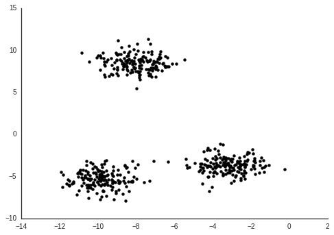
}The typical way to use Stan is Bayesian analysis, where you define your model in Stan along with your priors (which by default, like here, will be uniform) and use Stan to draw samples from the posterior. We will do this, then plot the mean of the posterior \( X \) values.

From this we can see that I. setosa is quite different from the other two species, which are harder to separate from each other.
Now imagine that the iris data was collected by two different researchers. One of of them has a ruler which is off by a bit compared to the other. This would cause a so called batch effect. This means a global bias due to some technical variation which we are not interested in.
Let us simulate this by randomly adding a 2 cm bias to some samples:
batch = np.random.binomial(1, 0.5, (Y.shape[0], 1))
effect = np.random.normal(2.0, 0.5, size=Y.shape)
Y_b = Y + batch * effect
Now we apply PCA to this data set Y_b the same way we did for the original data Y.

We see now that our PCA model identifies the differences between the batches. But this is something we don't care about. Since we know which researcher measured which plants, we can include this information in model. Formally, we can write this out in the following way:
$$ \begin{align} y^g &= {\color{red} v^g} \cdot {z} + {\color{red} w_1^g} \cdot {\color{red} x_1} + {\color{red} w_2^g} \cdot {\color{red} x_2} + {\color{red} \mu^g} + \varepsilon \\ \varepsilon &\sim \mathcal{N}(0, {\color{red} \sigma^2}) \\ g &\in \{1, \ldots, G\} \\ (x_1, x_2) &\sim \mathcal{N}(0, I) \end{align} $$
In our case, we let \( z \) be either 0 or 1 depending on which batch a sample belongs to.
We can call the new model Residual Component Analysis (RCA), because in essence the residuals of the linear model of the batch is being further explained by the principal components. These concepts were explored much more in depth than here by Kalaitzis & Lawrence, 2011.
Writing this out in Stan is straightforward from the PCA implementation.
data {
    int<lower = 1> N;
    int<lower = 1> G;
    int<lower = 0> P;  // Number of known covariates

    vector[G] Y[N];
    vector[P] Z[N];    // Known covariates
}
transformed data{
    vector[2] O;
    matrix[2, 2] I;

    O[1] = 0.;
    O[2] = 0.;

    I[1, 1] = 1.;
    I[1, 2] = 0.;
    I[2, 1] = 0.;
    I[2, 2] = 1.;
}
parameters {
    vector[2] X[N];
    vector[G] mu;
    matrix[G, 2] W;
    matrix[G, P] V;

    real<lower = 0> s2_model;
}
model {
    for (n in 1:N){
        X[n] ~ multi_normal(O, I);
    }

    for (n in 1:N){
        Y[n] ~ normal(W * X[n] + V * Z[n] + mu, s2_model);
    }

}
We apply this to our data with batch effects, and plot the posterior \( X \) values again.

Now we reconstitute what we found in the data that lacked batch effect, I. setosa separates more from the other two species. The residual components \( X_1 \) and \( X_2 \) ignores the differences due to batch.
Discussion
Note that the batch effect size \( v^g \) here is different for each feature (variable). So this would equally well apply if e.g. the second researcher had misunderstood how to measure petal widths, causing a bias in only this feature. There is also nothing keeping us from including continuous values as known covariates.
Typically when batch effects are observed, at least in my field, a regression model is first applied to the data to "remove" this effect, then further analysis is done on the residuals from that model.
I think this kind of strategy where the known information is added to a single model is a better way to do these things. It makes sure that your model assumptions are accounted for together.
A weird thing I see a lot is people trying different methods to "regress out" batch effects, and then perform a PCA of the result to confirm that their regression worked. But if your assumption is that PCA, i.e. linear models, should be able to represent the data you can include all your knowledge of the data in the model. The same goes for clustering.
In a previous version of this post, I estimated the parameters with the penalized likelihood maximization available in Stan. But estimation of the principal components in this way is not very good for finding the optimial fit. There are lots of parameters (2 * 150 + 4 * 3) and it's very easy to end up in a local optimum. Principal component analysis is very powerful because it has a very well known optimal solution (eigendecomposition of covariance matrix).
However, writing the models in Stan like this allows you to experiment with different variations of a model, and the next step would then be to try to find a good fast and stable way of inferring the values you want to infer.
The code for producing these restults is available at https://github.com/Teichlab/RCA.